Get 'em while they are young
A relaxed post as for a lazy Sunday afternoon: the little one is "hacking" graphics with Inkscape on a Fedora Linux laptop.
In case the VIDEO tag does not work for you, here's a YouTube version.
A relaxed post as for a lazy Sunday afternoon: the little one is "hacking" graphics with Inkscape on a Fedora Linux laptop.
In case the VIDEO tag does not work for you, here's a YouTube version.
Today I felt like drawing some clipart images, now is the time to share

As a business, when you are in need for some pictures, the cost effective solution is to use stock image services, that's definitely less expensive than custom work, you won't get something exclusive but chances are it will be good enough and cheap beats all (of course, I didn't consider the too often encountered case of scumbags simply picking images from the internet and when questioned answering "it was on Google, is free").
Having some recent photos that may fit the bill, I uploaded one of them on a stock images website as an experiment. For the experiment purpose, I also uploaded an illustration (nothing spectacular, just a collage from my already free clipart images). A first finding was a confirmation of what I already knew: while saturated with photos, they are more actively looking for illustrations. Uploaded at the same time, the illustration is already live on the site, while the photo still have an estimated 120 hours until review by an editor.
But my point here is not about photos versus illustrations, is about what they do with your images. The procedure for an illustration is to upload a JPEG preview and after approval you can add another format, AI, PNG, CDR or EPS (yes, you read it correctly, PNG is in there). Since I use Inkscape, my sources are in SVG and some features can't be exported in their supported formats, so I had to go with PNG. Still no major problem. But look at the image below, is a capture from their website:


I am taking a graphic design course and one of the assignements received was to remake the logo of a well known soft drink (for the purpose of this tutorial I replaced that logo with something else, as this is not the place for unpaid advertising, especially for products I don't use nor endorse). Is a trivial task with Inkscape, so I decided to enrich it with some water drops, as at the final exam I can show my skills and get a higher grade. For the exam I can't provide a SVG, will have to import/convert it in a proprietary format (such is life...), but Inkscape is my tool of choice so I m sharing the process here.
Initially, the lazy me wanted the short way, learn how others are doing it and there is an Inkscape rain drops tutorial already made by heathenx (thanks buddy, you rock!) which I used to a pretty result. Still, I didn't love it, just liked it.

Then I played with more variations, trying to make it more realistic, but liked the result even less, probably due to the softer edges. I went back to the heathenx way, not perfect, but good enough for a mere exam (without false modesty, for which I am already overqualified).

It was all well until yesterday evening when waiting for the subway I looked at a soft drinks poster, it had a photo with water drops added on top. Looking close, I saw the drops are clearly vector drawings (put on a photo) so I understood what I have to do: simplify, simplify, simplify. Now my homework looks like this:

The first step is to draw, using Beziers, a random rounded blob.

If yor hand is not trained enough for this, draw it with straight lines, we will round it later.

Select all nodes and make it smooth with the toolbar button, you have a rounded blob now.


A few weeks ago I gave myself the task to decorate one of the walls inside the home and the first thought was to buy some stickers and put those on the wall. The internet research was disappointing: few options, ugly and very expensive.
Of course my natural reaction was: I do graphics, I can do it myself! But I can't paint the walls myself, I have no experience with painting at such large size for the wall (and my experience with painting is very little, watercolors on paper, back from elementary school), so maybe a better option would be to design the stickers with Inkscape, find a place to print them and use that.
But the time was short and I had no idea where to print large-size wall stickers (plastic), so ultimately I gave-up, bought something offline (in the Chinese market they have some decent ones, low price, pretty enough and from a quality point of view, they will last enough for the price).
Of course my creative self was not happy with the defeat, now I found some free time and designed one of the many ideas I had back then: a set of stars with the moon, all of them with funny faces. I won't use them as stickers, all I can do is to make them available as clipart, if anyone has some need for them.
About the other ideas... we'll see if I get the time and mood to put them down too (less likely, this set was the easiest).

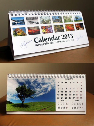
I made my own calendar for 2013: a design created with Inkscape and a bunch of photos, one for each month. It is already printed on paper in a limited edition, which will be offered with signatures from the photographers. However, I decided to put it for free download (PDFs downloadable from the same blog post) in case someone else find it good looking or useful. When a fellow photographer liked the design but witnessed his lack of design experience, I also included empty PDFs (no photos, no name) one can re-use for his own purpose. The PDFs are created to the requirement of the print shop: 220 x 100 mm, with 2 mm bleeds on all the edges.
Then I decided I can be more open, I can do more: the design is made with Inkscape, a software rarely used by photographers (they will most likely do it in Photoshop), but I can share my Inkscape SVG sources: they have the months and days, they also have guides to help with alignment, they can be exported to high quality PDF and, if you want, they can be imported in a DTP application for further processing. The only downside is, I made them for a certain paper size, but having access to the sources, is easy to adjust them. The font used is Free, MgOpen Cosmetica.
Still not perfect: I made the calendar in Romanian, since this is what people around me speak, but most of those reading my blog won't, so it was obvious a translation is needed, I also have an English version of the calendar design, also ready to use in Inkscape/SVG format - you just need to add your photos and name.
I can already hear people telling me: you should have used Scribus instead and to some degree they are right, Scribus would have helped me with having a single PDF or source file (lack of multipage support was Inkscape's main downside for the task), would have provided better PDF output and automatic bleed/crop marks, but I feel more comfortable with Inkscape, so I used the app that makes me happier (you can import the SVGs in Scribus).
Update: here's a tutorial for making your own Inkscape calendar layout design
I am doing a lot of photography lately but I also didn't forget about graphics, the latest project I was involved lately was doing freelance work on a proprietary commercial project for creating storyboards). While is not Free software, it allows to leverage my experience from my old Fedora webcomic and even build upon some of the assets I developed as a follow-up. From a technology point of view, the project is cool as it uses SVG for its files, so once installed you can extend it easily with self-made graphics or with images from the Open Clip Art Library, for example.
Unfortunately the app is Windows-only, made with .NET, so I can't easily provide screenshots (I use Inkscape and Fedora for my part of the work), but here's an example image from the Storyboard That website (probably people will recognize the graphics style):

I do release a lot of content, from drawings and clipart to photography and to videos and learned about many people using them, this always brings a smile on my face. But it can be otherwise :) Today I got a question about some of my clipart being used on some website, but with a twist: I am asked if credit is needed, as in such case the site owner has to adjust the layout to fit it, needing to think about that. My answer was dry "Since those clipart images are released into Public Domain, crediting is not compulsory, that's the license. Is up to you." opposed to an usual "the images are released into the Public Domain, you can use them in any way you want. credit is not required but is appreciated". Indeed, I released the stuff freely, no restriction can be imposed afterwards. But I can contemplate the laziness and freeloading. And smile.
I am not sure: the world is small after all or the little things we do really change it, even if a tiny bit. Either of those should be true.
Last week-end I was (with my camera, of course) at Nijikon, the anime convention taking place every October in Bucharest: there was cosplay, manga, anime, plush toys, really many things. And while wandering around searching for some photographer's prey, I noticed a wheel of fortune improvised at a manga booth:

Something there looked familiar, but I wasn't sure about it and had no way to verify it on the spot. In the evening, I was really tired arriving home, and forgot to check, so the next day couldn't ask the guys about it the second day, I checked only after the event ended:

Yup, the dice image is part of my Free clipart collection - one of my first drawings with Inkscape, made many years ago, so it looks quite weak, but still they found it useful.
Thise clipart images somehow managed to leave home, make a trip to California and return home by the way of the manga. Yes, the world is small.
For cosplay pics, I am sure my readers know where to look :p
Not sure how many of my readers remember how excited I was half a year ago when I spotted on YoutTube one of my clipart images being used by the Marina (very few probably know she did it again and again and she even blogged about it - awesome!). Today is one of those days again: a friend of mine wanted to make my day brighter by showing a funny photography-related Rube Goldberg machine and watching it I spotted something familiar: go to the 3:21 minute and notice a little cardboard rocket moving... it is my Public Domain rocket clipart, part of my free clipart collection, an image for which I even wrote an Inkscape tutorial.

The task was forgotten, sitting untouched for months, when I was reminded about it (and perhaps assigned in the tracker): make a poster design for the Fii Liber project, to be put at Ceata's headquarters.
I got the "Fii Liber Land" concept right away in my head, but it was too complicated (so I thought) and I was not in the mood for drawing it, so postponed it for a while, over a week, during which I kept working on demotivational posters (more on that in a couple of weeks, the project is not ready to be announced), while trying to simplify the idea and do something easy, which I would be able to do in the blink of an eye and no effort.
Time passed and I was unable to come with a simplified form, so build my courage and went for the whole shebang: I could get away with the simple kite (the Fii Liber logo) on a blue sky and the clouds from the current website header along with a text like "Fii Liber. Noi suntem liberi! Tu?" ("Bee Free. We are free! You?") but that was less than optimal: the kite and the clouds do not match in their visual style (I made the kite logo on my usual style but when it came to the clouds I was "busy" and skipped the task) and... I wanted to make a point and I am not the person to step back from a controversy.
Fii Liber is queued for an infrastructure upgrade, will be migrated to Drupal 7, and with this it will receive a new theme, which I find boring, corporate-like and bad for our "normal users" audience (obviously, some people in the team disagree, so they want the change). The poster is supposed to show the friendly and informal image I envision for the project.
But I talked already too much, time for some pretty pictures! Here is the poster design I came with:

Over the week-end I will probably be out taking photos, I won't follow the FUDCon happenings so I guess I can do some warm-up throwing a few bad jokes:


Moods is my latest free graphic project and in a long while the first not linked to openclipart.or of Fedora Design (from the first i am on extended leave and from the second on temporary strike). What is this project? Is best described with a quote from its own page:
This project started after I noticed myself saying a lot "pics or it didn't happen" so the idea was obvious: make a drawing, based on my free clipart images, to illustrate this classic line and then just pass a link to it. Obviously, as everything I do, it had to be Free and shared with the world. The next logical step was to develop it by adding additional mood images, which is a never-ending work, fuelled by own mood but also by the feedback received and the usage level, so use the images and it will be an incentive for me to add more.

What did I do that I have my upload limit increased to over the 15 minutes, unlike the other mortals? Don't know but surely enjoy it, I was limited before and not linking it. Then the second question: how can I ensure my videos are available ASAP for delivery in the WebM format? (I upload in Ogg Theora, Kdenlive in F14 still does not have WebM export, I need Theora also for blip.tv and don't want to transcode once more with my pity CPU).


Yesterday we had the last LUG meet for this year, and the last in this current location (from next month we need another place, still looking for it). One above another, it was a good one.


