30 May 2007

Fedora Tuica

Fedora 7 Moonshine translated in Romanian is Fedora Tuica (with diacritics Fedora Ţuică). It allow users to make their own mix at home and brew an own home-made derivative, with its own personal flavor, including liveCDs or liveUSB.

In a celebration of the Moonshine, here are schematics of an improvised installation for making tuica, just like my grand mother uses to use ages ago:

[moonshine maker]


There are a fey quick similarities comparing Fedora and Moonshine (tuica):
  • using any of them will make you happy
  • both are addictive and may render you dependant
  • being home made, Tuica is free, Fedora the same
  • you can share them with your friends
  • both are strong

A bit more info about the Romanian Tuica:
  • the original and traditional receipt is to made them from plums
  • an appreciated variety is the one made from pears
  • the flavor is poorer, but the fruits are everywhere, so many people make it using cherry plums
  • mulberry is a very sweet fruit, so people make tuica using mulberries, when they have them
  • a cheap receipt it to use the remaining of the pressed grapes after wine making

29 May 2007

Bible Fight - cool Flash game

This cool Flash game,, seen on Planet linux360, thanks to Starlog.

biblefight game


It bring me a bit of nostalgia about a time around 10 years ago when I used to enjoy a little Mortal Kombat match, but I am a little too old for that now and my fingers are not fast enough.


BTW, are there such fighting games released as GPL and available for Linux? (bonus point: funny, cartoonish look, maybe SVG graphics, kind of Monkey Bubble style)

24 May 2007

What is a name?

siegfriedI voted for Siegfired


Background info and credits for the photo at wikipedia

23 May 2007

Inkscape folded sticker

Ryan's tutorial about creating stickers with folded edge in Inkscape is very addictive, so I couldn't stop myself playing with it, here is what I did:

dioanad sticker fedora sticker

 Nice work, Ryan!

When I saw the sticker for the first time (before the tutorial was published) I had an idea, but being too lazy and too focused on other things for the moment will not follow it: how about a little web page to create such customized stickers? Like a form to enter your text, select the sticker color, click a button and your sticker is ready!

I see two ways to do it:

  • have two PNG images, one with the body of the sticker and another with the "dog ear", use a library like gd and combine these two PNGs with another one, generated on the fly, containing the text (also made with gd and php)

  • work with vectors, replace the text inside the SVG and use a command line utility to convert from SVG to PNG. Unfortunately, imagemagik is not up to the task (it does not support advanced SVG features) and Inkscape is probably not available on your web host (and I don't think Inkscape will work without X)

17 May 2007

cc Swag

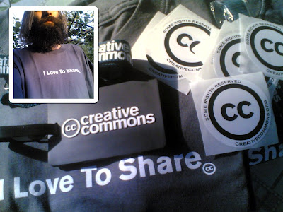
 I received a note calling me to the post office to pick a package. What that could it be? Suprise, surprise: it was a package with swag from CreativeCommons, nice!


Thanks Rejon!

02 May 2007

GIMP rain animation tutorial, "patrulaterul maro" buttons

GIMP rain animation tutorial

After a number of Inkscape tutorials, it was the time for me to make a GIMP one, this one about creating a fake a rain animation effect, like this:

gimp rain animation


It is quite big, with many large images, so I put it on a static page from my tutorials website, if you are interested, read it in its original location.

[read more]

"Patrulaterul maro" Buttons

As I am in the mood of showing some creative products, here are a few political buttons I made for my own use, but I share them with my Romanian readers who may find them useful.

probase suspendat 322 nu maro

probase

26 April 2007

Tips: using brushes with Inkscape

In another follow-up to Máirín's tutorial about Grungy Brushes, I showed an alternate way to create those using Inkscape only. But is kind of weird to create brushes with Inkscape only to use them with GIMP so I wrote a few tricks about using brushes with Inkscape.

inkscape brushes


The article is a bit heavy in images, with a few large screenshots, so I will not post it directly in my blog to waste people's bandwidth, but instead in a static page. Go read it if you are interested.

[read more]

25 April 2007

More "Grungy Brushes"

If you have not already read Máirín's nice tutorial about Grungy Brushes, published recently on the Red Hat Magazine, go and read it now before continue reading this. I skip here a lot of steps and present only part of the workflow.

I will explore a more simplified (and probably not that good looking) way to do it, using only vector graphics for path generation.


  • Fire Inkscape, of course, this is the tool we will use


  • Draw a rectangle, al large as you want. I made it red only for visual feedback in the next step.

    rectangle


  • Switch to the calligraphic tool and draw randomly until you cover the rectangle but leave a lot of gaps, we will use only the gaps. Make sure you have one single path, otherwise select the paths and do a union (Path > Union).

    random random


  • Select the the chaotic path and the rectangle and perform a difference (Path > Difference). After that break it (Path > Break Apart).

    noise


  • Optionally, if the blobs are too big make them smaller using inset (Path > Inset) and if they are too complex simplify (Path > Simplify).

    noise


  • Now, just as Máirín did, use the Align and Distribute dialog to move them around.

    arrange


  • And go wild with a lot of crazy shapes:

    brushes


  • As shown in the tutorial, export as PNG, import into GIMP, flatten image, convert to grayscale and save as brush (.gbr).


I think at another possible approach which would not use a rectangle and difference, but the bucket fill from the Inkscape development branch, but for now I will limit to tips and tricks about the stable version.

If you didn't read the tutorial before, I hope I got you interested, so go read it now!

24 April 2007

Sinclair Spectrum Nostalgia

My celebration of the 25-th anniversary of the Sinclair Spectrum is to highlight some games or applications that influenced me in some way.

  • Rygar - because it was my first and you will have a soft spot for your first forever. Well, it was not the first computer game I ever played, but it was the first I really liked and the first I won. Later I grew bored by the genre and stopped playing this kind of games, I revisited it years after in a improved version (MAME), but it have not captured the old feeling.

    rygar

  • Elite was in those years my backup game, something I played when I wanted to play something but didn't have something interesting to play (note: later, in the PC era the backup game became Heroes of Might and Magic II-IV). Sure, I tried later the PC version and some clones, but it was too little, too late.

    elite

  • The Dizzy series I liked so much that I tried to do my own clone, directly in Z80 assembly language. I started by drawing a complete set of tiles for graphics (with pen on graph paper, no less!), creating a game map of about 20 rooms composed from those tiles, an engine to display the game world and move the main character in this world (complete with keyboard input and sprite animation) and display of text messages using a custom font. Then I got to the hard part: implementing the game logic, so I put the game on hold to get some ideas and life took me away from it.

    dizzy

  • Art Studio was a graphics software, not a game, and it defined my way of drawing for many years. Later, in the Windows 95 era I kept using MS Paint and missing its version from Windows 3.x because it resembled better some "features" from Art Studio.
    art studio

Oh, and BTW, in that era my "computer monitor" was a black and white 14" TV.

23 April 2007

Fedora Visual Identity

 In the last few days I uploaded a number of screenshots to http://wiki.lug.ro/, mostly in the desktop area: graphics, office, multimedia, games. A lot of work is still to be done, but this process made me to have a clearer picture about the visual identity of Fedora.

I use a configuration pretty close to the default: for windows the Clearlooks theme and for icons Bluecurve/Echo/Mist, which in result is something very close to the upstream GNOME default. This in opposition to Ubuntu screenshots, which clearly stand apart by their look (which I don't like, but this is not the point). When a reader see a screenshot made with Ubuntu, he can recognize on the spot: Ubuntu, GNOME, Linux. In the case of a screenshot made with Fedora what else can be recognized except GNOME? Not much else.

 I guess this is part of the explanation why almost half (number pulled straight out of my ass) of the Linux screenshots found on the web are brown.

This is true at leas for me: having a more personal look of Fedora by default would motivate me more in publishing screenshots in such places as Wikipedia, is addition to my blog or my tutorials.

What a more personal look could be? It may be something little, like a specific shade of blue, a small change to the window decorations, a small tweak to the icon theme.

20 April 2007

The brown quadrilateral

Pro Basescu
Only a few months after acceptance in the EU, the communist restoration is flourishing here in Romania, it culminated yesterday with a coup d'état performed by the communist mafia.

The brown quadrilateral if formed by communists, political police from the communist era (securitate), mafia, and corruption.

The only sane thing one can do is to leave this shitty country for good, and never look back.


Me? In another life I would have cared about those things, but for now I just lack the energy...

11 April 2007

Spread Open Media

[xiph]Quote:

Spread Open Media (SOM) is a project in the same line as Spread Firefox, but combined with a powerful community like Mozillazine. SOM will promote Open Media formats like Xiph's (Vorbis, FLAC, Speex, Theora and XSPF) and others like SVG and ODF.


We, at the Open Clip Art Library, together with Xiph.org are hosting a contest for creating a logo and maybe a mascot for Spread Open Media. All submissions should be in SVG format and released as Public Domain, so they cam become part of the Open Clip Art Library. The contest started on 10 April 2007 and will end on 05 May 2007. Using those contributions as a base, a lot of materials like banners, buttons, badges, icons, fliers, t-shirts will be created.

[OCAL]Read more about the rules and start contributing your graphics!

03 April 2007

Communication channels

Channels

For this rant to be understood in its entire value, I should notice I do not work in a FOSS company and not even in a company where IT is the main focus.

Last week I was at work doing something at my desk when the phone ring: "Someone named XXXX from the city YYYY is asking for you". Unknown name, but I take the line, maybe is something business related and not spam. "Hi, I am XXXX from city YYYY and I have a question about OpenOffice". My first reaction was "from where do you have this number?". The answer: he got my name from the OpenOffice.org website, found my work email address, then my employer website and phone number.

Then he asked something about using regular expressions in Calc filters, but I was to shocked by his gesture to call me at work (is clear from the website we work in an unrelated area) so I could not answer at the moment (and I needed a look in the help anyway). My reply was along the "I can't tell you right now, but let's talk on the mailing list, even if I don't know the answer, maybe somebody else can and if not, you may ask on the English list". And he: "but I don't know enough English" (but he knew enough to find my employer website (which is entirely English), and my work phone number there.

Of course, he never came to the list to properly ask the question, which was not hard to answer.

The moral of this story is: use the proper communication channels, otherwise you may not get the desired answer (hehe, this may apply also to me sometimes...)

Articles page

On a related note, about the communication clarity, I did a cleanup of my articles page, it was a straight translation from my blog, with bad and bloated html and css. I now communicate clearer and my money are at the same place with my mouth.

28 March 2007

Censored?

I don't know if this is just a technical glitch[*] or straight censure, but one of the Planet aggregators carrying my blog selectively skip content (I talk about this post).
If I am censored, please either a) drop me from aggregation or b) stop censoring.

Thank you.


[*] - I doubt very much the glitch, as a lot of other aggregators (some run by me) are just fine

Update: Further investigation and cooperation of the admin show a technical problem. Too bad I write once in a while an article for my Romanian readers and then something happens and is not delivered in the channel. There must be a moral to this story...

27 March 2007

OLPC and Romania

The Romanian Parliament debate the OLPC program and the current tendency is to reject it. I find suggestive this quote from one of the most vocal opponents (source: HotNews.ro, translation mine):

"On the IT market, beside this manufacturer (OLPC), there are two worldwide companies, Intel and AMD, who produce more powerful mini-laptops"


I know the saying "Never attribute to malevolence what you can explain by simple stupidity", but Varujan Pambuccian, the author of this quote, is a former computer programmer, with an impressive background in IT&C.

Professional Webdesign

In the last few days I thought a lot about webdesign companies and their practices (probably this was ignited by the talk about Simplissimo and their attempt at an alternative approach).

The thing that bother me mainly is how those firms do their own website: usually a flashturbation extravaganza with very little meaningful content (sometime not at all). This is apparently a paradox, as the own website has to be the most effective selling tool for a website maker.

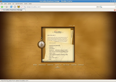
I'll focus on one almost random example, my old "friends" at INOVATIKA.COM, which are far from an isolated case, the majority is about the same. The websites they do for customers are not entirely bad (read me well, I didn't say good or even half-good, I said precisely "not entirely bad", I saw worse, but more about this later), but their own website is so bad, I can't understand how a customer in his right mind would buy a website.

Let's cut to the chase, here is how the website look most of the time:
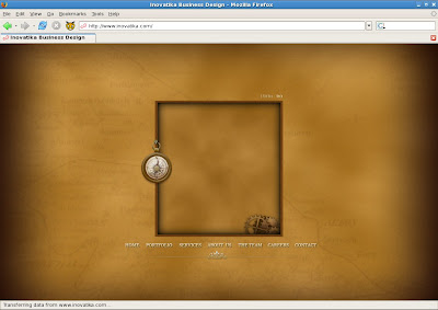
inovatika


And when displaying content:

inovatika


I could keep a long dissertation about how, why and where the site sucks, but I am not in the business of giving such advices for a commercial entity, one which is supposed to have first class experts (or so they claim in a comment on my blog).

Well, I used a little rhetorics above, surely I have my own theory: the usual customer does not know the basics of design, marketing or usability and they mistake bling and shiny for quality. They see the site which look complex and assume the creators know their turf. What a potential customer does not know it that the Flash website is usually not made by the same person/team (depending on the company size) as the HTML site he will get.

Another theory, specific to my example (INOVATIKA) can be drawn by looking at their Portofolio page, it not seems like those sites were purchased by customers discovering their website. So then what is the purpose of the website? Self increasing the ego? Dick contest with the competition?

I hope the people at INOVATIKA will not consider my use of this example (fair use I would say) as an insult, I said I saw worse from their competition. For example someone I know purchased some months ago (unbelievable, in the year 2006) for a 4 digits sum a website made with Dreamweaver, with a table based layout witch fail HTML validation (and that is a supposedly respected and widely know firm). Unfortunately at the time I was asked just for an advice, not having a decision (to reject on technical grounds) and not being listened, so they got away saying "W3C standards are optional, not required" and "Nobody in Romania use W3C validation" (now I'll defend INOVATIKA, at least they use validation to a certain degree).

There is more to say about webdesign, maybe other time I'll talk about a friend of mine (this time a real friend) who do websites for 50$ (by customizing free templates downloaded from the 'net) and does not have a website for himself.

Or maybe about huge corporations who do websites on big budget for government agencies, but here I just started gathering data.

Footnote: Sure, one can point his finger at my personal websites, which are not state of the art, but the thing is, I don't sell anything on them, I can afford even to insult my Internet Explorer using readers or to serve them intentionally a crippled version of the site. I think I am not a complete idiot in the field thinking at my work in a few community, commercial and educational websites, but I will not take it personally if someone affirm the contrary.

Update: now I have a Romanian translation of this in my articles page (in Romanian).
:-P

20 March 2007

Linux Personas

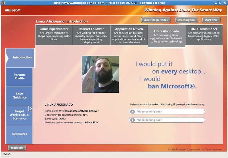
Winning Against Linux is a site where Microsoft identifies Linux users as personas, along with the ways to convert us to using their products and even the money they think can get. Awesome!

me, viewed by microsoft


I modified in the screenshot just one small detail, for increased realism: the user photo.

PS: so they fight if they feel the need need to win, the conclusion is that we have just one more step.

14 March 2007

Notebook stickers

I saw on Planete Beranger a collection of notebook stickers for various Linux distros. The Fedora one needed some minor tweaks, so here is a remade version (complete with SVG source, part of my artwork page):

fedora sicker fedora sicker fedora sicker


Yeah, I know it uses the logo and the wordmark, and the use of those by the community is taboo, but what else can I do?

Update: I know it is not good for print, but couldn't stop the urge to add blur, so I made an additional fancy version.

Update: and a monochrome one for as cheap as possible printing.

06 March 2007

On dogfooding and application usage

This is beyond my comprehension: when you post a screenshot about how to contribute to Fedora and post the screenshot on Fedora wiki which is the best to use? Mac OS X of course! To show the world how Fedora is a first class Desktop. At least the person who did the screenshot is sincere.

Please spare me the use the best tool for the job argument, for $DEITY sake, is a basic screenshot of a web browser uploading a file to a website.

I am very straightforward, my application usage, as reported by Mugshot is like this:

application usage

01 March 2007

Martisoare, martisoare

If I have regular readers of my blog, probably they already know my opinion about Mărţişor, but If Planet linux360 is talking about the subject, I'll add my voice in a visual way:


Yeah, good and sincere way to show your affection to your SO...