30 September 2013

G+ and RAW photos from the eyes of a FOSS photographer

I use GIMP for almost all my photography editing by choice, so when reading today a couple of articles about the new RAW photo editing capabilities in Google Plus and how those put Google in a fight with Adobe, as its only worthy competitor, I noticed in both a similar (your probably know how those articles are usually written) expression, along the lines of "don't mention GIMP, while nice it doesn't count". I knew about the RAW import for a few days, but it was not news for me, I don't plan to move my photography storage and editing to the cloud, but now the GIMP comparison made me genuinely curious what is it about.

So away we go! I have handy some RAWs from a recent shooting, it was a matter of uploading one and doing a few clicks, right? Not so fast! The first try, the first FAIL: while the RAW image uploaded properly and it was shown correctly as a JPEG in browser, editing does not work with Firefox, Chrome is needed.

google plus raw photos
Normally at this step I would give up, I won't change browsers any time soon, but it caught me in the proper mood for that, so I downloaded Chromium. No luck either, this time for an undisclosed reason. No luck with Chrome either. It should be because I am running Linux or they don't like my video driver (according to the troubleshooting page on G+). Clearly, they don't want me as a user.
google plus raw photos
I was so close to call it a failure and make a funny gesture towards Google... but I was already mounted, gave it another try, this time with Chrome under Windows, fully proprietary. Of course it worked. I can write a bit more than two paragraphs cursing Google for their useless effort.

At the first look, it is a simple interface: next to your picture there are some buttons for various adjustment operations, grouped in two categories "basic" and "Creative" (as you will see later, "Creative" is just a feel-good name, there is little creativity in applying a series of predefined filters).
google plus raw photos

In the "basic" area are some tools which are a must for any image to be published: tune image is doing exposure/color adjustments, details is for sharpening and crop & rotate to correct image framing. Everything with an easy to use interface.
google plus raw photos
Still under the "basic" category, there is a not so basic feature: selective adjust. I found it cute and original (still, no match for selective adjustment from a proper image editing software), you drop adjustments points in the image and tune it around them.
google plus raw photos
In the "creative" category a first tool is black and white conversion (in my opinion, also the single really useful from the category). It is simple still powerful, allowing to adjust the conversion based on specific colors and fine-tune it.
google plus raw photos
If about "drama" and "center focus" I am quite neutral (I can see how they may be useful for some, but with a lot of fine-tuning to prevent excess), starting with "frames" I heard a shout in my head "Instagram!". We are on the edge of the bad taste realm. Use everything with extra-care.
google plus raw photos
"Tilt-shift" is again some cute toy you use on your pictures and pretend it was made with a dedicated lens. The interface is simple and effective, the final result not so much.
google plus raw photos
"Vintage" and "retrolux" will damage your picture, but they are the wet dream of the ordinary Instagram user, will make the image hip, damaged but hip. Do not use.
google plus raw photos

As a conclusion, I can say this is no threat to Photoshop and will not replace it ever, is no treat to GIMP either, even it will be more used than probably any of them, is a tool with a different purpose, for a different audience. It may be some competition for tools like Lightroom and Darktable, when they are used for simple "RAW development", but only for simple use cases (no perspective correction? no noise removal? indeed, simple cases). Talking about real competition, it is real competition for Instagram/Facebook, but this probably makes for less sensationalist titles.
I will end my conclusion with a RAW image, first in its initial unedited state and with what I consider good and bad editing.
google plus raw photos

19 September 2013

A kind of low-hanging fruits

Last year I traveled quite a bit, so when Wiki Loves Monuments came, I was prepared with a sizable pack of pictures ready to upload to Wikipedia (IIRC, close to 10% from all Romanian uploads). This year my mobility was greatly reduced so the contest found me unprepared, with practically no picture ready to upload, which can't be: if I can contribute myself, how can I tell others to do?
Long story short, the best strategy was to attack low-hanging fruits: looking at the list of monuments in Bucharest I noticed some areas with many buildings marked as historical monuments but having no photos at Commons, so for today (well, yesterday, is already past midnight) I selected two streets for a personal photo walk.
Net results? in ~2.5 hours, ~150 pictures, which I am still uploading. I jumped as one of the top 5 Romanian contributors. Not bad for low-hanging fruits. If the stars will align, maybe next week will get the time for one or two more such walks.

wiki loves monuments
There is another benefit of such strategy: as one can see in the picture above, those buildings are not sexy, is not expected to win any photography prize with pictures of them, so they are not likely targets for people aiming for prizes (big drawback of Wiki Loves Monuments being presented as a contest.) Good thing there are some of us (organizers, jury) not running for prizes: the grunt work has to be done.

19 August 2013

How NOT to organize a FOSS workshop

This "Open Source" organization did a lot of cool projects along the time, I participated myself in a few and reported positively about them, one such project was a summer program with many workshops (mostly about development) at a local university. So I gladly accepted when I was invited as a guest at the 'graphics design and editing' workshop, which as the title says, it didn't went that smooth...

An emblematic moment was at the workshop's first day start, as part of the warming up, everyone introduced himself and students told why are they there. For the biggest largest group, this reason was "I want to learn Photoshop." At a GIMP workshop.

The trainers, designers with some years of experience, they don't use GIMP or Inkscape, the apps they were to teach, and didn't do it at all in the last few years (they had to research particularities the night before each class). He may hate me for replaying this but one of them told me "I didn't use GIMP from 5 years ago, when I discovered the features Photoshop". So imagine the amazement when I showed any advanced feature introduced in the last two release.

Also, the only mention of the "Open Source" term ("Free Software" would be waaaay too much) was in the day 4 (due to a busy schedule I was able to attend only day 1, 3 and 4) in the form of "so, see, to do such things you can use Open Source software, without paying for expensive apps".

Conclusion? if you want to organize a workshop, then is a bad idea to have both the students and trainers wanting to learn/teach something else than the declared topic and they are forced to stick to that topic. How to do it right? Make it clear what and why, be both alternative and pragmatic at the same time.

Still, there were positive things: the trainers were enthusiastic and really trying to make the students learn something and have fun and I can witness the students having a lot of fun time. Still, from a FOSS point of view (remember, it was a FOSS organization and a summer "Open Source" program) it was a failure: my guesstimate is ZERO of the students kept using the apps learned at the workshop.

13 August 2013

Editing for photowalks

I know Scot Kelby is a well known Photoshop writer trainer and and also evangelist, but he is also a well known photographer and photography writer (Wikipedia says for 2010-2012 he was the #1 best selling photography writer) and the organizer of the popular Worldwide Photo Walk, so I was surprised, but not shocked, when registering to this year's photowalk I saw this question in the registering form:

photowalk no gimp
I answered "None of the above" when asked which software I use to edit photos, as I use mainly GIMP and there is nothing close to it (only Photoshops, iStuff, bundled stuff and online stuff are available choices) as there is no one of the any other FOSS options (darktable, DigiKam, to name a couple). Still, no need to get paranoid, there aren't listed none of the many (and crappy) smaller proprietary editing tools, even if they are used by a lot of people.
I know some of the people participating in the Bucharest photowalk and most of them are in the "None of the above" category (still, they are neither in the "FOSS" category).

06 August 2013

How to become a graphic designer

I graduated University with a diploma in mechanical engineering, after that I switched the field and worked most of the time as a computer engineer, that was my day job. Graphic design was something I did in my spare time and was something I learned by myself, by reading, experimenting, being a part on FOSS projects and so on. And I had a few successes, all while using almost exclusively FOSS software.

Now when I find myself as a freelancer, it made sense to complete my professional background by receiving certification as a graphic designer. How to do that? By taking a recognized professional training for adults. Following is the experience of a FOSS guy going trough a traditional graphic design training.

Honestly, I didn't expect much from such a training, I have some years of experience in the field and I know how to read books, it was important to get an official diploma and the price to be affordable. Looking around, I found a training center fitting my criteria, I won't name it, since I am not in the business of doing advertising, neither positive, not negative.

This training center actually has two graphic design courses, both of them consisting of Adobe Photoshop and Corel Draw, it is quite specific, you rarely learn general principles, but how to use those two specific apps. Why Corel? I talked before a few times about it, won't get into details: the graphic design market in Romania is stuck into a vicious circle: everybody is using Corel Draw because everybody else is using it, while all of them acknowledging is not the best tool. The first course is “basics” and the second is “advanced”, but after any of them one will get exactly the same diploma, with a different annex. My choice is simple: for the advanced course I was unable to answer such questions like “what is the shortcut for operation X in Photoshop” (because I have not used it and have no intention to use it forward), so unlikely to pass the initial test. I went to the basic course. After all, the diploma is the same.

The actual training center  have some ancient desktops, all of them running Windows XP and quite old versions of the required software, for Photoshop it was CS3, while for Corel it was X3, unfortunately, I didn't take the time to investigate their licenses. All I can say, in the very first class the trainer said “do not ask me where you can buy the needed software at home, you are by yourself with this”, however it was expected we will have home newer versions and we were instructed to save backward compatible files. I suspect at least one of my classmates got her home computer infested with a virus from not knowing much about torrenting.

The basic course is 6 weeks long with 2 classes a week, for a total of 12 classes, which are split 8 classes for Photoshop and 4 classes for Corel and a lot of home works. For the final exam, you'll have do build a portfolio with various works, some of them part of the home works, some in addition to them. The class consisted in lecture, where you were expected to take notes (I personally didn't and managed just fine) since there was no useful printed support and practical applications under the trainer's supervision, together with the home works analysis. At its end you are expected to acquire a basic portfolio, which can be used for employment.

As I understand, the advanced course if a bit shorter, only 5 weeks long and more portfolio-oriented, at its end you will have to create a full identity manual for a [fictive] company, going trough many  steps, from logo to website mockup to flyer and more.

Back to the basic course, the Photoshop part covered most of its toolbar and and half of the menu, just before filters, I wonder if the filters are “advanced knowledge” for the second course. Anyway, I took issue with some of the transmitted knowledge, like black and white conversion for images being best made with gradient map (no, is better to use color channels and tune the final result) or the PNG image format being created by Macromedia (no, it was created by W3C), but I tried not to be a problem-student and kept my interventions to a minimum.

The vector graphics part in Corel was expedited faster, as you are supposed to use it for simple graphics. Still, the final project was to be made with it. It was interesting to see most of the students, while at the start being more interested in Photoshop, having more fun with vector graphics. That pretty much replicates my experience with combined GIMP/Inkscape workshops.

The trainer is a nice person but limited by the curriculum, she is one of the person transmitting the information, not the one who assembled it. She honestly recommended me to take the second course, where I may find some things to learn. Still, when she asked which graphic apps I used before and my reply was “Gimp and Inkscape” I got the expected “never heard of those”. For a few of the Corel home works I presented the required Corel-made version and how it can be if Corel supported some basic features I take for granted with Inkscape.

As said above, for the final exam I had to create a number of works:
  • 5 photomanips (change colors, switch heads and such), which I made with GIMP and exported as .PSD;
  • 2 original ads and a remake of an existing ad, here I did most of the work also with GIMP, exported as .PSD and imported in Photoshop for final touches and ensuring the file is rendered correctly (sometime it isn't);
  • 2 book covers (yes, this was to be made as raster, not vector graphics), for which I prepared all the needed elements with GIMP and Inkscape and assembled the final work in Photoshop, I had to do this way since the final result had to be a CMYK .PSD file;
  • a clipart image, which I made it with Inkscape, imported into Corel, corrected some import problems and exported as .CDR;
  • 1 original logo and 2 remakes of existing logos, again I made them with Inkscape and converted the SVG to .CDR from inside Corel;
  • a business card based on the original logo above, really quick task done with Corel in a couple of minutes;
  • a flyer, for which I had to use Corel from the ground-up, it was too complex to clean-up an eventual SVG import and the result was to be a CMYK .CDR. Still, it had to include some photos previously prepared with GIMP and the logo, originating with Inkscape;
  • the final project was to be a small, 6 pages, magazine also in .CDR format. Again, assembled with Corel but including a lot of images originating in GIMP.

The final exam was simple: a theoretical test and the portfolio review. The theory part was, as expected, simple: a quiz with  18 stupid questions, where you were expected to memorize useless (for me) things, like “what is the Photoshop operation to copy a selection into a new layer” or “for which Photoshop tools can be applied a feathered edge” or “which is a correct list of  node types in Corel” or “which is a correct list of operations you can to with the pick tool in Corel”. Still, easy to get 10 from 10 points if you didn't sleep trough the entire course. Reviewing the portfolio was a bit more frustrating, it felt more like they numbered the works, not looking at the amount of skill backing them. An accessible slam dunk.

In conclusion: was it worth it? I think so: I got my diploma, I had the opportunity to see how the competition if faring (last time touched Photoshop more than 10 years ago) and also to see how a recognized graphic design training is structured. And definitely was and incentive to put my lazy ass to work and create some stuff. Would I take the advanced course? No, if I have to pay for it. Now I have on my TODO to think more about how the marked would receive a training course based of FOSS tools.

29 July 2013

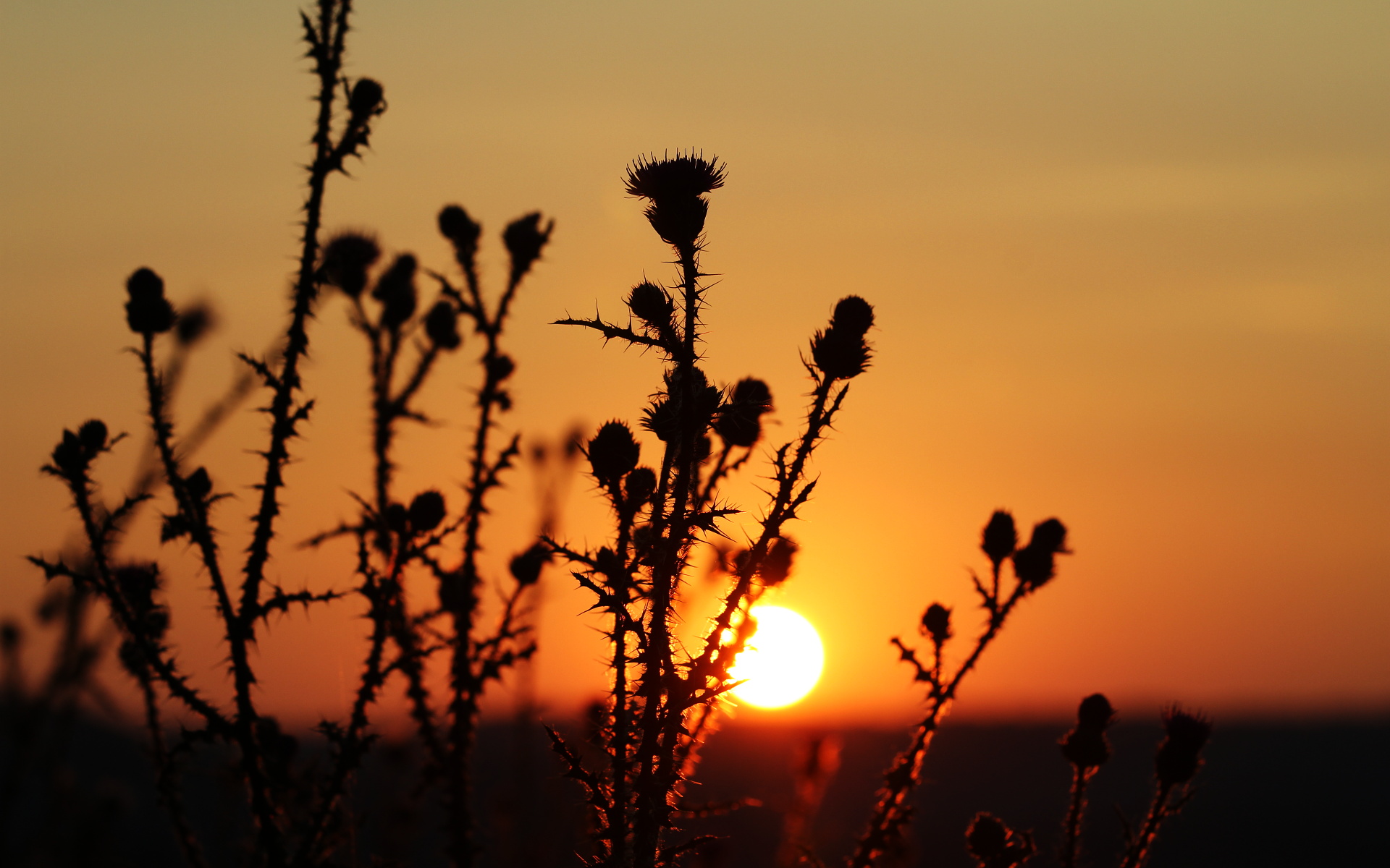
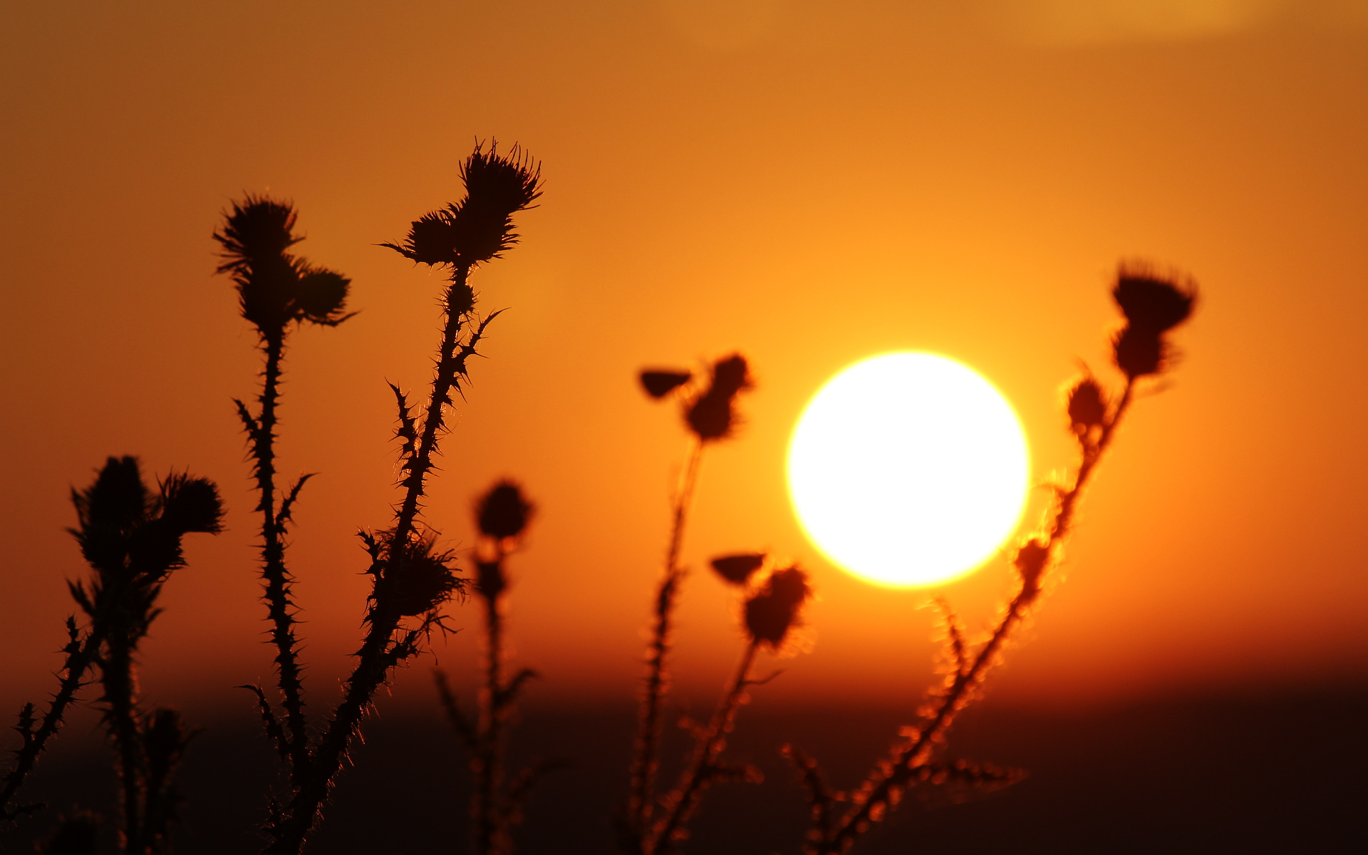
Thistle wallpapers

Thistles pictures as your desktop wallpaper? This does not sound very sexy! Add a rising sun in the background an there may be something into it. Have fun!

thistle wallpaper
thistle wallpaper
thistle wallpaper
thistle wallpaper

26 July 2013

Clipart spotting: lemonade

clipart spotting: lemonade
I started developing an eye for such sightings: today while eating a shawarma in the touristic city zone, something drew my attention: an add at the next-door shawarma place, they were offering a free lemonade for some orders. No, not the lemonade was of interest, but a drawing on the banner. A quick check on my clipart collection confirmed: yet another use of my freely licensed clipart images. Is not a spectacular image, made in the early days when I was learning vector graphics and Inkscape (still called Sodipodi), but it was of use for someone.
lemonade
PS: that's not that unexpected, is at the top of the first page in the Google image search for "lemonade"

25 July 2013

FLOSSCamp 2013

Unfortunately is not possible to take a 4.5 months old hacker from her basement to the mountains so I have to skip this year the FLOSSCamp meeting which will happen over this week-end, but based from the past experience is going to be fun and a chance to meet people from the Romanian FLOSS community. Hopefully, next year we may be able to attend it together.

23 July 2013

On traditional media in the internet age

We all know traditional media is struggling in the internet age, some of them are trying various (usually bad, like paywalls) solutions, some are blaming the public, some are trying to cut costs, some are struggling, some are giving up. Here is one anecdote I witnessed recently, which shows the problem may sometime be content-related.
Last week I took a picture and posted it on social networks (facebook and g+). Unexpectedly, it exploded over the week-end and became viral on facebook. Sooner or later, traditional media reacted and some of the biggest TV stations and newspaper in the country picked my picture. Here is how:
viral
I don't read newspapers (on paper) and I don't watch TV news, there is way too much bullshit, so what I saw was exclusively on their websites, I can't tell if/what happened on air or on paper. Is also to be noted the image was at the time available only on facebook and g+, in both places with public access and no watermark (I didn't expect it to become popular and I don't like watermarks anyway).

The first I noticed, was the website of Realitatea TV, which is a big news TV channel. And it was the worst: not only no credits for the image author, but is quite disingenious: the site claims the source is "Realitatea TV" and it is a "video capture", like it was their original content. This had upset me a bit and was the motivation to collect the usage and see if the others are doing it better or worse. realitatea
evz.ro is a "news portal" and the website for the Evenimentul zilei newspaper and they did a little better: at the bottom of the article they put the photographer name plain text. evz
Another newspaper, Gândul did it a little better: crediting the author they linked to his facebook account. gandul
ProTV is a top TV channel in the country (and on of the richest), they reacted late, only Monday (one day later is huge in news), but they credited the photographer along with a link to his facebook account. They also list themselves as the source, so it may have aired. protv
Last in my list is the website of another news TV channel, Romania TV. Also late in the game (Monday), they are straight: the news is picked from the above-mentioned Gândul, which is also watermarked in the picture. The way the image was edited and cropped suggest it was aired, not only published online. rtv

As a conclusion, I should add the content of all articles seems to be inspired from each other and their base is my short paragraph accompanying the picture, from where they expanded. At no point the photographer was contacted to verify the story, to ask for more info, for a larger version of the image, for more images (of course I have more). Of course, nobody asked for permission to use (content from my blogs is CC-BY-SA, content from social networks is not) or to offer payment. When they put so much work in their content, why they expect any respect?

12 July 2013

LightZone

A couple of weeks ago, when I first learned about LighZone, a photo editor, was opensourced, my reaction was "heck, even if it is Java, I should try it and compare with darktable", but the first impression was a failure: my access to the website is blocked! How dumb is for a FOSS project to blindly block all customers of the largest ISP from a country? What else they block? Angry, I made a screenshot and then forgot about it for a while.

lightzone
Today I saw it again and decided to give another try, even if the main website is inaccessible, the real meat is open on GitHub, complete with installation instructions: there are even packages for Fedora, via the SUSE build system.
Too good to be true? Indeed! The package fails due a dependency on liblzma.so. So the screenshots below are made under Windows:
lightzone
lightzone
After a few minutes with it, here's my quick comparison:
  • the browser mode in LightZone has the features, but is slightly harder to use compared with darktable;
  • in editing mode, LightZone is based on predefined styles: you pick one and then adjust parameters. With enough adjusting, you can probably get anywhere. Is beginner friendly, but I feel it limiting;
  • for those who need that, darktable has the tethering mode;
  • LightZone is truly multiplaform (is Java), while darktable pretty much Linux-only;
  • in 5 minutes it crashed once.
My conclusion: LightZone is a cute app, geared for beginners which allows to get the job (RAW editing) done. Still, for a Linux user, I recommend darktable instead. For myself, I will stick with GIMP-UFRaw-File Manager and for my gf, who is using a proprietary app on Windows, I won't try to push LightZone either, she uses some tools (like the clone stamp) which I didn't find there.

19 June 2013

Drawing water drops with Inkscape

I am taking a graphic design course and one of the assignements received was to remake the logo of a well known soft drink (for the purpose of this tutorial I replaced that logo with something else, as this is not the place for unpaid advertising, especially for products I don't use nor endorse). Is a trivial task with Inkscape, so I decided to enrich it with some water drops, as at the final exam I can show my skills and get a higher grade. For the exam I can't provide a SVG, will have to import/convert it in a proprietary format (such is life...), but Inkscape is my tool of choice so I m sharing the process here.

Initially, the lazy me wanted the short way, learn how others are doing it and there is an Inkscape rain drops tutorial already made by heathenx (thanks buddy, you rock!) which I used to a pretty result. Still, I didn't love it, just liked it.

inkscape waterdrops

Then I played with more variations, trying to make it more realistic, but liked the result even less, probably due to the softer edges. I went back to the heathenx way, not perfect, but good enough for a mere exam (without false modesty, for which I am already overqualified).

inkscape waterdrops

It was all well until yesterday evening when waiting for the subway I looked at a soft drinks poster, it had a photo with water drops added on top. Looking close, I saw the drops are clearly vector drawings (put on a photo) so I understood what I have to do: simplify, simplify, simplify. Now my homework looks like this:

inkscape waterdrops

How To

The first step is to draw, using Beziers, a random rounded blob.

inkscape waterdrops

If yor hand is not trained enough for this, draw it with straight lines, we will round it later.

inkscape waterdrops

Select all nodes and make it smooth with the toolbar button, you have a rounded blob now.

inkscape waterdrops

read more

14 June 2013

Backtracks

Months ago when I heard rumors about Microsoft preparing Windows Blue based on the large public disappointment with Metro in Windows 8 I thought about writing some words on a perceived advantage of proprietary software over Free software: since users are customers, it is forced to listen to their feedback and if a development goes wrong, they will reverse it (Microsoft is no stranger to that, the most prominent example being Vista/W7), while traditionally Free software developers do it primarily for themselves ("scratch your itch") and won't care much if bleeding users, as one can see with the GNOME project.

In the meantime Windows Blue is nearing release, has changed name to Windows 8.1, will be free of charge (something unusual for Microsoft, revealing the concerns over user unhappiness) and also a half-hearted move, we learn from the preview, since Microsoft has an agenda (app store, user locking, mobiles) and still plenty of money in reserve. Also, GNOME 3.8 was released including an optional "classic" mode, ridiculed by GNOME developers as a "Flinstone" mode.

It was a good thing I didn't write anything at the time, since I was mistaken, the important attribute on Microsoft software wasn't being proprietary, but being commercial. You can see this when learning based on user/customer feedback RHEL 7 will switch the default desktop from GNOME Shell to GNOME Classic. While still kind of a "Windows Blue" move, with a lot of words intended to control the damage, it gives years-worth air bubble to RHEL and CentOS users. As for GNOME, there is an eternity until a RHEL 8 will put the question on the table again, a lot will happen until then.

Just for fun: Apple also just announced a big interface change with IOS 7, is going to be interesting to see the evolution, especially now when their reality distortion field is weaker than ever.

PS: the troll inside me can't skip this question - if there will be a Fedora spin with GNOME Classic mode as a default, will it be called Fedora Blue?

13 June 2013

Photoshop versus GIMP: the Empire Strikes Back

My Photoshop course continues and in the classes where my homework was targeting the computer display my plan worked flawlessly: I used GIMP to do all the work and when done just saved as .PSD, I enjoyed the experience a lot. Now this strategy hit a roadblock: I have to create some stuff for print, as CMYK files in .PSD format. Total failure.

To be honest, I pretty much expected that, I know GIMP misses those features, I know they are listed in a dusted TO DO somewhere and I know at some point they may get implemented. To be totally honest, if I have to do such graphic things like book covers or posters, GIMP is not my first choice, I would prefer to use Inkscape, since I like better its workflow and thing vector graphics are better suited for the task, but it has the same CMYK problem, and I know the more appropriate job for the task is Scribus, it will create print-ready files.

But that is out of the scope, when I do my own stuff, I choose my own tools. For now I had a clearly defined homework: create a design as CMYK .PSD file. A good opportunity what work and what does not in GIMP.

Error! Error

gimp cmyk
While GIMP normally can open .PSD files (maybe losing an unsupported feature in the process and rendering it with some potential flaws), when it encounters a CMYK file will just throw out an error and won't load anything. So you can work only one way: .XCF -> .PSD.

Conversions

gimp cmyk
gimp cmyk
Of course, Photoshop can convert a file from RGB to CMYK, so you can still do you work with GIMP, save the final version as a .PSD file and then import it to Photoshop and convert to CMYK, the problem is not all the colors in RGB are printable, some are out of gamut, so a RGB to CMYK will change the colors in your image, you may find yourself forced to redo a good part of the work.
And if you insist in editing a CMYK .PSD with GIMP, of course you can use Photoshop to convert CMYK to RGB, open with GIMP, edit, save as RGB .PSD, open in Photoshop and convert again in CMYK. Again, some color loss is possible.

Color pickers

gimp cmyk
gimp cmyk
Since GIMP can't work with CMYK colors, probably nobody thought about this feature, which would be useful for conversion and losing colors: in the Photoshop when a picked color is out of gamut and won't print accurately, the dialog will warn you and offer to replace it with the closest printable color. That would be nice to have in GIMP, you would still have to convert color spaces, but at least without losing colors.

On the bright side, the GIMP color picker has some usability features: a list with the recent used colors, the ability to sample a color from anywhere on the screen and multiple modes (I prefer the color circle).

Measurements

Besides CMYK, there is another important part when working for print: instead of pixels, all your measurements will be in millimeters (or inches, if you are from USA).

gimp cmyk
gimp cmyk
Except the CMYK mode and color profiles, the New File dialog has everything you need, including measurement units (which later will reflect in the rulers) and high PPI. GIMP makes it easier to access standard image sizes like A4, while in Photoshop you have to go in submenus. Looks like a good start.
gimp cmyk
I almost couldn't believe when I discovered I can't set guides in millimeters for a printable, 300 PPI, image, only pixels and percents are possible. Of course, I can do the math and discover a 5 mm bleed is to be positioned at 59 pixels for a 300 PPI image, but I shouldn't.

Still, no way to produce print-ready files with GIMP?

Let me clarify: if you want to print a color image to your home or office printer and you can create only RGB files, there is no problem, it will be just fine, maybe no 100% accurate in colors, but close enough. You need CMYK only for professional, industrial printing (and maybe not even then, I sent photos in RGB JPEGs and they came out really well for some photo exhibitions). But if you need CMYK, there is a way.

gimp cmyk
Separate+ is a plug-in for GIMP (if you are a Fedora user like me, you'll have to compile it yourself, is not available in the repos) which will allow for CMYK color separation. It won't work as seamless as Photoshop and may unpredictably change the colors in your document, but at least is something. The workflow is like this: do you work normall and when done save the file (keep a copy, the next step is destructive), then flatten all layers and separate, it will result in 4 layers, for Cyan, Magenta, Yellow and Black. Then you can export as a print-ready .PSD of TIFF. IF you know what you do, is possible to edit the color separated image. Unfortunately, that's no help for my homework, I had to sell a bit from my soul to get it done :).