31 July 2008

Fedora Weekly Webcomic: Graduation

At first I was tempted to make another [probably better] joke, about how with so few votes we can get a bad name, like "Vista" but it appears that there are some days when I am not that inclined for controversy (right now I am half asleep), so not wanting to leave the wrong impression that I don't like the "Cambridge" name, I went with a safer option...

[fedora webcomic: graduation]

29 July 2008

Puzzled by translation or what's an RPM?

Yesterday evening I was at home and with nothing else better to do watching a Stargate SG1 on TV (one of the very few Sci-Fi shows available on cable around here).
Nothing spectacular, they were on a planet, drilling in rock to detonate some naquadah, when I saw this translation gem (translated back by me from Romanian to English) "decrease the package manager".

WTF? It made no sense, what has to do a package manager with a drill? Then I put my distributive attention to work, the shows here are subtitled with the original soundtrack and remebered hearing something like "reduce the rpm" (or it was "reduce the rpms"?). Figures!

It seems that the translator encountered the rpm term (revolutions per minute in that specific context) didn't know what it stands for and googled for the term. Of course RPM the package manager is the first and the second hit, so hw used that, even if it made no sense, it is a job right?

This is not the first error I noticed on that channel (I watch there only SG1), but this one I found particularly funny.

24 July 2008

My Fedora Weekly Webcomic: Steampunk

Have you voted already? If don't, it is the time for me to leave away my pretended impartiality and try to lure people for a certain theme concept:

[fedora webcomic: steampunk]


Beyond me acting like a shill, the reality is that the Round 2 is mostly about sub-teams forming inside the Art Team and supporting a concept, it is not a public vote and shilling is not really useful. But I am a shill and must act like one.

23 July 2008

The benefit of range voting

I have to witness that I find the range voting beneficial for me when voting for the Fedora 10 release name. Why? Because I find hard to make my mind and choose only one option (we have 9 options and each can receive a score ranging from 0 to 9).

But what are my options?

I like Terror, it is silly and over the top, but it is my kind of silly, it reminds me of Werewolf and I can't stop thinking about how we can jokingly prepare the release: "on October 2008 the Fedora Project will release the Terror upon the world". And I can imagine calling the Fedora project leader "the Lord of Terror" instead of "fearless leader".

And I also think I can find a couple of self-serving options, to me both Cambridge and Saltpetre have a "steampunky" ring so I guess I can link them somehow with the Gears F10 theme proposal.

22 July 2008

Fedora 10 themes - round 1

The first round for proposing theme concepts for Fedora 10 has ended. Before commenting, please keep in mind that the purpose of this round was to gather concepts, unfinished sketches, so do not expect polished images, use your imagination to extrapolate where they can be driven (with your feedback). This is partly why I use such small thumbnails, to make the reader follow the links, read more and see more.

The list is ordered chronologically, I have an entry here and I don't want to play favorites here (I can and did use other posts to root for it). The thumbnails are selected by me, so take them with a grain of salt (and do follow the links) and the description are quotes from their respective wiki pages (not all have a proper description, too bad for the submitters):

Gears

"In the naming contest for Fedora 9, Batisphere (see Wikipedia ) was a popular name, second to the final choice, Sulphur. From this "old but cool technology" concept, came the idea to feature the technology aspect of Fedora (technology advancement is one of the primary goals of our distro) by using a steampunk aspect. And as steampunk is represented by steam engines and clockworks, a Gears theme seems fit."

gears gears gears


Blue Fire

blue fire


Binary

"Everything in the computer breaks down into binary 1 and 0 symbols. Whether it is art, code or text, the very atomic building blocks are always the same. Yet their arrangement forms structures of greater beauty that the sum of their parts. The theme attempts to present (on a microscopic level) the formation of something large and complex from components that are very simple."

binary binary binary


Dice

"This theme plays with an idea that the ten (ten points) is the first *border* (decimal exponent == 1) to higher numbers up until the infinity, dice like a symbol of the variability."

dice dice


Neon

"After some IRC discussion, we three decided to co-op this theme idea, and will all submit our own stuff and mortal combat it out later"

neon neon neon


Wing Anatomy

"Wings perfectly symbolize stability, balance and freedom. The anatomy of the wing focuses on the well formed shape of the wing. A wing is curved in an optimal aerodynamic shape; it is light, but yet strong. The feathers are organized in a most effective way: vibrant, messaging to reach for infinity."

wing wing wing


Eden

"The bits I thought were most important to the theme were the roots extending below the ground, and the flowers appearing on the branches of the tree. If you want to get all deep and meaningful, I guess the roots could represent the solid base that Fedora is building on: the concepts of free software and open community; the flowering branches represent Fedora's rapid growth and all the new ideas that we're bringing into the world all the time :)"

eden eden eden


InvinXble

"I've created the "invinXble" theme thinkin about this is the 10 version of this distribution. I've thinked to the difficulties founded on the road, but the project doesn't quit, and, if sometime it may be falled it raised up strongest than before. Fedora had to fight to reach this point, so we can say Fedora it's Invincible, or better invinXble. I play with the name, yes. :D"

invinxible invinxible invinxible


Solar

"My creative path was: 1) start thinkin to the "Perfect System" meaning a good, right working OS. 2) I think to find something in nature representing some Over-good working System 3) Idea! I said... The Solar System blinks in my mind. Solar System... and then the step was so short... - SOLAR, simbolizing the centre of the universe, the engine of our galaxy, the light in big shadows."

solar solar


Libera Programaro

"A futuristic / sci-fi theme. The idea here is, literally, computing "with no strings attached"....or, translated into Esperanto: Libera Programaro."

libera libera


Simmetrical Freedom

"he concept is the perfection that simmetry can offer with the freedom power of the possibilities of forms and states that it can take and reborn inside the same thing."

symmetrical symmetrical


Spectrum

"Envisioning Fedora (blue) as part of a continuous spectrum. It is influenced by a variety of users of different backgrounds and ideas working together. They leave their mark on Fedora, and vice versa, affecting and complementing each other in an ongoing cycle."

spectrum


Now you can help us decide what will make to Round 2 and how the images will evolve, to not hesitate and talk to us (the mailing list is the preferred medium and the best place you will be heard by the right people). Do not be afraid to say even that all the current proposals sucks, we already heard that, plenty of times, you won't shock us (and we won't completely ignore you if you say that).

21 July 2008

FLOSSCamp 2008 - Romania

[floss camp]At the initiative of the Grupul pentru software liber (the Group for Free Software) there is an event organized in Romania for the first time this year: FLOSS Camp, on 29-30-31 August at Păltiniş, with the ideea to "take out of their houses all the people wanting to discuss or to exchange ideas and opinions about Free software".

So I guess everyone is invited - it is an offline event, there won't be Internet access and most likely not even electric power, but a couple of days away from our computers should be good, healthy and refreshing.

If nothing really brutal happens, I plan to attend and will share impressions about it (good thing it is not the same week end as FUDCon, for which I still have to make a decision for myself).

When to say to someone: you suck?

Living in the Eastern Europe I wasn't brainwashed into Political Correctness but still have a scale of moral values (which may be different from those in, say USA or Australia) so I have a mental blockage of saying to someone directly "you suck" or "your work suck", even if there are times when I really fell a need to do so.

Example: someone comes to the Fedora Art list, introduces himself and shows some graphics which are supposed to be a proof about his experience in the field. But the graphics are so bad, that there is no chance that person will be able to ever produce something useful. Usually you ignore the message or give a polite, but cold, reply, hopping he will understand (as anyone else, I had my share of those and sometime I think I understood the message, butprobably not always).

So a question I ask myself over and over is: is not more honest (and maybe the better thing to do) to say to that person directly "your work is not good enough"? That way he will not have false hopes, will not work in vain and maybe will have a chance to explore another area, where he may be good enough (but them, you will not be considered a "friendly community").

Of course, the same question may be asked outside the tiny niche of Linux graphics and I bet everyone wanted at least once to have heard a blunt "you suck" right from the start.

Note: this is not about literally saying "you suck", but about not necessarily trying to say nice things at all costs.

18 July 2008

Do NOT send me your CV - or About open communities

One of the administrative tasks I try to follow is keeping a bit sane the Art group membership requests queue in FAS (a job that hopefully will become a lot easier): I send a mail to the applicants inviting them to the mailing list and showing the open tasks queue, which is rarely followed. But this is boring and I already talked about it in the past, now to the meaty part...

Yesterday was a full day, probably the day with the most requests received in one day so far (interesting, the bulk of requests came from the Middle East) and, the interesting part, after one of welcome messages I received, on my private address, a CV.

This in not how one should introduce himself to an open community (like Fedora in general and the Art Team in particular are), you join the mailing list, say "Hi" and maybe a few words about you. And in the Art Team case, a link to some website hosting a few graphics made by you do not hurt.

We are not that formal to require a CV, we are a community of (I believe) friendly people. And, in any case, if you want to send a CV, do not send it to me, I am a notorious asshole (or so are some people trying to google-bomb my blog).

Since I received the CV, obviously I did a quick read and sent some observations back: in our case (Fedora Art) in interesting the experience with graphics FOSS applications (GIMP, Inkscape, Blender), so if you send your CV, it should better have a mention about them. And not be in .doc format.

17 July 2008

My Fedora Weekly Webcomic: The Incident

I won't comment about "the incident" at this time, there are lots of labels, flames and reactions about it. But I can draw some inspiration from it.

[fedora webcomic - the incident]

16 July 2008

Pink - or how (not) to sell computers

I started to crave for a recently released ultraportable notebook (a certain model), thinking seriously about buying one. What's the problem? The local sale strategy.
I won't complain about the global strategy (even if there is enough room to complain: only a Windows version is available, to be followed only after a couple of months by the Linux counterpart, which will be underpowered - less RAM an poorer battery).

My complaint is about local sales: all the stores offer only the pink version (rumours say black and white are supposed to be available in a couple of weeks). Like they want to get rid of the unwanted stock. Stupid move, who want to be seen in public using a pink laptop? They should have manufactured less units in this color.

And a second complaint: almost all sellers are giving a crappy 1GB MP3 player as "gift" with the purchase. Except one seller (which does not have any in stock), which has a lower price. Hoe lower exactly? With the MP3 player's price, so the "gift" is another way to get rid of an undesired product (you know, like I was a kid, under the communist regime and when you wanted to buy food were forced to also buy some undesired crap and help the store to report exceeding "the plan").

15 July 2008

Steampunk photography - a GIMP tutorial

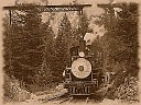
The other day I asked for a steam engine in Bucharest to which I can take a photo and I received the best next thing: a Free photo which I can use, thank you Kevin! So I don't have to go with the plan B (which involved shooting myself a toy train and adding fog/steam myself with GIMP). Now I can proceed to writing a GIMP tutorial about turning a regular photo intro "steampunk photography" effectively photos that would fit my Gears theme proposal for Fedora 10. (note: those photos are intended as additional graphics, not as a default wallpaper, I am not a big fan of photographic wallpapers as default and I can see no way of adding some blue to it, to make it look like Fedora).

Those familiar with my graphic tutorials probably know that I use to address the beginners, showing some techniques as simple as possible (and only pre-built filters), followed by some pointers about advanced usage and also letting it open, with a lot of optional steps and alternative ways, so I will try to do the same this time.

For beginners

So what's more appropriate for a steampunk photo than a steam engine? Nothing... so I got a steam engine photo (thanks again Kevin!) and opened it into GIMP and applied all the basic operations (crop to take out the unneeded parts and focus to the subject, adjusted the colors resized to decrease the file size and sharpened to compensate for the resize) and got it decent looking:

[steam engine]


The I applied the Old Photo filter (Filters > Decor > Old Photo), where I decreased the border size a bit (for my image size the default value was a bit too large). After reading the next steps, decide if you want to let Defocus on (I let it on, as it is the default):

[steam engine] [steam engine]


And instantly we have an old looking photo:

[steam engine]


We can leave it as it, looking old (150 year old?). But what I want is a steampunk image, like we are living in an alternate reality without electronics, and the photo was just taken yesterday with steampunk technology. So I made it more vivid by adjusting the color curves:

[steam engine]

[steam engine]


And the defocus option in applying the filter was a nice touch in making the photo look old, but I want to experiment with taking it into the opposite direction and apply a heavy sharpen:

[steam engine]


For a result I find interesting:

[steam engine]


Now going over the top, add a few coffee stains (Filters > Decor > Coffee Stain) to the photo (accident happens with old photos). The stains are drawn randomly, so try a few times until you get something you like:

[steam engine] [steam engine]


And the final result, which we obtained only with pre-built effects:

[steam engine]


Beyond the basics

Sure, applying the sepia effect automatically was easy, but with manual control we can get something much better (I think), so let's redo that step manually, like pros.

Back to the initial (color) photo. Turn it into black and white (a quick way is to desaturate it - Colors > Desaturate, but you can also use convert to grayscale and then back to RGB).

[steam engine] [steam engine]


The result is as expected, black and white:

[steam engine]


Now select a light brown as foreground (painting) color, add a new layer, fill it with that light brown. Optionally rename the layer "sepia" to help you identify it.

[steam engine] [steam engine]


Add a Layer Mask to the brown layer and leave it white (full opacity):

[steam engine] [steam engine]


Now go to the background (photo) layer, select everything, go back to the sepia layer, select its mask and paste (paste into the mask, not into the image layer). Anchor the selection.

[steam engine] [steam engine]


The result will look funny, but do not get scared:

[steam engine]


Just change the layer mode from "Normal" to "Color":

[steam engine]


And you will have a good looking sepia image (now we can merge the layers):

[steam engine]


If we want a border we can add it using the Fuzzy Border filter (Filters > Decor > Fuzzy Border), just take care to select a good color for it (use the color picker and take a sample from the picture) and a good size:

[steam engine] [steam engine]


And the result is something like this:

[steam engine]


If you want to defocus add a little Gaussian Blur or if you want to go the opposite way just sharpen it:

[steam engine]
[steam engine]


And also you can play with the Color Curves:

[steam engine]


What's next?

I think it would be interesting to experiment with Steampunk Portraits, that is, changing people photos to show like from a steampunk universe, but those are (at leas for me) more difficult: I need props - clothing, accessories, facial hair, etc.