Showing posts with label GIMP. Show all posts

14 February 2017

Valentine's

For the Valentine's Day, a thematic selection from my pictures at the on-going protests in Bucharest (the events are covered more in-depth in my photography blog)

valentine

For the curious, the images are processed with darktable, GIMP and now PhotoCollage.

PS: It looks like a bunch of other Linux geeks were there
linux protest

03 September 2015

How I organize my photos

Not long ago, there was a talk about how people deal with their photos: organize, edit, archive and such, and I gave then a partial answer. Why partial? Because I follow two slightly different processes, one when the photos are made for fun and the other when they are for work. Since that answer was partial and made behind a walled garden, I feel the need to expand it in a public piece. I don't pretend what I do is perfect, actually I recognize some flaws myself, but I got there after years of improvements and is not final.

As a sidenote, I do use a Linux desktop, MATE under Fedora, and almost exclusively Free Software, GIMP, darktable, ImageMagick, UFRaw, G'MIC, but what I do is pretty generic, can be done with various other tools. I may follow with another piece on using these tools.

Fun is fun

organize photos

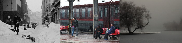
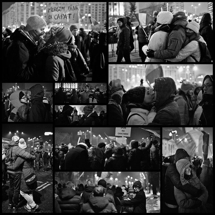
When I talk about pictures made for fun, I mean they are not made for a paying customer, period. This can include anything from photos made for exhibitions, snapshots with the daughter, pictures for my blog, for Wikipedia and whatnot. Usually I take them with an older APS-C DSLR, a Canon 600D, but sometime I bring the FF DSLR. For the most part, I try to protect the better camera, but sometime I am lazy and grab whatever is closer or greedy and want prettier pictures.

The first thing to be noted is that for fun pictures, in the large majority of cases I shoot in JPEG. ...yes, I hear the outrage for such a blasphemy, but the truth is, JPEG is good enough for most of those pics, RAW would be a waste of space and time. When I feel the shoot is important or the light is really difficult, I do use RAW, even for fun pictures.

As a matter of discipline and to keep myself in shape, I try to take pictures as often as possible, ideally every day, and as soon as possible I download the pictures in my computer and then erase the memory cards. The camera has to be ready at any moment to take as much pictures as possible.

I do not use any fancy software to organize the pictures, just the file manager and a directory structure. Of course, it helps that the file manager, with the right plugin, can display thumbnails even for RAWs. The photos made in a day go into a folder with a name like YYYY-MM-DD, for example yesterday pics are in the folder 2015-09-02. Sometime, when I want to find the folder easier, I add a keyword, as there I have a 2015-08-14-seaside

organize photos

As soon as the pictures are downloaded, I try to process them - the next day probably others will come and the newest are always the most exciting. So, I enter the folder and delete some pictures: those which are failed or boring. I still don't delete enough (or still take too many), but I'm getting there, improving continuously (space is cheap, some will say). From the too many undeleted pictures left, I copy a few in a working folder, to be edited and then published. Every year I have a new working folder, and when there are more pictures from a certain event (say, more than 10), they go in a subfolder.

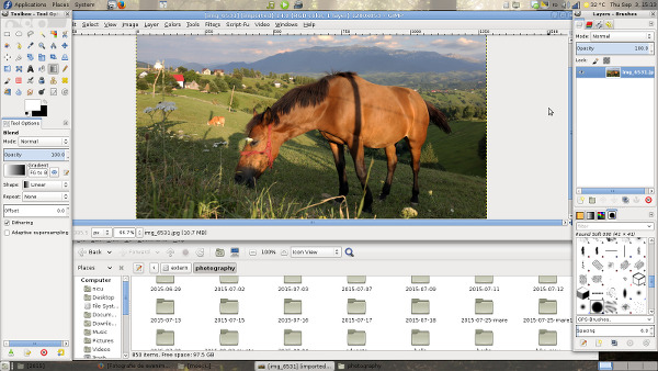
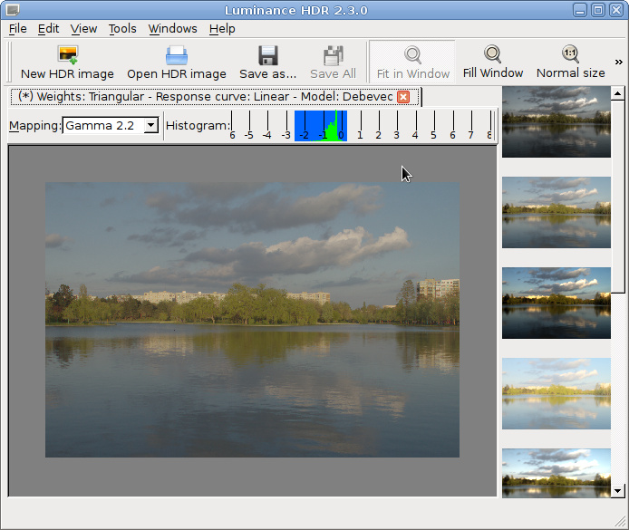
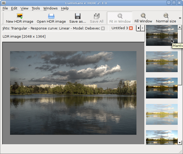
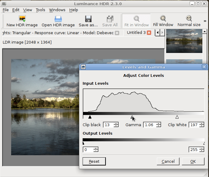
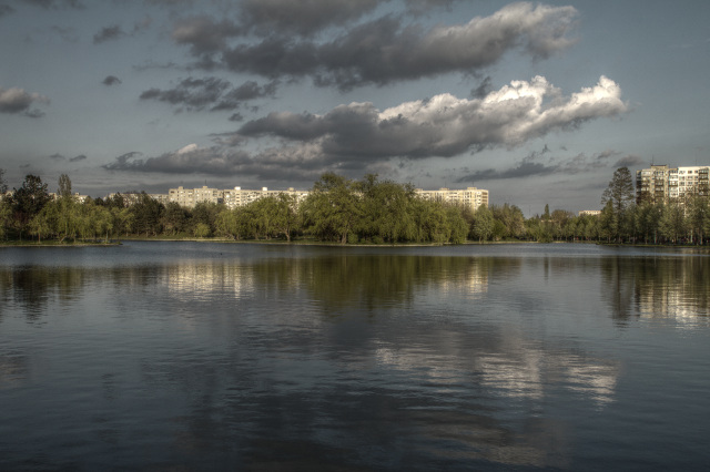
Almost exclusively I edit my 'for fun' pictures with GIMP, this is the editing software I feel the most comfortable with and the one that gives me the most control. There are not many pictures, so I can take my time with them. If there are RAWs, GIMP will call UFRaw for the import, and in the rare cases it is needed, G'MIC will provide some advanced filters. For batch operations like mass-resize or mass-watermarking, there is ImageMagick.

Speaking of watermarks, I almost never do it, but there are are a few exceptions, like the pictures which I suspect have the potential to be 'stolen' by newspapers (it happened a few times, even with watermarked pictures). I firmly believe a watermark will destroy the image, so I try to avoid that.

Again, because next day may come with another pictures, I try to publish my photos as soon as possible. Still, I don't want to spam my viewers, so sometimes there is a delay. For the photography blog, I don't post more than 4 items a day, and for photography sites (the likes of 500px) I post only once in a while. Social media is something I still have to work on: I lost a lot of readers (or at least interactions with readers) a couple of years ago, I blame the loss on posting too much and try to work on it. Publishing go hand in hand with license, so almost everything shoot for fun is published under a CC-BY-SA license: free to use, free to modify, free to almost anything.

Of course, there is archiving. From time to time (not on a schedule, mostly when I run out of space) I move the unedited pictures, with their directory structure, from the computer's hard drive to two external drives, in a manual process. The edited pictures stay on the computer for the entire year, maybe even next year. They have copies online and at least the copy on G+ is high quality (do you know Facebook destroys your pictures with aggressive compression and metadata removal?)

Flaws

As I said before, I recognize some flaws. The most important couple of them:

  • I do not have continuous backup, there is one only when pictures are moved to the external drives. What is currently on the computer is at danger of data loss. Still, they are 'for fun' pictures and I am lazy, so the loss won't be huge, only at most a few weeks of 'for fun' pictures;
  • When I am away for a while, in a trip or vacation, I can't properly process the photos, so when returning home a lot of work will pile-up. For a while I will have to process both old and new images.

Work is serious

organize photos

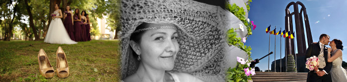
For work, you have to deliver the best result from a technical point of view, so when there is a paying customer I use my full frame DSLR, which happens to be a Canon 6D, a camera recognized for its good low-light performance. As for shooting, the pictures are taken as RAW and JPEG. JPEG is there as a backup, while the RAW is the one to be edited. Here I need 1) to get the most possible from the pictures and 2) deal with low-light situations which happens a lot when doing event photography.

Again, as soon as I get home, I download the pictures from the memory cards. But this time I do not delete the cards, I put them in a closet, to have a backup somewhere until the processing is done. Processing the photos for an event may take up to a few weeks.

I have a different directory hierarchy for the work photos, so I copy there all the files, in a directory named after the specific client or work. If the work was an event, the first thing is to make a quick and small selection (10-20 pictures) which I edit fast and deliver the same day, as a preview. The idea is for the client to have something really fast, and if he wants to post pictures on social media while it's hot, he can post pictures from me, not some crappy phone-made images.

Then I parse the files with the file manager and its native image viewer, deleting only very few, and make a selection with images to be edited and delivered. From this selection I copy all the RAWs in a different, working folder.

organize photos

Considering the large amount of images (for a wedding it can be around 1000 pictures), editing with GIMP would be a poor option, so I use darktable instead. After a few days or weeks, depending of the size of the work, images are exported with darktable at a resolution good for large prints. Then for some images that I think need more advanced editing, I open and process them further with GIMP.

After that, I deliver to the client the images, in two sets: one at big, printable, resolution, and another resized for web use. Of course, there is no watermark in sight, the client paid for the images, they are not to be tainted in any way.

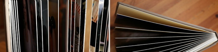
If the job requires it, then I start working on the printed album. Here the work is done with GIMP ...blasphemy I hear again? Why not use Scribus? Simple: the print shop requires sRGB JPEGs, and they do a very nice job with that. When there is to be made an engraving on the album's leather cover, I prepare it with Inkscape and save in a vector format (PDF/EPS).

Only after the printed album was delivered to the client I can consider the job done. Then I move the files (sources, edits, album pages) to the two external drives and erase the memory cards.

Of course, somewhere during this process, when I get the time, a few pictures are added to my online portfolios. I have to advertise myself, right? This time, as the images are made for the client, the license can't be a free one. Sorry for that, I wish clients open to free licenses, I would offer a discount for that.

Flaws

  • Since there is a lot of time from when the pictures are taken and until I get them in the backup system, for a while the memory cards are the backup. I could probably change that and save them faster;
  • I still have a lot of work to do with promotion.

organize photos

22 April 2014

Pseudo-HDR editing

Usually I don't edit much my landscape photos, not because I don't know how but I prefer them this way. Still, recently I felt the need for some more advanced processing for a picture, it enjoyed some success so I decided to share the process. The tools used were UFRaw (in the form of the GIMP plugin), Luminance HDR and, of course, GIMP.

I passed by this scene in the nearby park at the "golden hour" and it looked photogenic, but I wanted to make it more dramatic. One can increase the drama in a landscape photo by using a HDR treatment, but not having the tripod with me (for a proper HDR image you need at least 3 images with exactly the same scene but different exposures) I decided to go for pseudo-HDR. For this, I set the camera recording mode to RAW.

pseudo hdr

Note: the real purpose of a HDR image is to have details both in the shadows and in the highlights, beyond what the camera sensor can record, the improved drama is a side effect.

The RAW image was imported in GIMP via the UFRaw plugin 3 times: with normal, -1 and +1 exposure. If you really want, you can try doing the same starting from a single JPEG an simulate the exposure bracketing with color levels/curves, but I wouldn't advise: if from a RAW you can recover some lost image details, in JPEG they are gone forever.

pseudo hdr

The result is 3 JPEG images, one under-exposed, one exposed properly and the other over-exposed, which are to be combined in a HDR. For more drama, you can bracket with more than one step.

pseudo hdr

I imported the JPEGs to Luminance HDR and set their exposures manually to -1, 0 and +1 (or whatever values you used for RAW development). Then just press "Next" a few times, there is no need to adjust parameters, nor align the images (they were obtained from the same source).

pseudo hdr

Now we have a High Dynamic Range image, which can't be used or viewed as-is on a normal computer display, it has to be converted back to Low Dynamic Range, but optimized for what do we want from it (details in shadows and/or highlights, drama, whatever).

pseudo hdr

Time to pick one of the presets in the right column, one you think is the best for your case.

pseudo hdr

Then I adjusted the color levels a bit (if you prefer, the levels can be adjusted later with GIMP or any other image editing app).

pseudo hdr

Now the image can be exported as a JPEG benefiting from the HDR/pseudo-HDR treatment. You can leave it as-is if you like.

pseudo hdr

However, I opened it again with GIMP for more refinement: sharpening and color curves adjustment, to make the colors warmer. This is my end result.

pseudo hdr

18 March 2014

DPI and photography

There is a good understanding of DPI among hardware geeks (they may boast about how superior is tablet X due to a higher DPI display), still I am surprised to see how many people from the photography world do not understand this (sometime don't want to learn, on the "is technical stuff, I am an artist and not care about technical details") to the point it becomes ridiculous, so I will try to explain it with simple words, in case someone will pay attention.

DPI stands for "Dots Per Inch" and is a characteristic of a hardware device (for example a computer/tablet/phone display). It says how many pixels are in one inch (1 inch = 2.54 cm). Example: the computer I use to write this piece has a 38 cm wide display, which is 38 cm / 2.54 ~= 15 inches. Considering the horizontal resolution is 1600 pixels, then it has a resolution of 1600 pixels / 15 = 106.67 DPI. Of course, the higher the DPI value, the better looking the image will be on your display, as it will enable to to see finer details.

dpi screen
In digital photography the situation is different: your photo is a file and it can be put on a wide range of displays. The DPI value is not as important as the actual image resolution in pixels, it is actually metadata. Actually the correct term when talking about photos is PPI, standing for "Points Per Inch", but PPI and DPI are close enough, is not a huge problem if you interchange them. PPI is relevant when you print the image, is the density of color points to be printed by a inch. The math is similar and having a target print size and print image quality (PPI), it will help determine the needed pixel resolution. Example: you want to print a 15 x 10 cm image at good quality (300 PPI). On the horizontal 15 cm / 2.54 = 5.9 inch, then 5.9 inch * 300 PPI = 1770 pixels. On the vertical, 10 cm / 2.54 = 3.96 inch, then 3.95 inch * 300 PPI = 1182 pixels. In conclusion, you will need a 1770 x 1182 pixels image. 1800 x 1200 is close enough and easy to remember, so a 1800 x 1200 image will print at good quality at 15 x 10 cm.
dpi print
JPEG is the file format we use day to day to exchange photos and it has the ability to store a DPI value somewhere inside its metadata, but is only metadata: an indication at which size (in cm or inches) to print the file. But you can print the same file at any dimension or any DPI/PPI value (of course, with the respective image quality consequence). Changing this value won't modify in any way the look and work of your digital file.

Now, what is a good DPI value for your print? This depends on its intended use, of course :) A 300 DPI is considered good enough for a quality print, like those in the glossy magazines, where you look closely and expect to see fine details. When printing a poster which will be seen from a couple of meters, you can lower the DPI value at 100 and for a billboard to be seen from tens of meters, you can go way lower: it does not mater the printed points are huge when looking closely, nobody will do that.

Now another practical example to illustrate the ridiculous part and how to deal with it. For a recent photo exhibition (it is still on display), the requirements were "100x66 cm at 240 DPI". This is ridiculous: 100 cm / 2.54 = 39.4 inch, 39.4 inch * 240 DPI = 9456 pixels and 66 cm / 2.54 = 26 inch, 26 inch * 240 DPI = 6240 pixels, so to satisfy it you need a 9456 x 6240 photo, which means 9456 * 6240 = 59005440 - you need a 60 Megapixel camera to produce it. Nobody in the target group for that expo has access to such a camera. What to do?

Knowing the people, I can safely say most of them just ignored a requirement they don't understand, and even if they understand can't follow. Still, some tried their best and this is the right thing to do, consider other exhibitions have sane requirements you can, and then should, follow, like the one asking for 1400 x 933 at 96 DPI.

The most obvious thing to do is to resize your image to achieve the needed resolution in both pixels and DPI (GIMP example below). This is sensible thing to do when you scale down the image, as in the 15 x 10 cm case, (reduce the pixel resolution count) and you can optimize interpolation method and post process your image. However, when it would need to scale up, as in the 100 x 66 cm case, is not only a waste of resources and time, extrapolation will lower the image quality so the result will be worse than printed at a low DPI value.
dpi print
What I do in such cases (and I got my images accepted in quite a few exhibitions) is to give the image at the largest pixel resolution I have available and then set the metadata DPI value for the desired target in centimeters, even if lower than the requirement. Is going to be the best print I can anyway.
dpi print
Most of the photos you will encounter have a value of 72 DPI, this is because that is the value assigned by default by the camera for historical reasons: it was the common resolution for computer displays when digital cameras were introduced to the market, at the time we used 14"-15" CRT monitors. I am not sure I can change it inside my Canon, but it does not matter: most of my photos are to be shown on a computer display and I can change the value (as shown above) when editing for a special print.

Of course, as I told above is specific to photography. For illustration/vector graphics is a different matter, we may talk about at another time if there will be enough interest.

27 January 2014

Nightmare wallpapers

A fan of my photos keep asking for large resolution versions of various pics (I usually put online web-optimized stuff) so I cave in, that's the explanation for me having often posts like this.
The images below are pretty-much made in camera (they were edited with GIMP only for crop, resize, BW conversion and color curves adjustment). The motion blur is created in-camera, with the following recipe (which you can learn looking at EXIF data): put a somewhat long exposure time, 1/10-1/15 of a second, start moving the camera and then press the shutter. The first and the last are made moving the camera on the vertical axis and the second by rotating the camera and zooming at the same time - pretty easy but you will need a bit of exercise to achieve a smooth movement.

nightmare wallpaper
nightmare wallpaper
nightmare wallpaper

29 December 2013

Anaglyph

Disclaimer: to properly read the following article, you need to have a pair of red-cyan 3D glasses, otherwise the images won't display as intended. The cheapest one should do it, perhaps even home made. Lacking such glasses, you can generate your own 3D images for different types of glasses.

A few weeks ago I stumbled upon an old article about how James Cameron is/was remaking Titanic in 3D and somewhere in the technical explanation it was mentioned you can do 2D to 3D conversion with Free Software tools, namely the G'MIC plugin for GIMP.

In the late '90ies I received a computer magazine which came with a pair of paper 3D glasses and a CD containing the usual software demos AND a few 3D pictures, it was my first contact with anaglyphs. I still have the glasses, but I use them maybe once every few years, when I remember to search some such images.

Along the time I learned how to properly make such images: two cameras, filters, combine the two images in one. Way too much effort for me. It looks like way too much effort even for some commercial filmmakers...

When I saw the Titanic article, I said to myself 'what the heck, let give G'MIC a try'. AFAIK it is not available in any official Fedora repo, but you can download a binary from the upstream, drop it in the proper folder and go with it. It will survive even a distro update/reinstall. Not a big fan of the 'application inside another application' approach of G'MIC, nor of its duplication of existing GIMP features, that's why didn't have it already installed, but playing is fun.

anaglyph

I don't have the time and patience to learn how to fine-tune the parameters (with hand crafted depth maps you should be able to reach high quality results), nor do I plan to return to anaglyphs any time soon, so I used pretty much the automatic settings. Below are a few pictures I think came decently with no fiddling and automatic settings:
anaglyph

anaglyph

anaglyph

anaglyph

anaglyph

anaglyph

anaglyph

09 October 2013

On stock images

As a business, when you are in need for some pictures, the cost effective solution is to use stock image services, that's definitely less expensive than custom work, you won't get something exclusive but chances are it will be good enough and cheap beats all (of course, I didn't consider the too often encountered case of scumbags simply picking images from the internet and when questioned answering "it was on Google, is free").

Having some recent photos that may fit the bill, I uploaded one of them on a stock images website as an experiment. For the experiment purpose, I also uploaded an illustration (nothing spectacular, just a collage from my already free clipart images). A first finding was a confirmation of what I already knew: while saturated with photos, they are more actively looking for illustrations. Uploaded at the same time, the illustration is already live on the site, while the photo still have an estimated 120 hours until review by an editor.

But my point here is not about photos versus illustrations, is about what they do with your images. The procedure for an illustration is to upload a JPEG preview and after approval you can add another format, AI, PNG, CDR or EPS (yes, you read it correctly, PNG is in there). Since I use Inkscape, my sources are in SVG and some features can't be exported in their supported formats, so I had to go with PNG. Still no major problem. But look at the image below, is a capture from their website:

stock images

Allow me a moment to explain: I uploaded at first a 2480x3508px JPEG and later a 2480x3508px PNG. While I am not sure all those resolutions are generated from the JPEG or PNG, I am sure about the image size. So the "premium" TIFF version, costing 50% more than the next one is just an upscale version (from 2480x3508px to 3507x4961px) of a raster image! Wasted money! There is also a "maximum" option, with a slightly higher price over my original size, which is an odd upscale (from 2480x3508px to 2912x4119px) of the raster original.
I think this is an useful hint for the potential buyers: on stock image services, maximum price or maximum resolution may not mean maximum quality.

30 September 2013

G+ and RAW photos from the eyes of a FOSS photographer

I use GIMP for almost all my photography editing by choice, so when reading today a couple of articles about the new RAW photo editing capabilities in Google Plus and how those put Google in a fight with Adobe, as its only worthy competitor, I noticed in both a similar (your probably know how those articles are usually written) expression, along the lines of "don't mention GIMP, while nice it doesn't count". I knew about the RAW import for a few days, but it was not news for me, I don't plan to move my photography storage and editing to the cloud, but now the GIMP comparison made me genuinely curious what is it about.

So away we go! I have handy some RAWs from a recent shooting, it was a matter of uploading one and doing a few clicks, right? Not so fast! The first try, the first FAIL: while the RAW image uploaded properly and it was shown correctly as a JPEG in browser, editing does not work with Firefox, Chrome is needed.

google plus raw photos
Normally at this step I would give up, I won't change browsers any time soon, but it caught me in the proper mood for that, so I downloaded Chromium. No luck either, this time for an undisclosed reason. No luck with Chrome either. It should be because I am running Linux or they don't like my video driver (according to the troubleshooting page on G+). Clearly, they don't want me as a user.
google plus raw photos
I was so close to call it a failure and make a funny gesture towards Google... but I was already mounted, gave it another try, this time with Chrome under Windows, fully proprietary. Of course it worked. I can write a bit more than two paragraphs cursing Google for their useless effort.

At the first look, it is a simple interface: next to your picture there are some buttons for various adjustment operations, grouped in two categories "basic" and "Creative" (as you will see later, "Creative" is just a feel-good name, there is little creativity in applying a series of predefined filters).
google plus raw photos

In the "basic" area are some tools which are a must for any image to be published: tune image is doing exposure/color adjustments, details is for sharpening and crop & rotate to correct image framing. Everything with an easy to use interface.
google plus raw photos
Still under the "basic" category, there is a not so basic feature: selective adjust. I found it cute and original (still, no match for selective adjustment from a proper image editing software), you drop adjustments points in the image and tune it around them.
google plus raw photos
In the "creative" category a first tool is black and white conversion (in my opinion, also the single really useful from the category). It is simple still powerful, allowing to adjust the conversion based on specific colors and fine-tune it.
google plus raw photos
If about "drama" and "center focus" I am quite neutral (I can see how they may be useful for some, but with a lot of fine-tuning to prevent excess), starting with "frames" I heard a shout in my head "Instagram!". We are on the edge of the bad taste realm. Use everything with extra-care.
google plus raw photos
"Tilt-shift" is again some cute toy you use on your pictures and pretend it was made with a dedicated lens. The interface is simple and effective, the final result not so much.
google plus raw photos
"Vintage" and "retrolux" will damage your picture, but they are the wet dream of the ordinary Instagram user, will make the image hip, damaged but hip. Do not use.
google plus raw photos

As a conclusion, I can say this is no threat to Photoshop and will not replace it ever, is no treat to GIMP either, even it will be more used than probably any of them, is a tool with a different purpose, for a different audience. It may be some competition for tools like Lightroom and Darktable, when they are used for simple "RAW development", but only for simple use cases (no perspective correction? no noise removal? indeed, simple cases). Talking about real competition, it is real competition for Instagram/Facebook, but this probably makes for less sensationalist titles.
I will end my conclusion with a RAW image, first in its initial unedited state and with what I consider good and bad editing.
google plus raw photos

19 August 2013

How NOT to organize a FOSS workshop

This "Open Source" organization did a lot of cool projects along the time, I participated myself in a few and reported positively about them, one such project was a summer program with many workshops (mostly about development) at a local university. So I gladly accepted when I was invited as a guest at the 'graphics design and editing' workshop, which as the title says, it didn't went that smooth...

An emblematic moment was at the workshop's first day start, as part of the warming up, everyone introduced himself and students told why are they there. For the biggest largest group, this reason was "I want to learn Photoshop." At a GIMP workshop.

The trainers, designers with some years of experience, they don't use GIMP or Inkscape, the apps they were to teach, and didn't do it at all in the last few years (they had to research particularities the night before each class). He may hate me for replaying this but one of them told me "I didn't use GIMP from 5 years ago, when I discovered the features Photoshop". So imagine the amazement when I showed any advanced feature introduced in the last two release.

Also, the only mention of the "Open Source" term ("Free Software" would be waaaay too much) was in the day 4 (due to a busy schedule I was able to attend only day 1, 3 and 4) in the form of "so, see, to do such things you can use Open Source software, without paying for expensive apps".

Conclusion? if you want to organize a workshop, then is a bad idea to have both the students and trainers wanting to learn/teach something else than the declared topic and they are forced to stick to that topic. How to do it right? Make it clear what and why, be both alternative and pragmatic at the same time.

Still, there were positive things: the trainers were enthusiastic and really trying to make the students learn something and have fun and I can witness the students having a lot of fun time. Still, from a FOSS point of view (remember, it was a FOSS organization and a summer "Open Source" program) it was a failure: my guesstimate is ZERO of the students kept using the apps learned at the workshop.

13 August 2013

Editing for photowalks

I know Scot Kelby is a well known Photoshop writer trainer and and also evangelist, but he is also a well known photographer and photography writer (Wikipedia says for 2010-2012 he was the #1 best selling photography writer) and the organizer of the popular Worldwide Photo Walk, so I was surprised, but not shocked, when registering to this year's photowalk I saw this question in the registering form:

photowalk no gimp
I answered "None of the above" when asked which software I use to edit photos, as I use mainly GIMP and there is nothing close to it (only Photoshops, iStuff, bundled stuff and online stuff are available choices) as there is no one of the any other FOSS options (darktable, DigiKam, to name a couple). Still, no need to get paranoid, there aren't listed none of the many (and crappy) smaller proprietary editing tools, even if they are used by a lot of people.
I know some of the people participating in the Bucharest photowalk and most of them are in the "None of the above" category (still, they are neither in the "FOSS" category).

06 August 2013

How to become a graphic designer

I graduated University with a diploma in mechanical engineering, after that I switched the field and worked most of the time as a computer engineer, that was my day job. Graphic design was something I did in my spare time and was something I learned by myself, by reading, experimenting, being a part on FOSS projects and so on. And I had a few successes, all while using almost exclusively FOSS software.

Now when I find myself as a freelancer, it made sense to complete my professional background by receiving certification as a graphic designer. How to do that? By taking a recognized professional training for adults. Following is the experience of a FOSS guy going trough a traditional graphic design training.

Honestly, I didn't expect much from such a training, I have some years of experience in the field and I know how to read books, it was important to get an official diploma and the price to be affordable. Looking around, I found a training center fitting my criteria, I won't name it, since I am not in the business of doing advertising, neither positive, not negative.

This training center actually has two graphic design courses, both of them consisting of Adobe Photoshop and Corel Draw, it is quite specific, you rarely learn general principles, but how to use those two specific apps. Why Corel? I talked before a few times about it, won't get into details: the graphic design market in Romania is stuck into a vicious circle: everybody is using Corel Draw because everybody else is using it, while all of them acknowledging is not the best tool. The first course is “basics” and the second is “advanced”, but after any of them one will get exactly the same diploma, with a different annex. My choice is simple: for the advanced course I was unable to answer such questions like “what is the shortcut for operation X in Photoshop” (because I have not used it and have no intention to use it forward), so unlikely to pass the initial test. I went to the basic course. After all, the diploma is the same.

The actual training center  have some ancient desktops, all of them running Windows XP and quite old versions of the required software, for Photoshop it was CS3, while for Corel it was X3, unfortunately, I didn't take the time to investigate their licenses. All I can say, in the very first class the trainer said “do not ask me where you can buy the needed software at home, you are by yourself with this”, however it was expected we will have home newer versions and we were instructed to save backward compatible files. I suspect at least one of my classmates got her home computer infested with a virus from not knowing much about torrenting.

The basic course is 6 weeks long with 2 classes a week, for a total of 12 classes, which are split 8 classes for Photoshop and 4 classes for Corel and a lot of home works. For the final exam, you'll have do build a portfolio with various works, some of them part of the home works, some in addition to them. The class consisted in lecture, where you were expected to take notes (I personally didn't and managed just fine) since there was no useful printed support and practical applications under the trainer's supervision, together with the home works analysis. At its end you are expected to acquire a basic portfolio, which can be used for employment.

As I understand, the advanced course if a bit shorter, only 5 weeks long and more portfolio-oriented, at its end you will have to create a full identity manual for a [fictive] company, going trough many  steps, from logo to website mockup to flyer and more.

Back to the basic course, the Photoshop part covered most of its toolbar and and half of the menu, just before filters, I wonder if the filters are “advanced knowledge” for the second course. Anyway, I took issue with some of the transmitted knowledge, like black and white conversion for images being best made with gradient map (no, is better to use color channels and tune the final result) or the PNG image format being created by Macromedia (no, it was created by W3C), but I tried not to be a problem-student and kept my interventions to a minimum.

The vector graphics part in Corel was expedited faster, as you are supposed to use it for simple graphics. Still, the final project was to be made with it. It was interesting to see most of the students, while at the start being more interested in Photoshop, having more fun with vector graphics. That pretty much replicates my experience with combined GIMP/Inkscape workshops.

The trainer is a nice person but limited by the curriculum, she is one of the person transmitting the information, not the one who assembled it. She honestly recommended me to take the second course, where I may find some things to learn. Still, when she asked which graphic apps I used before and my reply was “Gimp and Inkscape” I got the expected “never heard of those”. For a few of the Corel home works I presented the required Corel-made version and how it can be if Corel supported some basic features I take for granted with Inkscape.

As said above, for the final exam I had to create a number of works:
  • 5 photomanips (change colors, switch heads and such), which I made with GIMP and exported as .PSD;
  • 2 original ads and a remake of an existing ad, here I did most of the work also with GIMP, exported as .PSD and imported in Photoshop for final touches and ensuring the file is rendered correctly (sometime it isn't);
  • 2 book covers (yes, this was to be made as raster, not vector graphics), for which I prepared all the needed elements with GIMP and Inkscape and assembled the final work in Photoshop, I had to do this way since the final result had to be a CMYK .PSD file;
  • a clipart image, which I made it with Inkscape, imported into Corel, corrected some import problems and exported as .CDR;
  • 1 original logo and 2 remakes of existing logos, again I made them with Inkscape and converted the SVG to .CDR from inside Corel;
  • a business card based on the original logo above, really quick task done with Corel in a couple of minutes;
  • a flyer, for which I had to use Corel from the ground-up, it was too complex to clean-up an eventual SVG import and the result was to be a CMYK .CDR. Still, it had to include some photos previously prepared with GIMP and the logo, originating with Inkscape;
  • the final project was to be a small, 6 pages, magazine also in .CDR format. Again, assembled with Corel but including a lot of images originating in GIMP.

The final exam was simple: a theoretical test and the portfolio review. The theory part was, as expected, simple: a quiz with  18 stupid questions, where you were expected to memorize useless (for me) things, like “what is the Photoshop operation to copy a selection into a new layer” or “for which Photoshop tools can be applied a feathered edge” or “which is a correct list of  node types in Corel” or “which is a correct list of operations you can to with the pick tool in Corel”. Still, easy to get 10 from 10 points if you didn't sleep trough the entire course. Reviewing the portfolio was a bit more frustrating, it felt more like they numbered the works, not looking at the amount of skill backing them. An accessible slam dunk.

In conclusion: was it worth it? I think so: I got my diploma, I had the opportunity to see how the competition if faring (last time touched Photoshop more than 10 years ago) and also to see how a recognized graphic design training is structured. And definitely was and incentive to put my lazy ass to work and create some stuff. Would I take the advanced course? No, if I have to pay for it. Now I have on my TODO to think more about how the marked would receive a training course based of FOSS tools.