Mixed stuff: fonts, photos, games, anniversaries
When is a good time to use the "Impact" font? How about... never!
Last week a friend of mine put on sale some stuff on an auction website (kind of local ebay, this is his the main activity of his small business) and when creating the page he had to choose a few style elements, the font being one of them.
He selected the Impact font, thinking that such a name probably stands for a font that will catch attention from the readers. But being a Linux user, without the Microsoft Core Fonts installed (Impact is part of MS Core Fonts), he didn't saw how the font really looks, all he saw was a harmless san-serif fall-back option. And made it red, no less.
Only after I showed him a screenshot of the site in action he understood and changed it to something sane. Look below at a sample "lorem ipsum" text to see how unreadable it was:
![[impact]](http://nicubunu.ro/pictures/impact.png)
With this still fresh in my mind, one can understand my probably exaggerated reaction when I saw Impact used on a Fedora related proof of concept website and complained about it.
From here I can draw a couple of conclusions:
- Who named the font Impact had an effective idea, even the fonts is hard to read beyond very short labels (probably it can be used on buttons), a lor of users fall for its name
- It is not a good idea to use such "fancy" on websites intended for a large audience, even less when your audience is mostly Linux users: there is a huge chance they will not have the font installed and don't see the page as intended. Stay with the basics, they are nice enough
Upskirt
This is an interesting reason to use the bus to go from work to home (Bucharest, the 300 bus line):

The photo is not that great, being made with my 2.5 years old phone (I didn't had the guts to reach my backpack and take out the SLR with really big lenses), but think it was taken wile standing and with the phone at the height where you are normally using it for writing text (and imagine what could I do with just a bit of effort).
Walking guy
A couple of days ago I posted a small animation (made with Inkscape and GIMP) of a little guy walking. I am not completely happy with the result (and I still have a lot of other graphics to do for that project), I added the other walk directions:
 | ||
 |  |  |
 |
Birthday
Tomorrow, 12 July, is an important birthday. I am really sorry I will not give any gift. I didn't forgot. And I have god ideas, good enough (I think) to top last year's gift. It is only a delivery problem.
PS: It is not my fault if someone has not updated the feed address and carry posts that are not announcements in the Romanian language and has to endure what is perceived as offtopic crap :p
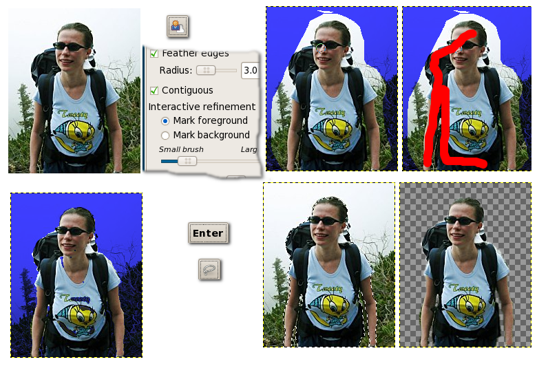
![[selection]](http://howto.nicubunu.ro/gimp_plugins/synth_remove_select.jpg)
![[plugin]](http://howto.nicubunu.ro/gimp_plugins/synth_remove_plugin.jpg)
![[progress]](http://howto.nicubunu.ro/gimp_plugins/synth_remove_progress.jpg)
![[done]](http://howto.nicubunu.ro/gimp_plugins/synth_remove_done.jpg)
![[wtf]](http://howto.nicubunu.ro/gimp_plugins/synth_remove_wtf.jpg)
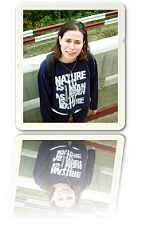
![[photo]](http://howto.nicubunu.ro/gimp_polaroid_photo/polaroid.png)
![[photo]](http://howto.nicubunu.ro/gimp_polaroid_photo/polaroid1.png)
 Romanian translation
![[gimp]](http://nicubunu.ro/pictures/button_gimp_01.png)
![[flash upload forms]](http://nicubunu.ro/pictures/video_upload_forms.png) But now to the ugly part: those sites are defective by design, they have the upload forms made with Flash (the upload pages, like other parts of the site are identical to the last word with each other, from what I understand
But now to the ugly part: those sites are defective by design, they have the upload forms made with Flash (the upload pages, like other parts of the site are identical to the last word with each other, from what I understand 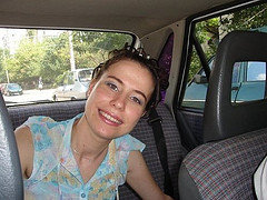

![[en]](http://nicubunu.ro/gfx/flags/en.png) my own site
my own site![[GDM]](http://fedora.nicubunu.ro/gdm/transparent_gdm_thumb.png) A couple of days ago I was playing with my own variations of
A couple of days ago I was playing with my own variations of 
 With fast release cycles (about two releases a year)

![[stamps]](http://howto.nicubunu.ro/inkscape_postage_stamps/stamps.png)

![[buttons]](http://dioanad.info/ghiduri/butoane_web_inkscape/buttons_splash.png)


![[moonshine maker]](http://nicubunu.ro/pictures/moonshine_maker.png)
 A bit more info about the Romanian Tuica:
