Fedora Visual Identity
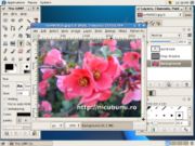
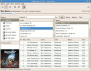
 In the last few days I uploaded a number of screenshots to http://wiki.lug.ro/, mostly in the desktop area: graphics, office, multimedia, games. A lot of work is still to be done, but this process made me to have a clearer picture about the visual identity of Fedora.
I use a configuration pretty close to the default: for windows the Clearlooks theme and for icons Bluecurve/Echo/Mist, which in result is something very close to the upstream GNOME default. This in opposition to Ubuntu screenshots, which clearly stand apart by their look (which I don't like, but this is not the point). When a reader see a screenshot made with Ubuntu, he can recognize on the spot: Ubuntu, GNOME, Linux. In the case of a screenshot made with Fedora what else can be recognized except GNOME? Not much else. I guess this is part of the explanation why almost half (number pulled straight out of my ass) of the Linux screenshots found on the web are brown.
This is true at leas for me: having a more personal look of Fedora by default would motivate me more in publishing screenshots in such places as Wikipedia, is addition to my blog or my tutorials.
What a more personal look could be? It may be something little, like a specific shade of blue, a small change to the window decorations, a small tweak to the icon theme.


No comments:
Post a Comment