Drawing a rocket with Inkscape is not rocket science
Many places I go I meet people telling how much they liked graphic tutorials and how much they learned about using GIMP and Inkscape following theb, and this makes me feel bad, as I am quite busy lately with a lot of things (video and photography ate a lot of my time) and rarely manage to write something new. But here is a perfect opportunity, Fedora 13 entered Alpha and had a code name (Goddard) and so far a visual theme based on rocketry, so it seems a tutorial titled "Drawing a rocket with Inkscape is not rocket science" would be just fit.
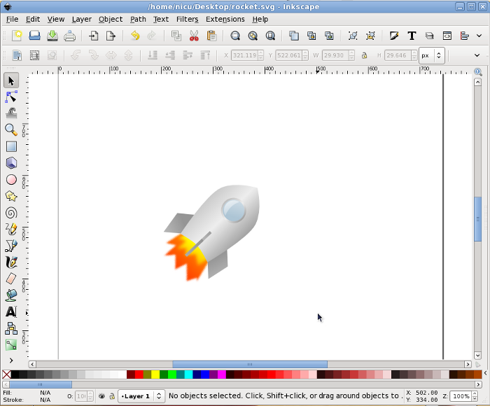
The target here is to produce something like this, not extremely realistic but easily recognizable as a rocket and the most important, fun (hopefully) and easy to create by someone who is using Inkscape for the first time.

So start Inkscape and draw a rectangle, which must be more tall than wide (we are drawing a rocket!) and have straight, not rounded corners.
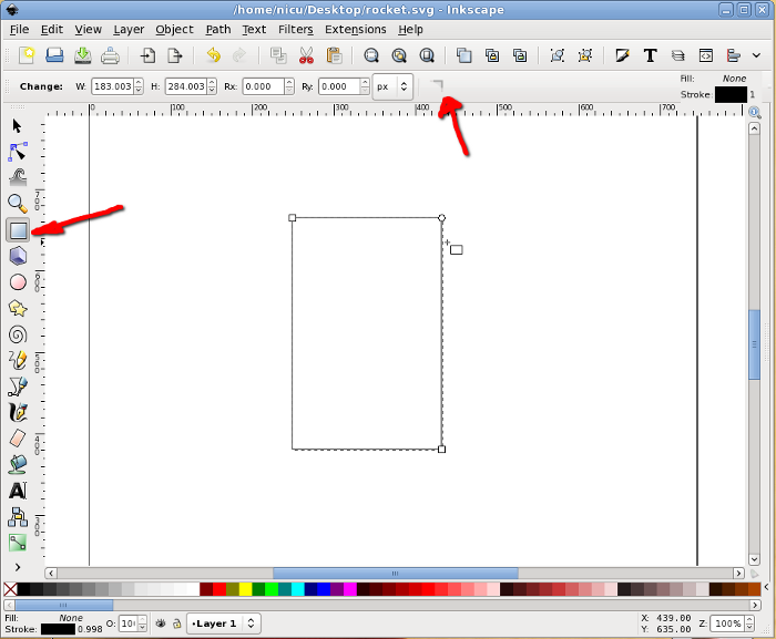
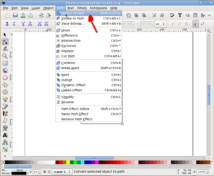
Then select it and convert to path, we will do node editing.
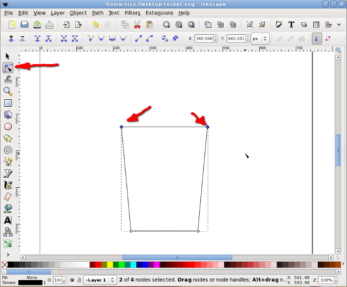
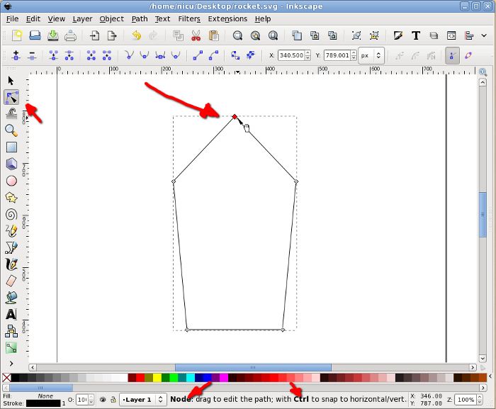
Now go in node editor and select the two top nodes. The following operation can be done (as far as I know) only from keyboard: press Ctrl + Alt + > to enlarge the segment, the result should be a trapezium with the big side up.
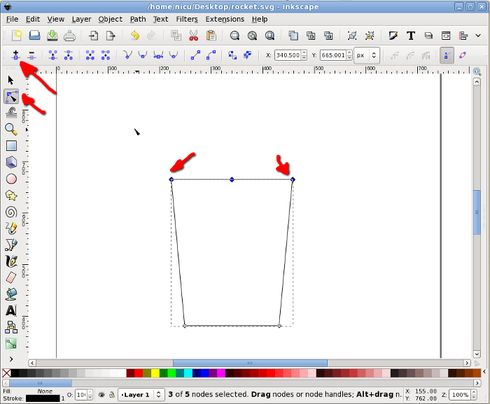
With the same two top nodes selected, add a new node in the middle of their segment.
Select the new node (only it) and move it up (keep the Ctrl key pressed to limit the movement to vertical only).
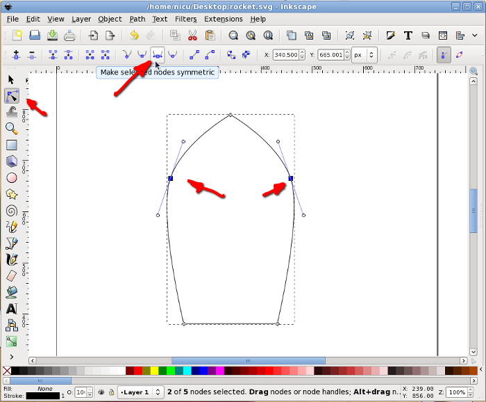
Select back the two nodes that were the top corners of the rectangle and make them symmetric, for a shape starting to look like a bullet/rocket.
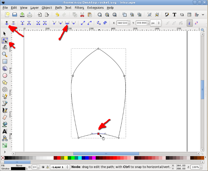
To finish the bullet shape of the rocket body we need to make the bottom edge rounded: select the two bottom corners, add a new node in the middle, select it, move a bit up and made it symmetric, now we have a bullet, an aerodynamic shape.
A rocket needs some "wings", so we will create another rectangle, this time much smaller.
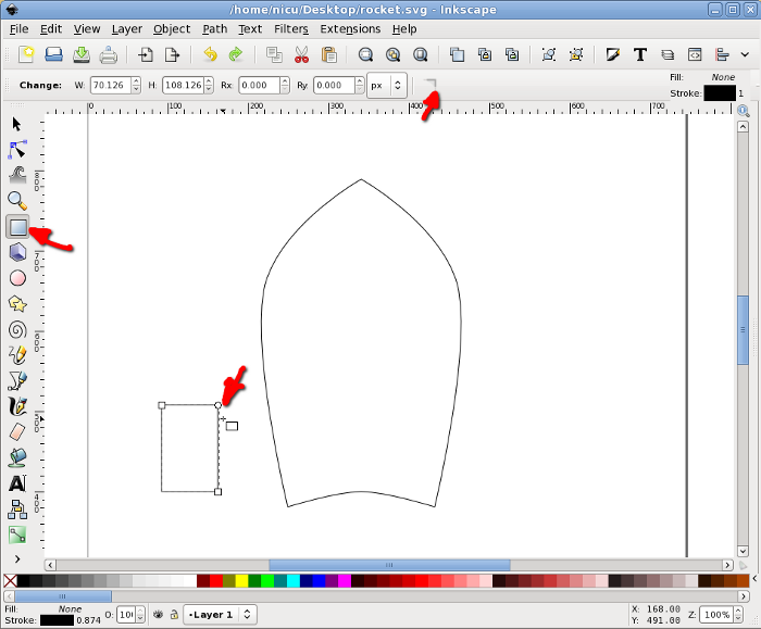
Select the rectangle and click on it once, this will put in in rotate/skew mode so we need to skew it a bit my dragging on the arrow on one of its edges.
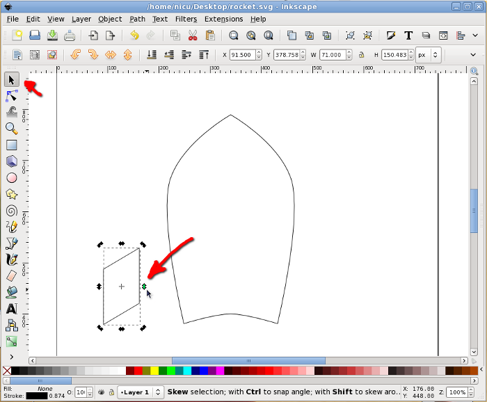
Move it in position, next to the rocket body.
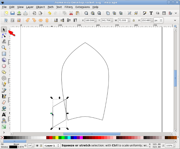
Again, in rotate/skew mode, rotate it a bit by dragging one of the arrows at the corners, until we like the alignment. Note: no worry if the alignment is not perfect, lower it under the body and when filled with color this won't be noticeable.
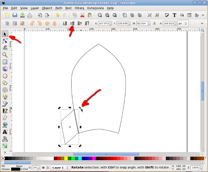
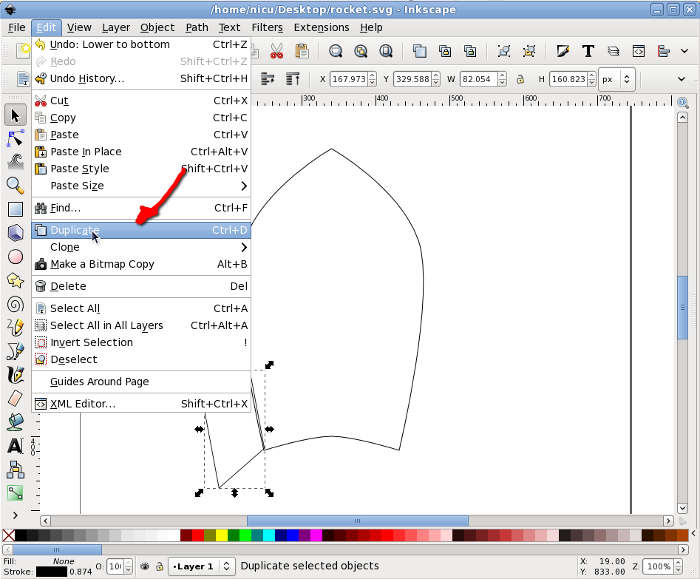
Select the wing and duplicate it.
Flip the new (duplicate) wing horizontally and move it to the other side of the rocket body (keep Ctrl pressed to limit the movement to horizontal).
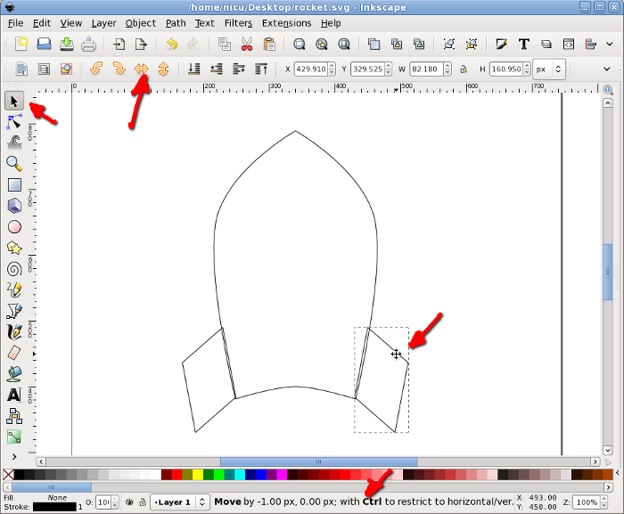
The wing facing us is another thin rectangle, with the same height as the other wings (technically, we should have two rectangles, one for each edge, but for now use one for simplicity). To center the new wing to the rocket body, select it and the body, then use the Align and Distribute dialog to align them horizontally relative to the biggest item (the body).
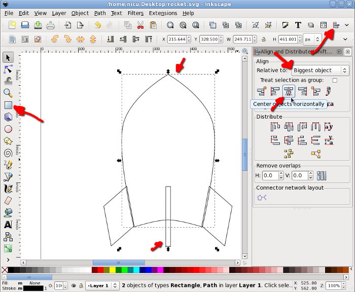
Now you know what is needed for a funny rocket? A window, so the astronauts inside can look at the space. Start by drawing a circle, which will be the windows frame (I think I am boring repeating this, but keep Ctrl pressed, so what you draw is a round circle not an ellipse).
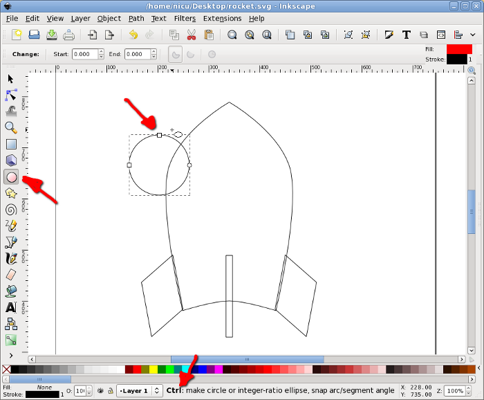
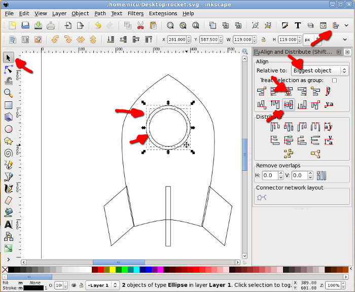
Select the circle and the rocket body and align vertically to the center of the body.
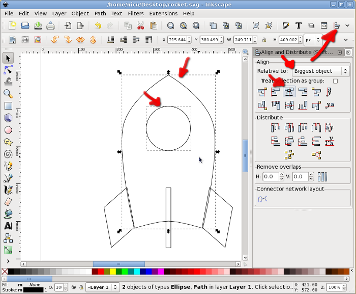
Another smaller circle will be the real window.
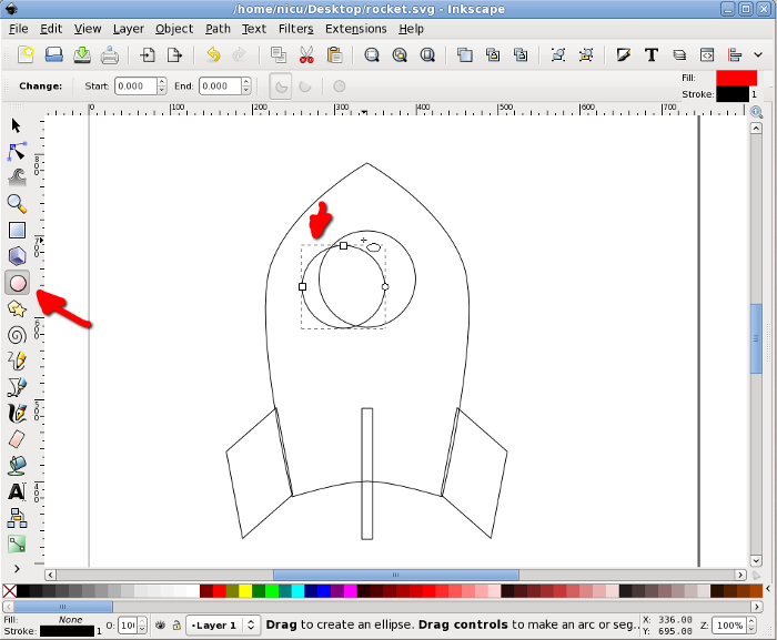
Select the two circles and align them horizontally and vertically.
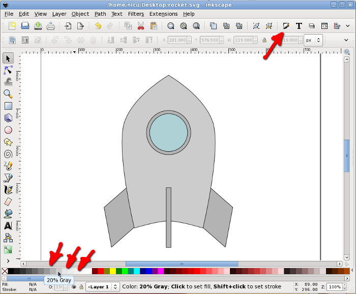
Now color the items, using either the color palette at the bottom, the Fill and Stroke button in the toolbar or any of the other possible ways (there are quite a few). A rocket is usually silverish, so use shades of gray.
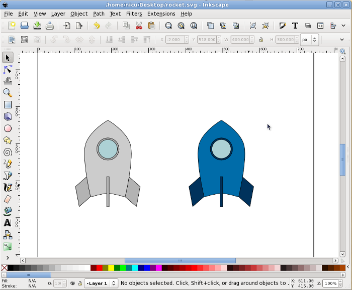
If you want the rocket less realistic but screaming "Fedora", make those grays a bit bluish or go the extra mile and straightly use the Fedora colors (light and dark blue).
Back to our rocket, let's make it fly. Take the Bezier tool (pen) and draw freely a few spikes, they will be the flame.
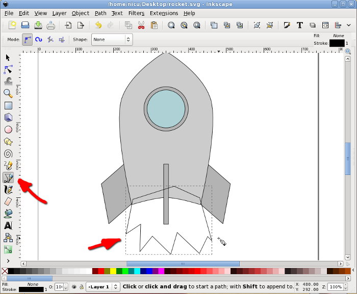
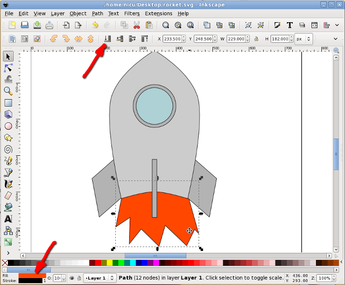
Color the flame red or a redish orange and lower it under the rocket body.
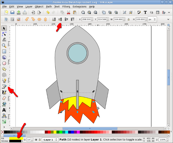
The core of the flame is supposed to be warmer, so let's draw a new set of smaller spikes in yellow.
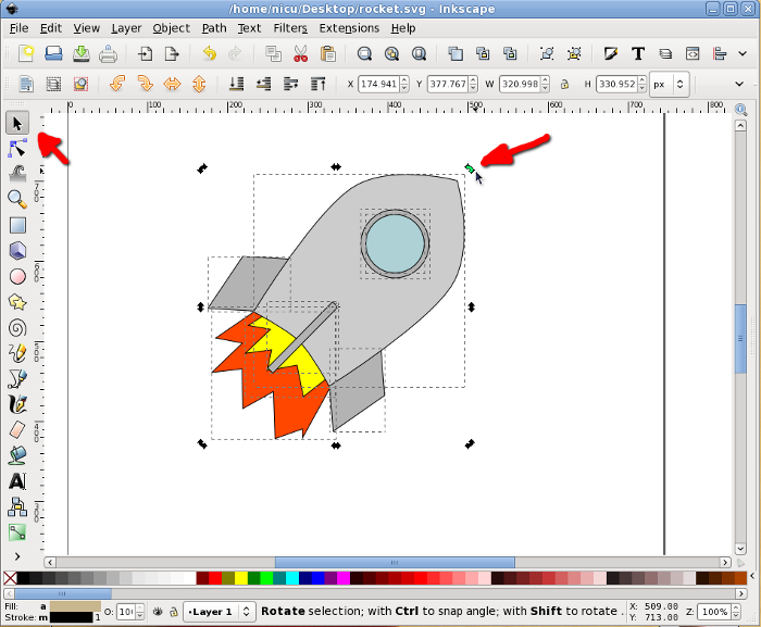
Optionally, if we want the rocket cruising, not just taking-off, select everything and rotate a bit.
A bit of beautification never hurt, so let's make the rocket a bit more realistic (if you can call that "realistic") and less cartoon. Remove the strokes (for example using the Fill and Stroke dialog) and use silver gradients for all metallic surfaces, do this by using the Gradient tool, dragging and editing colors.
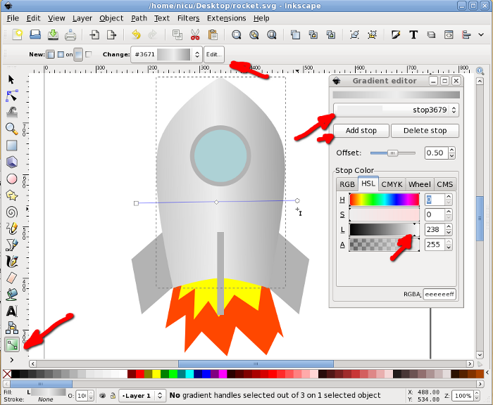
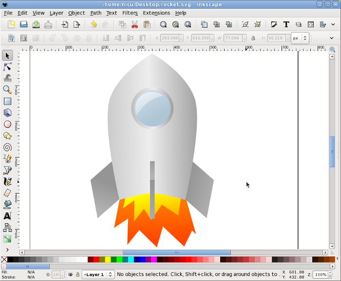
Fill everything with gradients, including the flames and the window.
Select the inner (yellow) flame and using the Fill and Stroke dialog Blur it a bit for a more realistic (and prettier) look.
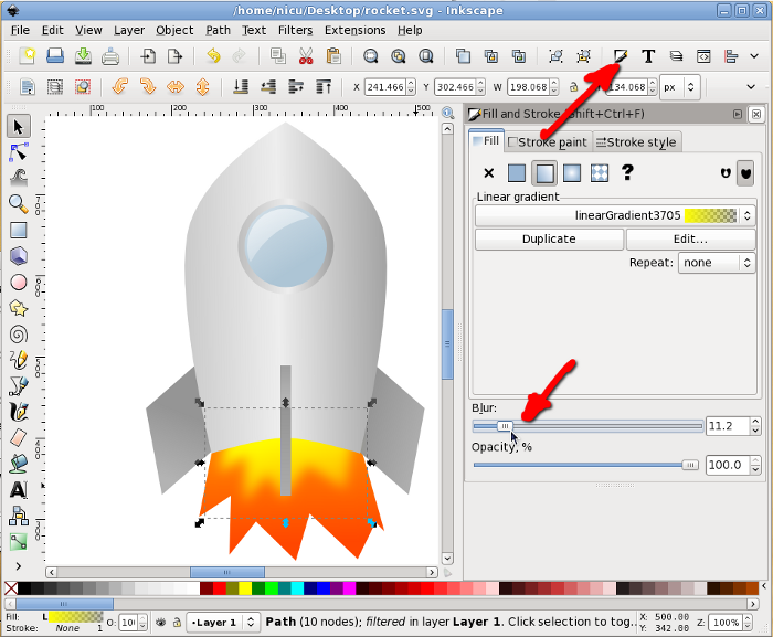
Blur also the outer (red/orange) flame. And that's about all.
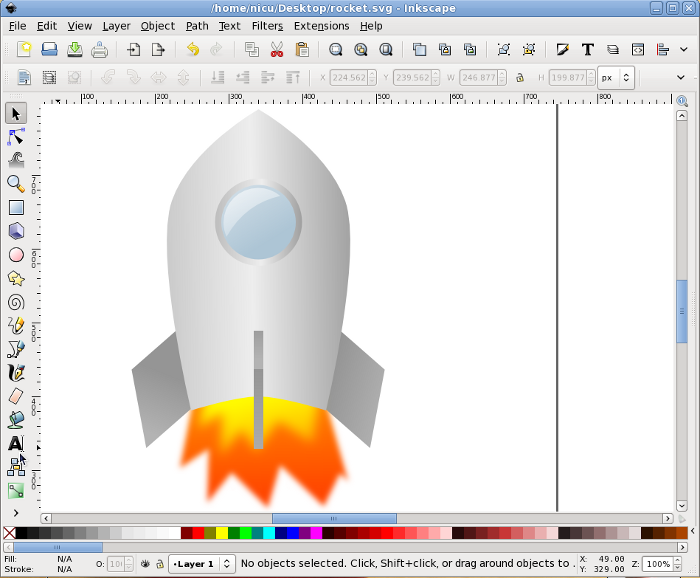
Now our rocket can take-of and fly proudly. Go to the stars and beyond them!


I seldomly use inkscape - but I love these short howtos because they show how easy it is to use once I need it :D
ReplyDeleteSeriously, I just got a bit more confident that the next time I need to draw something that I can do it with Inkscape and that it will be quite easy :)
A plain awesomeness, Nicu! That rocket looks a bit like Orzel 7! :) (http://www.youtube.com/watch?v=CVYd1tyv2Co)
ReplyDeleteAs well as the first commenter I'm not very proficient with Inkscape either and really like these howtos!
Lubomir, that cartoon if fun-fun-fun (even if I don't understand a word :D). The Orzel 7 should be even simpler to draw, as it is a cylinder + a cone, without the bullet shape. You only have to spend a little time on a few details (a door! why I didn't thought about that?) and coloring.
ReplyDeleteBut the point of this tutorial is you don't have to be a "wizard", simple shapes and a chain of simple operations and you can have something cute.
Very very nice tutorial! thanks!
ReplyDeleteNice one, Nicu!
ReplyDeleteIt's all about idea ;-)
Thanks Nicu, i will definitely will try it ;)
ReplyDeleteThanks for the great tutorial. I have completed and you can see the resulting rocket http://martinamca.blogspot.com/2010/03/roket-figuru.html
ReplyDeleteexcellent martinamca, that's the spirit! and i love how you added your own improvements (drop shadows, better gradients)
ReplyDeleteYeah, i got the spirit! :) I'm just an amatuer, love learning inkscape and drawing in inkscape. Thanks.
ReplyDeleteWhat a great starter guide - thank you!
ReplyDeleteIt all went well for me, until I got to the gradient tool (ironically, I had been looking forward to that part - the realism ;-)). I think that a few more tips are needed there - for example, my silver rocket keeps on becoming partially transparent (translucent?) and reveals the flames hidden underneath. Still your article got me started and that is the biggest step. Thanks again.
I've tried everything I can, and can't seem to make the third step work to create a trapezium. When I hold down Ctrl + Alt + > it just traces the rectangle, but doesn't change its proportions.
ReplyDeleteThanks for creating this tutorial!
@poelcat: you sure converted the rectangle to a path before trying to enlarge a section? surely only two nodes are selected?
ReplyDelete@Anonymous: the gradient part deserves an entire tutorial dedicated to it... but basically when you use the gradient tool on an object and start dragging, it will create a gradient from the initial color to transparency. Use the edit gradient button to change it, change the alpha valuefor the transparent end, add new stop, change their colors.
ReplyDelete@nicu
ReplyDeleteMaybe I'm selecting the nodes wrong? What is the correct way to select the two top nodes? I was holding down CTRL to do that.
Here is what happens: http://poelstra.fedorapeople.org/paste-bin/inkscape-try.ogg
@poelcat: selecting a node whith Ctrl pressed will make it smooth, so select the nodes another way, wither with Shift or by dragging (I usually drag with the mouse, as I am lazy) - http://howto.nicubunu.ro/video/inkscape-enlarge-selection.ogv
ReplyDeleteThat was the solution. On to the next steps. Thank you.
ReplyDeleteI have been using Inkscape to create graphics which I then insert onto my pages. I have toyed with JavaScript to make these animate and it works fine.
ReplyDeleteI know, I know, JavaScript. But it works.
You can either embed the JavaScript within the SVG object (which inkscape creates) or have the page run a script that will have access to the graphic.
I started out doing things like this by hacking kbounce.
In Inkscape it is easy to label parts so that you can
get at them with the DOM. After you build your rocket,
load it into firefox where you have a DOM Inspector (if you don't have it you will need to install that plugin). Then you can acess the XML of the object and modify it in your browser!
It is actually a fairly trivial application of the DOM. However, from these simple things big things are made.
I would prefer not to use JavaScript, soome other plug in. But in the mean time the DOM concepts are easy to understand and can be used in any language.
I would like a DOM aware browser where one can create hooks 'off to the side' to alow for animation of various SVG components(or other XML through hooks to the DOM). And then it would allow for setting up the
various transformation (which would form a sort of 'script'). Then one would 'publish' these to a file and
the code to make the animation would be inserted into
the objects (either into the SVG or in the page in which the SVG is inserted.)..
If you look at my website you can find some animated
SVG objects (I insert them into my page with an
embed statement).
As in all things XML there are very many ways to do the same thing. I have been, while unemployed, experimenting with variuos ways of animating SVG with
the DOM. Anyone have anything better than JavaScript?
I believe JavaScript is the most used (and the better?) way to animate SVG.
ReplyDeleteI like your tutorials. very easy to follow. Thanks so much for sharing your expertise. As a new learner with Inkscape, I can use all the help I can. You've made it a simple chore in learning. Again, thank you!
ReplyDeleteThanks for this tutorial, very very easy to follow and you have all explained it perfectly :)
ReplyDeleteI did a great rocket !
just for you to note; you forget to explain the transparent part of the window (the glow) but it's ok I knew hos to do that :)
i didn't get into details with the glow since that was for "advanced users" :) but as you say, is trivial: a simple path filled with transparent white. i think i did similar things on many of my other tutorials
ReplyDeletevery nice tut.
ReplyDeleteReally good tutorial, thank you.
ReplyDeletethat was really hard
ReplyDeletesorry... if it helps, there is a video demonstration of this tutorial (the second half of the video), but unfortunately is spoken in Romanian
Deletelike how u uzed arrows
ReplyDeletePerfect Tutorial, thanks a lot!
ReplyDeletedieser peinis ist zu alt
ReplyDeletehall
ReplyDeletehiiiiiiii
ReplyDeleteheheheha
ReplyDeleteheheheha
ReplyDeletedu popo kaka
ReplyDeleteahh
ReplyDeletesuiiiiiiiiiiiiiiiiiiiiiiiiiiiiiiiiiiiiiiiiiiiiiiiiiiiiiiiiiiiiiiiiiiiiiiiiiiiiiiiiiiiiiiiiiiiiiiiiiiiiiiiiiiiiiiiiiiiiiiiiiiiiiiiiiiiiiiiiiiiiiiiiiiiiiiiiiiiiiiiiiiiiiiiiiiiiiiiiiiiiiiiiiiiiiiiiiiiiiiiiiiiiiiiiiiiiiiiiiiiiiiiiiiiiiiiiiiiiiiiiiiiiiiiiiiiiiiiiiiiiiiiiiiiiiiiiiiiiiiiiiiiiiiiiiiiiiiiiiiiiiiiiiiiiiiiiiiiiiiiiiiiiiiiiiiiiiiiiiiiiiiiiiiiiiiiiiiiiiiiiiiiiiiiiiiiiiiiiiiiiiiiiiiiiiiiiiiiiiiiiiiiiiiiiiiiiiiiiiiiiiiiiiiiiiiiiiiiiiiiiiiiiiiiiiiiiiiiiiiiiiiiiiiiiiiiiiiiiiiiiiiiiiiiiiiiiiiiiiiiiiiiiiiiiiiiiiiiiiiiiiiiiiiiiiiiiiiiiiiiiiiiiiiiiiiiiiiiiiiiiiiiiiiiiiiiiiiiiiiiiiiiiiiiiiiiiiiiiiiiiiiiiiiiiiiiiiiiiiiiiiiiiiiiiiiiiiiiiiiiiiiiiiiiiiiiiiiiiiiiiiiiiiiiiiiiiiiiiiiiiiiiiiiiiiiiiiiiiiiiiiiiiiiiiiiiiiiiiiiiiiii
ReplyDeleteardolf
ReplyDeleteheheheha heheheha hehehehea hehhehehea hwehehhrhrha
ReplyDeleteyour mom
ReplyDeleteheheheha
ReplyDeleteheheheha
lllllllllllllllllllllllllllllllllllloooooooooooooooooooooooooooooooollllllllllllllllllllllllllllllllllll
ReplyDelete