F13
I may act most of the time as a fanboy but, believe or not, I am deep inside a balanced guy (am I?) so a cold shower from time to time probably does not hurt, I guess I can share bluntly my first impressions after living a bit with Fedora 13 (beta/devel).
One of the main reason I use Fedora is the 3-rd Foundation, the features, so if in the past I used to jump with my main desktop to a new release around Beta, this time I felt unmotivated, not only because I was busy with the life, but also because for the first time in all the Fedora history the features list didn't have anything to bring butterflies in my stomach.

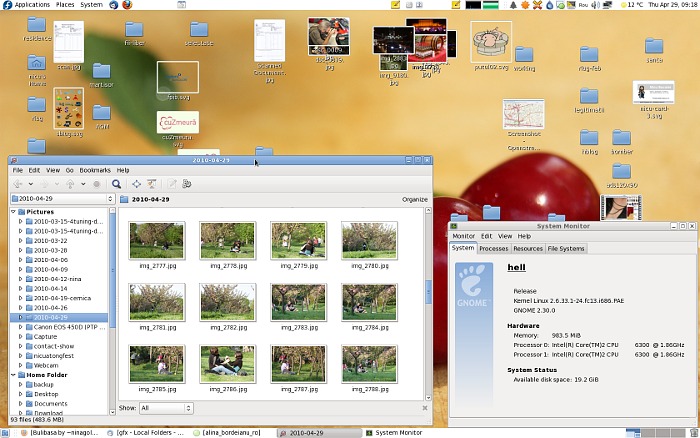
Ultimately, I built the energy and installed it a couple of days ago I accumulated enough energy and installed it. It was a big disappointment, from the look (I don't like the new icon theme and I hate the new cursor theme) to the need to re-learn old habits (never though it will be so hard to use again a file manager in browser mode).
Beyond the superficial look and feel, which can be easily changed, I encountered loss of functionality which keeps me from getting work done, one example is gThumb, removed as the default but still easily installable, does not have any more the feature I used the most: export as a Web Album. I guess I will need to use some script for it. Similarly, Gwibber, not a default any more but still installable, lot the ability do watch any RSS feed, something I was relying on and became useless to me, with this reduced functionality I can stay very well with the default, and much lighter, pino.
Initially my plan was to write this in a different tone, highlighting one thing that I really like, but after 24 hours of intense use, weren't able to find such thing so let my crankiness out. But I will live with it, I don't have any plan for going back to 12, instead will move the netbook to F13 too in a few days. I am self-destructive like that :p


why not using digikam for webexport?
ReplyDeleteBecause installing all the KDE stack for just this would be too much, a simple script (python, php, etc.) could do the job
ReplyDeleteThis comment has been removed by the author.
ReplyDeleteafter many years of frustration with both gthumb, eog and many more including f-spot, digikam I finally found a fast(against eog), light(against f-spot) and good looking (against pretty much all of them) image organiser - Shotwell :) you could try it http://yorba.org/shotwell/ . It has packages in Fedora and probably soon an even better support for tags :) .
ReplyDeletep.s. It doesn't have the same webexport the gthumb has btw :)
@MStoykov: Shotwell is the new default photo app in F13 Desktop. Myself I find it useless, it can't do anything I don't already to with nautilus + eog + GIMP. I used gThumb only for export to web.
ReplyDeleteNicu perhaps it's time to suggest a custom-spin that's specifically designed for photographers and artists, - maybe then you will have all the tools you know and love available without having to rework things? Just an idea :-) Try not to get too grumpy :-)
ReplyDelete@Canoe: for F13 we will have for the first time the Design Suite spin (and my grumpiness is unrelated to software development and FLOSS, it just happen to be)
ReplyDeletePerhaps that's not a bad thing. Grumpy people live longer.
ReplyDeleteDo they? I thought stress is a killer
ReplyDeleteSee it on the right perspective: if there aren't any revolutionary changes, maybe it means that Fedora is getting almost perfect, isn't it?
ReplyDelete:D
Unfortunately, it also has a ton of small annoyance, like the keyboard indicator which was moved into the notification area and can't be taken out from the screen and I have to live with some ugly text here.
ReplyDelete> (I don't like the new icon theme and I hate the new cursor theme)
ReplyDelete> Beyond the superficial look and feel, which can be easily changed
I love the new icon theme, but pretty please, tell me you found a way to revert to the previous cursor theme.
This new one looks like the Ubuntu's one (which I also dislike btw) in black. Gimme back my blue spinning circle!
@bochecha: i think you will need to install the cursor theme package from F12
ReplyDeleteYes, just doing a yum install bluecurve-cursor-theme and changing the pointer theme gets us back. Phew...
ReplyDelete