Fedora 9 Artwork: Round 2
After a first round when we gathered theme concepts, the second round, dedicated to further visual refinement has ended and it will be followed by a third, and last, round (with a current deadline for 28 February) where those proposals are expected to approach completion.
From an initial lot of 7 proposals we got to 2 still standing, so I present you (listed in chronological order):
- Sulfuric Waves
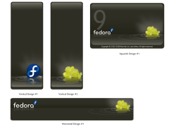
It is a combination of the initial Waves concept by Martin Sourada symbolizing "infinity, freedom, voice..." combined with Máirín Duffy's take on the F9 codename (Sulphur); - Shoowa
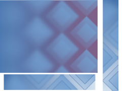
Luya Tshimbalanga's geometric take on the diversity of the Fedora community through the use of art from different cultures.
Now is the time for you to voice your opinion about them, please do!
![]()


Luya Tshimbalanga made a big step from Round 1 to the current version. I didn't like the R1 version at all but the new one is really nice.
ReplyDeleteNevertheless, I'd prefer mizmo's...I figure I always do, she's doing great work. Even though I think the waves look a little unnatural on most pictures.
I have to admit the squares never did it for me.
ReplyDeleteI prefer the black wave layout. the yellow sulphur crystals on the dark background look great.
Black "Sulfuric Waves" artwork looks really awesome! :)
ReplyDeleteI think you meant Fedora "9" Artwork in the title.
ReplyDeleteUps! I am so stupid sometimes... Thanks for the notification :p
ReplyDeleteI think that the "Sulfuric Waves" looks really professional and I like the fact that it ties in with the release name.
ReplyDeleteI'd vote for Sulfuric Waves!
ReplyDeleteSulfuric waves looks infinitely better, but it could be improved by adding clarity to make it look more real.
ReplyDeleteSulfuric waves stuff is much more pleasing to the eyes. I vote for waves.
ReplyDeleteI really like the black based sulphuric waves artwork.
ReplyDeleteGerry