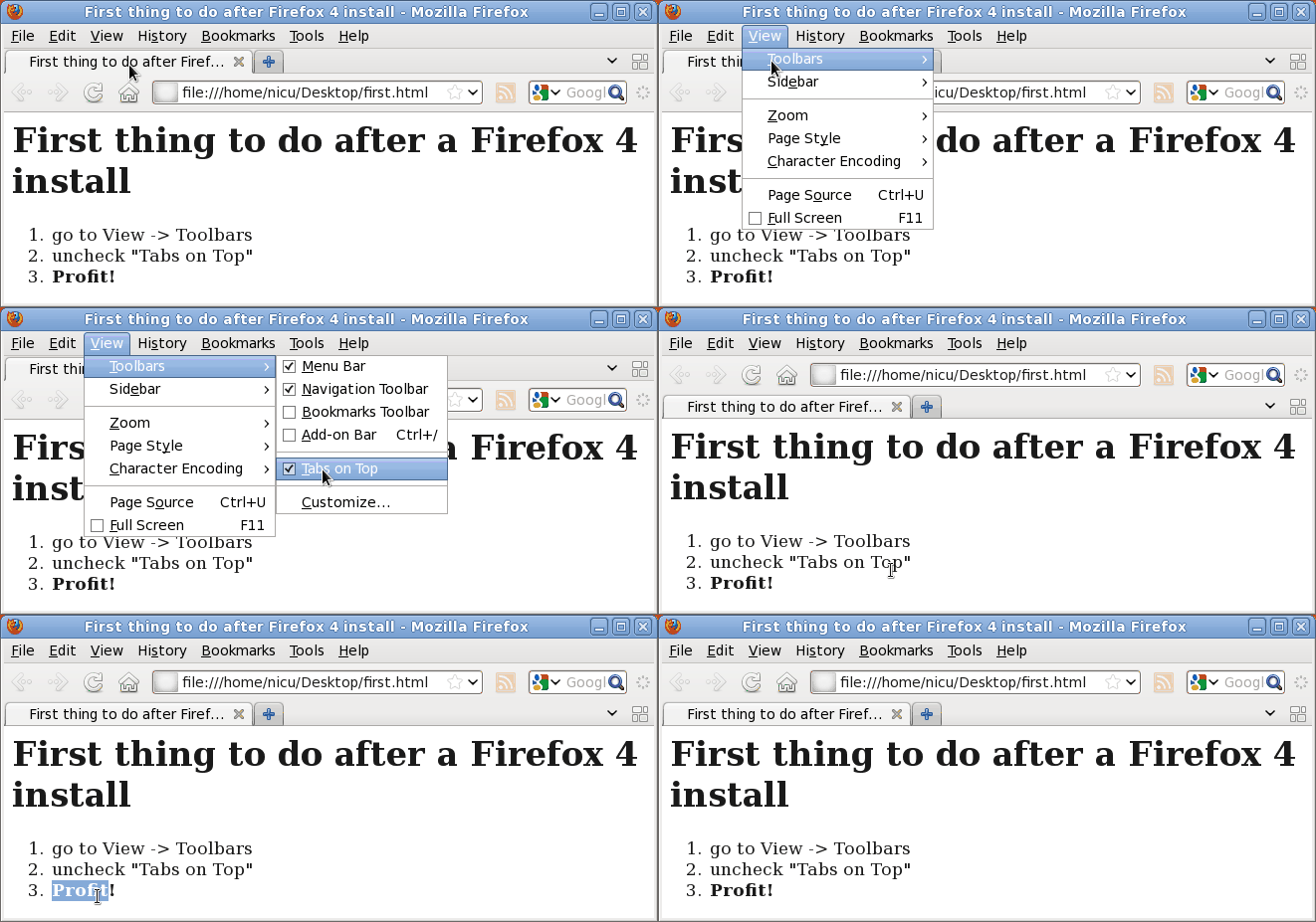
First thing to do after a Firefox 4 install

- go to View -> Toolbars
- uncheck "Tabs on Top"
- Profit!
a bit about Free software, a bit about graphics, a bit about design, a bit about photography, a bit about gadgets, a bit about life and many more

Posted by
nicu
at
11:34 AM
![]()
Labels: fedora, gnome, linux, software-liber

how you can made this picture?
ReplyDelete@Anonymous
ReplyDeleteWith Gimp. Save file as animated gif.
There is a nifty small tool, Byzanz, allowing to make screencasts in GIF format... you want it only for small animations, for anything larger use a proper video screencast in Theora (with RecordMyDesktop or Istanbul) or WebM.
ReplyDeleteCongratulations, now your Firefox is as wrong as the rest of your desktop!
ReplyDeleteAlthough arguably the entire concept of tabs is wrong (indicating a serious failing in window management paradigms that nobody really has a solution for yet), tabs on top at least makes sense. That toolbar and address bar and menu bar relate almost entirely to the content of the current tab, therefore they should be visually inside that tab.
Firefox 4 doesn't get it completely right, but it's a big improvement. Even though it doesn't match visually, and I'm usually a stickler for visual consistency.
For usability is good to have all the apps with the same look and feel, to provide the elements in a predictable location. I don't want to have to think which app I use and hunt for its widgets.
ReplyDeleteAnd if i wanted a Chrome look-alike, i would have used Chrome in the first place.
Byzanz also lets you make a screencast in Theora (+ Vorbis audio). Also .FLV.
ReplyDelete@Paul: I noticed this too when I made this screencast... I usually use RecordMyDesktop and produce Theora videos (until something will be able to make WebM videos)
ReplyDeleteByzanz is the perfect example of what's wrong with Gnome 3.
ReplyDeleteDue to the fact that byzanz hasn't seen new development in quite a while now, and due to the fact that it's implemented as a Gnome panel applet, it's going to become overnight a dead project due to no fault of its own.
Unless it reincarnates as a standalone application (fat chance).
In conclusion: all the work people have done over the years to build and refine Gnome panel applets has been wasted now.
@Dan: GNOME Shell has a built-in utility that records the desktop in WebM just by invoking Ctrl+Alt+Shift+R.
ReplyDeleteSo, you don't see the logic in moving tabs on top... But try this: let them stay there, and remove the menu bar (google search as well, as you can always do a search by typing in the address bar, or simply with Ctrl-K). You'll get something similar to Chrome, and much more vertical space in a window.
ReplyDeleteJust want to mention, in addition to the previous comment, after reading all the comments: you're certainly not using FF instead of Chrome just because of the positions of the tabs.
ReplyDeleteCan you tell any other app that uses address bar and tabs, in the way that the old FF does? Why do you say that FF perturbs the look and feel of other apps? What apps? And, what lokk and feel?
I'm justr trying to think about it, I'm not assaulting your oppinion.
But i use the menu and the search box all the time, why i would remove them? and, as i said above, why i would want something similar to Chrome but not use Chrome instead? And why do you think i bought such a large display as the one i use?
ReplyDeleteThe first reason to use Fx is Gecko, but there is also Seamonkey providing the same rendering engine... As a matter of fact, any application conforming to the GNOME 2.x HiG has the tabs below the toolbar.
ReplyDeleteThis comment has been removed by the author.
ReplyDeleteAlso install status-4-evar
ReplyDeletehttps://addons.mozilla.org/en-US/firefox/addon/status-4-evar/?src=api
to have a proper status bar :D
I still need to find a way to make FF follow the themes as it doesn't follow them quite right , (toolbar and tabs)
Interesting, get virtualbox (or whatever) and try windows 3.0 I bet you'll like it a lot.
ReplyDeletei used Windows 3.x in its time quite a lot, many times with alternative shells. what's your point?
ReplyDeleteNicu: fwiw, those are my exact first steps too. I instantly liked ff4 after that :-)
ReplyDeleteI also killed the menu, was not using it much anyway and the current menu-wannabe gets the job done. I was using the toolbar only to host delicious buttons, but now that yahoo is killing it that is gone too.
I don't get the people prefering tabs on top. When I look at the top of the screen, I want something clear, not a sea of unreadable tab names.
i think the logic is like this: that's the user interface used by Chrome, Chrome is growing fast and "stealing" users from Firefox, maybe coying the interface will keep the users. I think this is flawed logic, but...
ReplyDeleteYeah! I also put my tabs back where they belong.
ReplyDelete