The story of a poster or the making of Fii Liber Land
The task was forgotten, sitting untouched for months, when I was reminded about it (and perhaps assigned in the tracker): make a poster design for the Fii Liber project, to be put at Ceata's headquarters.
I got the "Fii Liber Land" concept right away in my head, but it was too complicated (so I thought) and I was not in the mood for drawing it, so postponed it for a while, over a week, during which I kept working on demotivational posters (more on that in a couple of weeks, the project is not ready to be announced), while trying to simplify the idea and do something easy, which I would be able to do in the blink of an eye and no effort.
Time passed and I was unable to come with a simplified form, so build my courage and went for the whole shebang: I could get away with the simple kite (the Fii Liber logo) on a blue sky and the clouds from the current website header along with a text like "Fii Liber. Noi suntem liberi! Tu?" ("Bee Free. We are free! You?") but that was less than optimal: the kite and the clouds do not match in their visual style (I made the kite logo on my usual style but when it came to the clouds I was "busy" and skipped the task) and... I wanted to make a point and I am not the person to step back from a controversy.
Fii Liber is queued for an infrastructure upgrade, will be migrated to Drupal 7, and with this it will receive a new theme, which I find boring, corporate-like and bad for our "normal users" audience (obviously, some people in the team disagree, so they want the change). The poster is supposed to show the friendly and informal image I envision for the project.
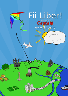
But I talked already too much, time for some pretty pictures! Here is the poster design I came with:

As you can see, it represents a happy land with hallmarks of life, technology and culture (as Ceata is an organisation promoting Free arts and technology) with a kite (the logo) flying freely over it. Of course, there are some stereotypes included, like Dracula's castle, a Modavian painted church or the Endless Column (do I need to also talk about sheep?)
Now the work is not done :) From my point of view it may be, but since the design is Free and a group has different visions, modifications may happen: the Ceata logo, which is not loved any more may get axed (in what I see as a mistake for growing the identity) and some text may get added at the bottom, where I intentionally didn't allow the space for.
As said, done, time to go forward, staying a bit more in the poster land... a bit of work is planned today on the demotivational side :)


but I like the current website theme :((
ReplyDeleteit has warm colors, good for its intended audience
ReplyDeleteMerci Nicu
ReplyDeleteMa bucur ca ti-am gasit blogul , pentru ca mai descopar comunitati romanesti in domeniu acesta. Chiar ma bucur .
Bravo.