GIMP 2.8: Preview
I wrote the other day about me upgrading my system in order to be able to run the Preview Release of GIMP 2.8, I have it up and working, ready for real work: a preview of the new features to be expected.
So the new GIMP 2.8 release is currently in the Release Candidate stage, the final release may come any time now (wild guess: the Libre Graphics Meeting conference is taking place in a couple of weeks and it will bring together a number of its developers), previews and reviews are starting to appear, is a big deal since this release is about 1.5 years late - it was expected since December 2010 but got delayed again and again - probably it was not sexy enough for the developers, who are excited about the next release, 2.10, which is going to deliver more meaty stuff.
Major user interface change
What make titles for this release is the big interface change (I wrote about it before) which introduced optionally (not yet as default) a Single-Window Mode (activate it in the "Windows" menu). From what I see, newbies will like it, finding it less scary (my girlfriend is a good example, she saw me preparing the article, I showed her the differences, she "definitely" liked the single-window mode - she does photo editing, but with simpler apps, no GIMP, no Photoshop). Photoshop nay-sayers will hate it, they will hate anything but a total Photoshop interface cloning, which will never happen (and that is a good thing). For the rest of us, the opinion will be split, I find the single-window mode wasting more screen estate, especially on the netbook, and harder to use when working with multiple images at once. For those reasons I keep using the multi-window mode. But the single-window mode is cleaner. Here's a comparison, you decide:
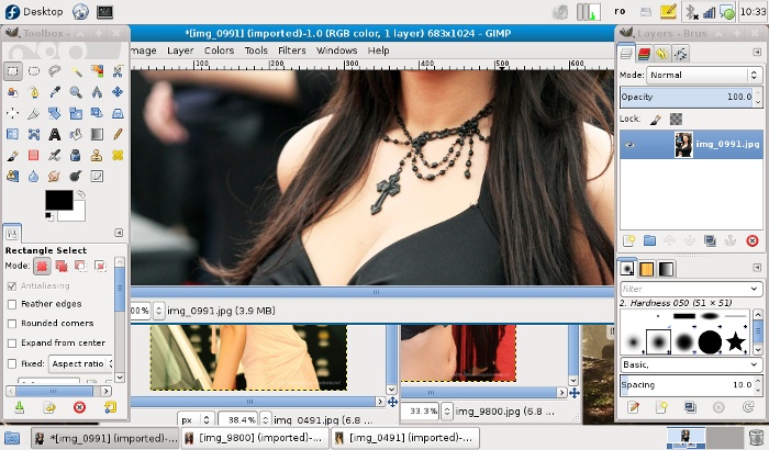
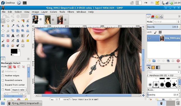
Underlying library work
What's really important, but maybe less user-noticeable, is behind the scene: library work. GIMP 2.8 is an intermediary step in the progress for GEGL integration (GEGL is a graph based image processing framework that will provide the core for GIMP, allowing for much advanced features). This process started with GIMP 2.6, advanced with 2.8, will be finished in 2.10. Expect the real meaty features (like high depth color channels) in the release after 2.10 (is not know if it will be labelled 2.12 or 3.0). For now GEGL is used in some UI elements and some optional filters and tools:
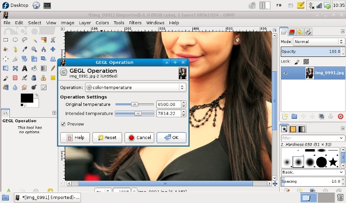
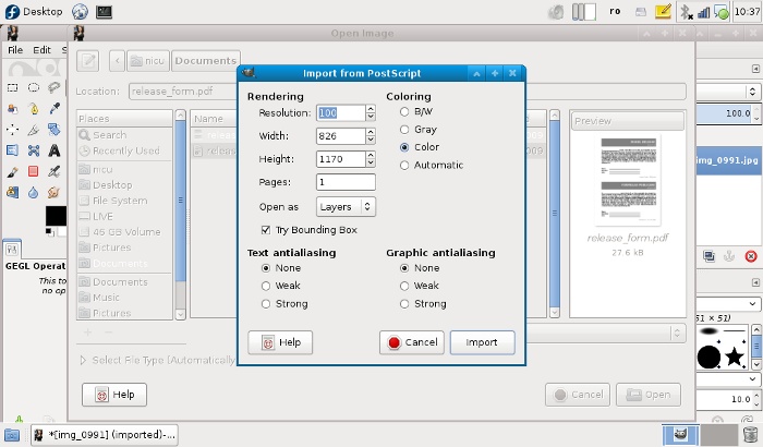
Cage Transform Tool
Another feature that will make headlines is the introduction of a new tool: Cage Transform. It was developed as a GSOC project a couple of years ago and now is the time to appear in a first release. It allows do define an area (as a polygon) and then apply deformations of the parts of the image inside, by moving the nodes - while spectacular (expect a wave of digital breast enhancements), it is mostly a technology showcase for GEGL, used behind the scene, and cairofication, which allows for the on-canvas editing, expect something really useful later (2.10 or even later) in an on-canvas version of the iWarp filter which will hopefully be a worthy replacement for Photoshop's Liquify tool.
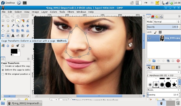
On-canvas progress indicator
Grace to cairofication, some tools have now an on-canvas progress indicator, which make GIMP a little more pleasing to the eye:
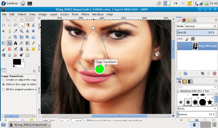
On-canvas text editing
Again with the help of Cairo, now the text editing is done on-canvas with instant preview and apply, not in a separate dialog window. Such a feature may sound trivial and expected long ago, but it needed something like Cairo for the infrastructure, is pretty and we finally have it. Is a plus.
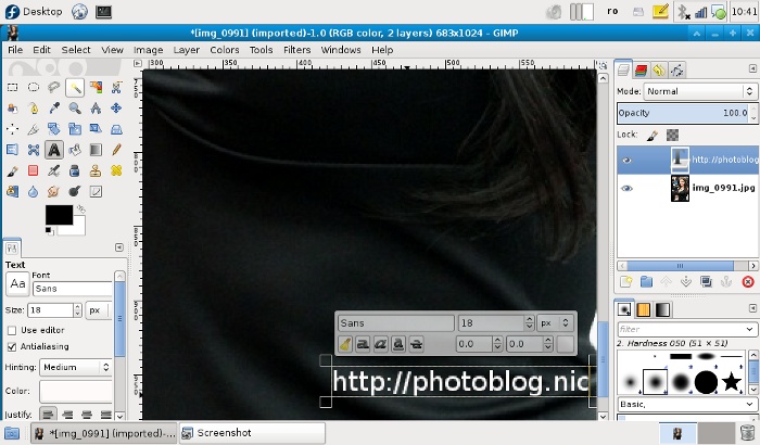
Layer groups
Yet another intermediary feature: now GIMP has layer groups which will help you better organize a complex work, but expect the feature to get more useful in a later release, when it will be possible to apply filters to an entire group. For now, simple operations are possible, like setting the layer mode for the entire group.
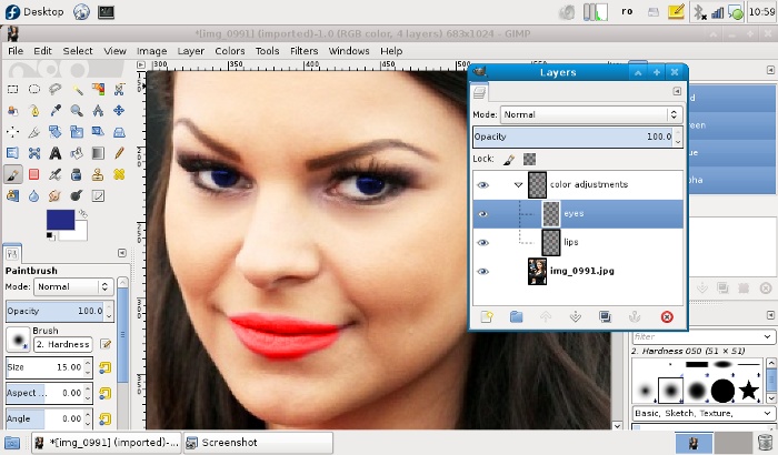
More stuff
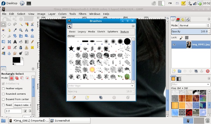
Of curse, there are more smaller features to be found there, for example the new brushes pack and an improved brushes dialog window that provides filtering for categories. Useful for digital painting.
Annoyance
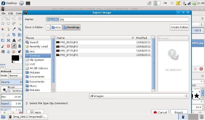
Many things changed in the new release, including shortcuts, so you will have to do some re-training of your reflexes (or go in the preferences and adjust them to your liking). For example, wanting for their app to be seen as "serious" and not only a "JPEG editor", the developers went for some low-hanging fruits, until real features will come (post 2.10/GEGL), we have face-lifts: having "save as JPEG" was not considered a professional feature, now you can save only as XCF (GIMP's own layered file format), for everything else you have to use Export - annoying then most of the time you just want to save as JPEG or PNG (and I say this with my photographer hat on).
As a conclusion, GIMP 2.8 is a worthy upgrade, but don't expect something earth-shattering. Have fun using it :)


what I miss in GIMP from Photoshop or why I can't / hate to work with GIMP
ReplyDelete1. group similar tools in the toolbar (space saver)
2. layer style for every layer (time saver)
3. clipping mask for layers (time saver)
4. grouping layers/folders easily (time saver)
5. move layers around easily (time saver)
6. edit/style text easily (time saver)
7. smart objects/ filters (time saver)
8. better mask tools (refine) (time saver)
GIMP is a great tool but some of the reasons I pointed really missed me when I try to do something with the program.
Are there plans to add such functionalities soon ?
i am not a GIMP developer, so i can't answer point by point, but from my understanding some of those features are coming, with layer grouping in 2.8 being the first step
Deleteeasier text editing is something like the new features described in the article?
The best feature is on-canvas text editing
ReplyDeletethat depends on the way you use GIMP... for the tasks involving a lot of text editing (layout, interface design, prints, illustration) I find Inkscape a much better tool. usually in an image editor (raster based), text editing is supposed to be minimal.
DeleteThe trick to being perceived as a pro photo editor is to ... be a pro photo editor. The Gimp developers were told 15 years ago -- before there were deep architectural assumptions -- that things like 16 bit color, LAB color, etc. were essential. They ignored this. They're frantically trying to retrofit all of this in, but until they do, it will continue to be perceived as an amateur JPEG editor. Introducing annoyances like "Export as JPEG" won't help.
ReplyDeleteTo be fair, I do not think rewriting the whole core in GEGL can be described as a retrofit. More like a fresh start - it is late/overdue/whatever but much of the core work has been done (can't find the link to the article, sorry). As an amateur (all these years) GIMP has been ample for my photographer needs. My R0.02.
DeleteHuh, I found the new save/export tool _really_ useful, no more warnings about losing layer info when exporting to JPEG, and you can easily update both the xcf and jpeg at the same time with just one extra click (ie. do ctrl+s and then ctrl+e).
ReplyDeleteFor your use, where you never save as XCF, just remember to click ctrl+e instead of ctrl+s. How is that more complicated?
Anyway, nice writeup :)
actually i changed my keyboard shortcut so Ctrl + S does "Export To..."
Deletelayer groups, was about time \o/
ReplyDeleteHow does it compare to RealWorld Paint?
ReplyDeleteRealWorld Paint does not work on Linux and have sources available, so it is not even on the radar
Deletethat about "save" only saving in the native .xcf format made me to re-assign ctrl+s as export, not save...
ReplyDeleteNice wrap up.
ReplyDeleteAnyway who is the beautiful girl on the photo ? ;)
I love gimp, keep up!
ReplyDeleteI don't think I've seen a single stable OS X port, I think that would be a nice "feature" (-:
ReplyDeleteNice overview, I'm looking forward to Gimp 2.8! Do you know / did you test if the new layer grouping feature is used with imported PSD files? This is always a big issue when I get screenlayouts from my clients.
ReplyDeletei have not tested yet, as i have no PSD files around
DeleteSo here's my question. Will it be late 2013 or early 2014 before we see 2.10?
ReplyDeletenobody knows, probably not even the GIMP developers (remember, 2.8 was expected 1.5 years ago)
Deletea save box that allows u to save in any format by adding the proper extension seems 'pro' to me, while 'export' seems like a lame left-over from my dos based autocad'ing days... also, non-floating palettes are total lose... don't people go multi-head for a reason? overall your review made me loathe my next upgrade. :(
ReplyDeleteI'm pretty sure you will be able to undock the palettes. It sounds like it will just be docked by default on the first run.
Deleteindeed, you can dock/undock all the palettes and arrange them the way you want, save the layout and feel at home
Deleteactually they are undocked by default
Deletehas anybody tried to use the new text editing tool and been completely frustrated with it's constantly changing and overwriting my settings because I clicked on the wrong part of the text, I just drove myself crazy to the point where I closed it, I clicked on the canvas, got the in-canvas-text-widget, changed the font size to 70, started to type, in size 18, selected the text, drove it up to 70, clicked on the text, back to 18....ARGGGGH!!!! what is wrong with these guys???
ReplyDeleteHI
ReplyDelete