A history of Mozilla browsers design
Writing the piece on FOSS design, it made me think about past experiences in various communities and brought back memories to the point when I decided to put down some thoughts on Mozilla browsers (won't cover other apps today) design history as I saw it, both as an user and from my involvement with its community. Even if the screenshots below are taken mostly from Wikipedia (try to run 10-15 years old binaries on a current Linux desktop), all the experiences are mine.
As Mozilla has its roots in the old Netscape, a history of its design must start with Netscape, which in its time was very popular, the most used web browser, but was not very good on the "looks" chapter. It was using its own widgets set, allowing the application to run on multiple platforms, but in none of them looked very good. When Internet Explorer came, it dethroned Netscape on many ways: it was already installed (the monopoly lawsuit on the matter has its own history) and it was "good enough". But it also had a better design, it used native widgets and it looked "native" (on Windows, of course), simple and familiar, while Netscape remained with the antiquated look and feel.
 Late Netscape 4.x look
You maybe know the story of Netscape going Open Source as Mozilla after its management read The Cathedral and the Bazaar and also as the only chance they saw against the Internet Explorer assault. It debatable if their move to rewrite the entire suite from scratch was a good thing or not (on one hand it was a chance to get rid of the old cruft, on the other it was a huge delay), but here I talk only about the design, so the rewrite brought also a new interface and new widgets. At the time there were "milestone release" from the development tree, working to various degrees. It also has a new interface with a "futuristic", non-native, look, to show the power of XUL and allowed for a new feature: theming - at the time making the interface themeable was the rage of the industry, I don't know who invented it, but Winamp (by then also an AOL property, as Netscape) made it really popular.
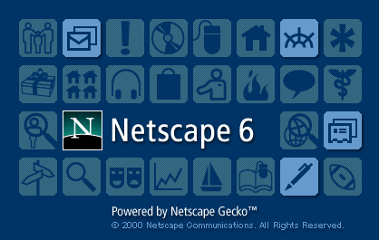
 Early Mozilla suite look (M3)
During the "milestones" stage the interface didn't change very much:
 Early Mozilla Suite look (M8)
Then it moved to numbered, pre-1.0, releases. Those releases saw many changes who led to the 1.0 like tabbed-browsing, which at the time was not adopted for their friendliness (they are NOT better for usability), but for pragmatic reasons: it was painfully slow to open a new window, but a new tab was faster. Also the new pair of themes, "Classic" and "Modern". It was also the start of Netscape's "design sabotage" of Mozilla.
Netscape moved to Open Source, but they tried a "hybrid" model, while having the Mozilla suite as Free software, they kept the Netscape suite derivative (just a rebuild) the old proprietary way. And they used they engineers, placed in strategic positions, to keep this reality. One example is the default look: the suite included by default two themes, "Classic" was a direct copy of the old Netscape 4.x look and was the default for the Mozilla Suite, with the intentions to keep the end-users away, while Netscape had "Modern" as default, to attract users:
 Mozilla Suite with the Classic theme
 Netscape Suite with the Modern theme
Of course the community routed against it, then were sites providing tons free themes. And Open Source developers did even better: the "Classic" theme was made to use native widgets which, despite the still ugly icons, it made it work way better.
Another Netscape idiocy happened around then (while not directly design-related, it links with the following step): annoyed by the prolonged development delay, they released a "stable" Netscape Suite release based on an early Mozilla Suite beta, which was slow and ridden by bugs, a bad impression for users.
With the mantra "Mozilla is for developers, Netscape is for users", the Mozilla Suite was shipped with a completely unprofessional splash screen, designed to scare end-users away:
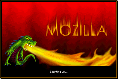 Mozilla splash screen
The community tried to fight-back, the Bugzilla item for about the splash screen was the most active, some submitted new and beautiful images as patches, nothing worked, the issue was controlled by Netscape engineers (and the application has a slow start, needing the splash screen).
Of course, the Open Source development made it customizable, after a while it became possible to use your own splash by just dropping a PNG file in the same directory with the main binary, there were sites and forums offering alternate splashes and so. But the default matters, and after huge wars the image was "upgraded" to an orange rectangle with black "Mozilla" text:
 "Improved" Mozilla splash
In the meantime, the splash screen for the "user-oriented" Netscape was more polished:
 Early Netscape splash
And it really evolved in time:
 Improved Netscape splash
Yet another example was the design of the mozilla.org website, it was also kept "scary" for end-users and with a lot of disorganized information, even the experienced FOSS hackers had troubles finding it:
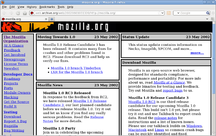 Mozilla.org website
Of course the strategy backfired and both the Mozilla Suite and the Netscape Suite were almost wiped out of the map, reaching, IIRC, a marketshare low of about 2%.
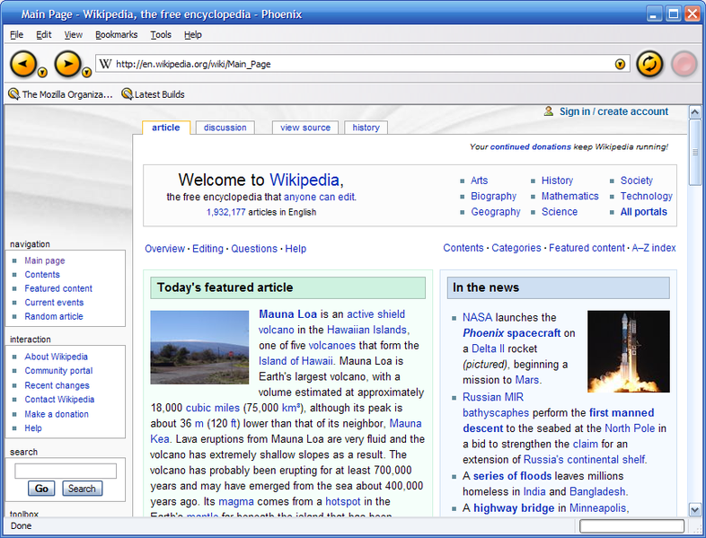
Then a reborn happened: a couple of engineers started the Phoenix project, it was an alternate browser based on the Mozilla technology but free of the Netscape management and user-oriented.
 The Phoenix/Firebird logo
At first Phoenix was Windows-only, as there were the users, but later other FOSS developers ported it to Linux and other operating systems. The interface was heavily targeted at bringing back Internet Explorer emigrants, with changes in menu layout,shotcuts, icons and dropping features and components (it was only a browser, with no email composer or chat). The Internet Explorer targeting was aggressive, with bugs tracking the progress towards this goal.
Another characteristic of this project was its decisional structure, which was more "cathedral", with less developers being allowed to make changes (in the Suite, Netscape engineers had pretty much free reign).
 Phoenix 0.1
While the first release, Phoenix 0.1, was small and humble, its design took many cues from the existing competing browsers, Opera and (the infamous) Internet Explorer 6 (there may be influences from Safari, but I have no direct experience with it, so can't talk about that):
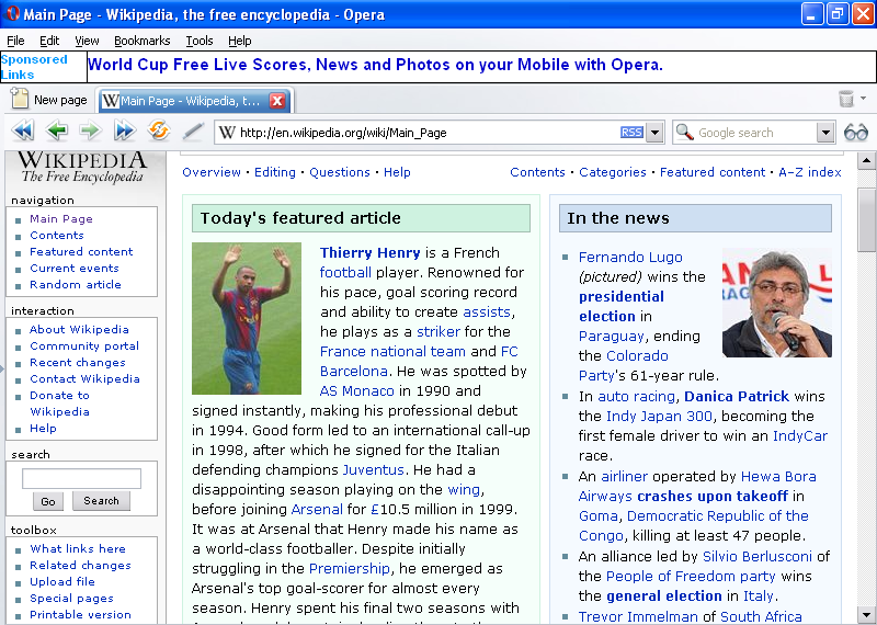 Opera look at the time
 Internet Explorer at the time (version 6)
After two change in names (the Phoenix name was already used by a BIOS maker, they moved to Firebird, which was already used by a FOSS database so they had to change again to Firefox) and many intermediary release, Firefox 1.0 came to light. By the time it was governed by the Mozilla Foundation who took over Netscape and was targeting at last end-users (just as the browser). The increase in user-base followed.
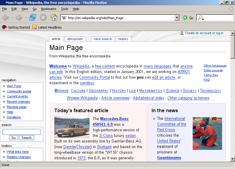 Firefox 1.0
The model of Firefox was followed by the email client, Thunderbird (which started as project Minotaur) and the HTML editor BlueGriffon (which followed KompoZer and Nvu).
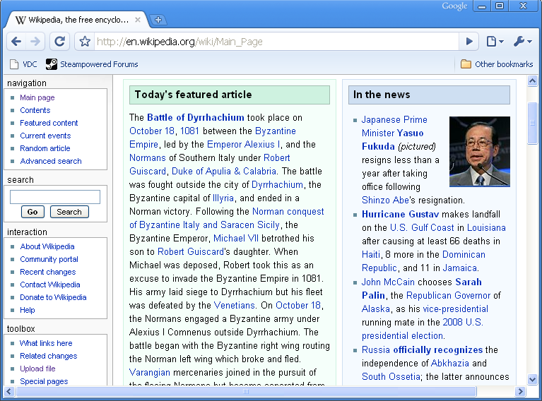
For many of you the relatively recent design and development of Firefox may be familiar, it didn't get earthshaking advancements, it had small modification, new icons set and the most, and somewhat controversial feature (fortunately, it happened only on Windows, not touching yet us, Linux users) was the "keyhole" modification of the navigation buttons.
 Firefox "keyhole"
Then Chrome happened. Powered and heavily promoted by Google, fast, sporting a minimal and simple interface, it gained a lot of market share, overtaking Firefox and closing into Internet Explorer. Modern Firefox get its share of criticism for copying much of the Chrome design (and also the release numbering).
 Early Chrome release
Modern Internet Explorer design also has its influence on the Firefox design, which from the beginning was intended as a Internet Explorer replacement:
 Internet Explorer 8
This bring us back to the current Firefox, which had recently yet another release, Firefox 12:
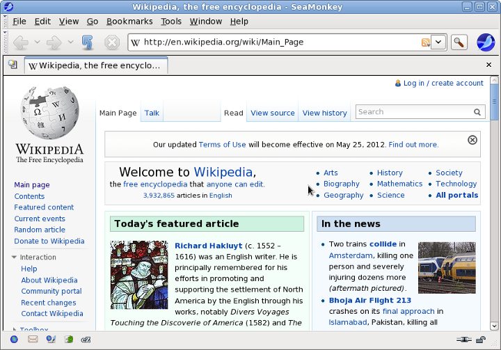
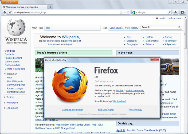 Current Firefox (version 12)
But I still didn't finish my story, Mozilla Suite has yet another child, a brother of Firefox: with the Netscape Suite demise, after being stagnant for a while, the code was reborn as the Seamoney suite, a direct follower, sharing the old look and feel of the suite but bringing also some new features from Firefox and Thunderbird. Even its "Classic" theme, despite the new and pretty icons, has cues of the old theme.
 Recent Seamonkey suite with the "Classic" theme
For nostalgics, it also has the "Modern" theme, just the same as the old "Modern" from the Mozilla/Netscape suite (grace to the advanced hardware of today, it not slow any more, just ugly).
 Recent Seamonkey suite with the "Modern" theme
![]()


Thanks for the History Lesson Nicu, it was extremely illustrative. I knew about Mozilla's Origins, but not to the point of adding scary splashscreens and all.
ReplyDeletethanks a lot! they are very illustrative. at the time Netscape was an odd app running on a RHL system, not only because the look (well, by then a Linux desktop was itself a huge mess of various widgets, styles and icons) but also because the license, because it was pretty much the only competent browser with a GUI, we had to use it, despite its proprietary license.
ReplyDeleteI think any Pheonix/Safari likeness had more to do with Dave Hyatt being hired by Apple to work on webkit than the other way round. I think your screenshot is from a year before Safari was launched.
ReplyDeleteYou seem to have missed one theme :) I remember this clearly, it was the one in use back when I first used Mozilla:
ReplyDeleteMay I present Mozilla M11: http://www.andrewturnbull.net/mozilla/moz-m11.png
Actually, this whole site: http://www.andrewturnbull.net/mozilla/history.html is pretty cool, there's very a very detailed step-by-step walkthrough of Mozilla version history.
Deleteindeed, that was an important milestone, thanks! i think it was also the theme for Netcaspe 6
DeleteLsst screenshot for modern theme is the same as "Classic".
ReplyDeleteops! my mistake, corrected
Delete"It was also the start of Netscape's "design sabotage" of Mozilla.
ReplyDeleteNetscape moved to Open Source, but they tried a "hybrid" model, while having the Mozilla suite as Free software, they kept the Netscape suite derivative (just a rebuild) the old proprietary way"
Pure bullshit. Nobody "sabotaged" Mozilla. They were paying for the freaking programmers, for God's sake!. They had a right to set the direction of the project.
"Of course the community routed against it, then were sites providing tons free themes"
routed? I guess you mean "rooted". The community made free themes? So did Mozilla programmers, on Netscape' s payroll. They even released a CCK (Client customization kit) so *everyone* was able to made new themes. Doesn' t sound "evil" to me. It sounds to me that you didn' t understand Netscape' s strategy at the time.
"the Mozilla Suite was shipped with a completely unprofessional splash screen, designed to scare end-users away"
AHAHAHAH you must be drunk. Scare users away? Unprofessional? I *LOVED* that splash screen. Nobody designed it to be "scary" but rather to be FUNNY, the small Mozilla mascott throwing fire. The power of Mozilla, see about:mozilla. See also when Netscape devs placed a huge Mozilla in Microsoft' s lawn.
I guess you miss a lot of cultural background. Perhaps in Romania people see a cute green Mozilla and start running in the streets. *joke* *joke*
"Of course the strategy backfired and both the Mozilla Suite and the Netscape Suite were almost wiped out of the map, reaching, IIRC, a marketshare low of about 2%."
This had nothing to do with features. It had to do with Microsoft' s Monopoly by preloading IE. In the words of the NY Times David Pogue said: "ABOUT 85 percent of the Internet population uses the Microsoft Internet Explorer browser to surf the Web, even though it's relatively ancient, crusty with neglect and about as secure as a screen door. In what other industry would 85 percent of consumers choose such a product — when better ones, also free, were also available? Trick question. Those consumers aren't actually choosing Internet Explorer; in fact, they're not choosing. They just use what came on their Windows computers."
Only after a series of serious IE security bugs and several security firms even advising people NOT to use IE, together with that full-page ad on NYT then people started looking at Mozilla browsers.
I think this "Netscape, Evil, open source" bad is history rewriting at its best.
Firefox wasn' t an army of rebels against Netscape' s management as you put it. It was the only way for the browser to "lean" and gain market share after AOL basically shut down the Netscape division, firing all its programmers.
FC
i remember very well the "end-users should use Netscape" mantra from those times.
Deleteabout what's preinstalled, yes, is important but not the only factor, IE also comes preinstalled in Windows these days still both Chrome and Firefox have large market share (Chrome fighting for first place and Firefox not far) for their features and promotion.
> It sounds to me that you didn' t understand Netscape' s strategy at the time.
DeleteThat's ok, since Netscape didn't understand it either.
by the way: SeaMonkey with its Modern theme still kicks Firefox's butt for the "power user". I can do things with a couple of keystrokes on SeaMonkey that you cannot do with Firefox, without adding "extensions".
ReplyDeleteTwo cases in point:
1. Email a whole page from the browser, as an attachment. File->mail page (opens SeaMonkey Mail with a new compose window and the previous page already loaded as an attachment).
2.remove adverts banners before printing. File->Edit page (loads current page in Composer) select the advert banners, hit delete, then print. DONE!
Plus, SeaMonkey can run most of the FF extensions and even GreaseMonkey.
http://xsidebar.mozdev.org/modifiedmisc.html
And last, the new "simplicity" mantra in user interfaces is bullshit. In fact, Chrome has taken it over the top and sadly Firefox followed, even removing the status bar.
The status bar was there for a reason!. New GUI design morons keep removing features in the name of "simplicity" then you find youself scrolling a huge list of values to configure something, when Mozilla/Netscape's "dual/panel" nested configuration screens had a reason and saved a lot of complexity.
Not to mention the removal of CUA Menus, that took years of coordinated standarization between IBM-Microsoft-Apple and is now surely being thrown down the drain...
GUI Design is going to hell in a basket
FC
I remember using each and every one of them. Now I feel old :(
ReplyDeleteused netscape instead of internot explorer back then.
ReplyDeleteswithed to linux and got mozilla.
was very happy.
those were the days.
still using firefox.
as a tribute i guess.
Nicu,
ReplyDeleteI am quite new user of Mozilla's FF browser, and I couldn't be happier with it.
Nice screenshots of the old versions, really a fan of Mozilla.
Jerome.
Mozilla has frequently updated Firefox, and it causes many incompatibilities of the installed addons.
ReplyDeleteI have at least 2 outdated addons everytimes it's updated.
that's not related to interface design
DeleteStock Homes Institute Best Stock Market Training Institute In Indore.Join To Get Affordable Courses & Get NISM Certification Diploma
ReplyDeletebitsourceit
ReplyDeleteDifferences Between Java and JavaScript
ReplyDeletebitsourceit
ReplyDeleteBest Seo Company in Lahore
ReplyDeletebitsourceit
ReplyDeleteBest SEO Company in Dubai
ReplyDeleteBest SEO Company in Dubai
Best SEO Company in Dubai
Best SEO Company in Dubai
Best SEO Company in Dubai
Sugoi dekai meaning
ReplyDeletesugoi dekai meaning US Sugoi Dekai is a Japanese saying or phrase that means “Very much so”. The phrase "Sugoi Dekai" contains two words' Sugoi '&' Dekai'.Sugoi means great, strong, great, wonderful, wonderful, and wonderful. Also, Dekai means great, great and great sugoi dekai meaning.
test
ReplyDeleteI like the gainful knowledge you give in your articles. I'll bookmark your site and check again here habitually. You did a great job and i am very happy to see this because it is very useful for me. Thanks for sharing. This is my first time i visit here and I found so many interesting stuff in your blog especially it's discussion. The top Mobile App Developer Dubai company provide good service of app developer you visit here site for more info.
ReplyDeleteThis comment has been removed by the author.
ReplyDeleteNice post thank you Theresa
ReplyDeleteWOW just what I was searching for Excellent content you provide in your post.
ReplyDeleteHealth Insurance
Car Insurance
bracelets
ReplyDeleteSuch an amazing blog! If you want to use these premium apps just click on this link for Free for a Life time
ReplyDeleteAmazon Prime Video Premium
Netflix Lifetime Premium
YouTube Premium