29 November 2012

A visual tour of the Fedora 18 new installer UI

The most important and most visible feature in Fedora 18 is going to be the new user interface for the installer, Anaconda. It was a major change and it needed a major fixing effort, which was the cause for repeated schedule changes (the final release will come with an over 2 months delay). Since the Beta version was released earlier this week, anyone can perform an install and experiment the new look and feel. Below is a series of screenshots (click for large size view) captured during my install of the Xfce spin (the steps should be identical for the other spins). I repeat: this is the Beta release.

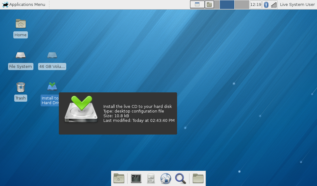
So I copied the Xfce spin to an USB stick and booted from it to a working device. There is the expected "Install to Hard Drive" icon - that's the case for all "live" spins for a long while.

anaconda

Traditionally, in the first step you are asked about the language to be used during install:

anaconda

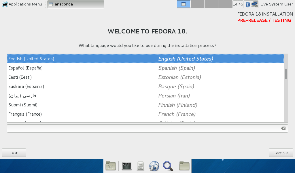
Then is the pre-release warning in a humorous tone, in the stile of old text-based adventure games. A good thing. Still... I thought is only one month in the future. Do someone know something I don't?

anaconda

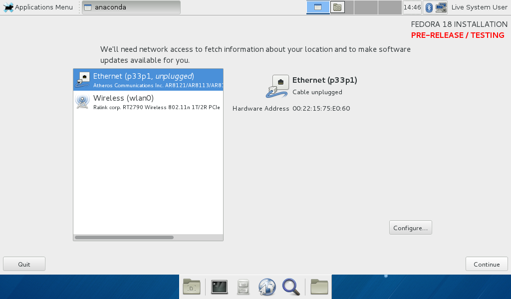
I booted from the USB stick with the purpose of performing an install, so the network wasn't configured. Now the installer asked to set-up the network. A good thing, I may be able to customize the package set, add other repos (Rpmfusion and get done with everything in one go). Only it didn't... it wasn't possible to customize the set and it wasn't possible to add repos. A regression, we used to be able to do that.

anaconda

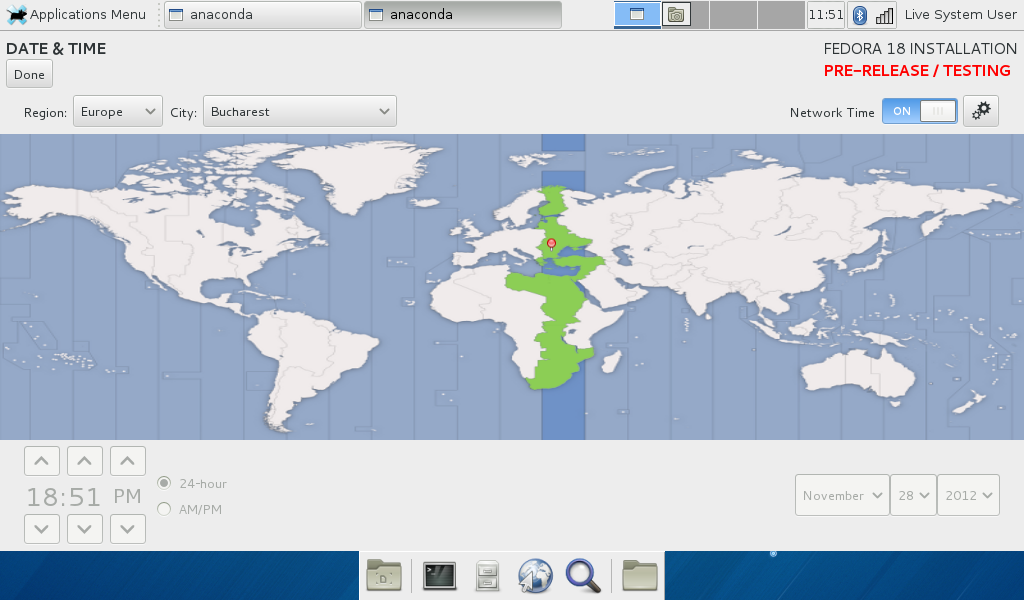
Then it goes to the main installer screen, where the redesign can be seen: instead of a "wizard" approach, where you follow the steps in serial order, from one to another, now it is a "hub", from the main page you can go to various config sections, complete them and go back. The section that must be filled are marked with an orange sign, the other are optional. A hub for only 3 options, 2 of which are totally minor (keyboard layout and timezone) is overkill. The future will probably add more, still I am not convinced about the benefits, I still used it as a wizard.
In the looks, there can be noted the extremely simplistic and monochrome, Windows 8 style, icons, which do not look like icons or buttons.

anaconda

The first option to edit is the time zone selection. From all the install experience it is my favorite part and a good change. In the old Anaconda the widget was small with the need to unintuitively zoom the world map. Now is easier. Still, the position, caption and shape of the "Done" button is not inspired and is a flaw to be found in every similar configuration screen. I have to witness I had to hunt for it, I expected a bigger, more visible button in the bottom-right corner.

anaconda

The keyboard layout section is the same, very simple (was an entire screen needed?) with the "Done" button in the same unexpected place.

anaconda

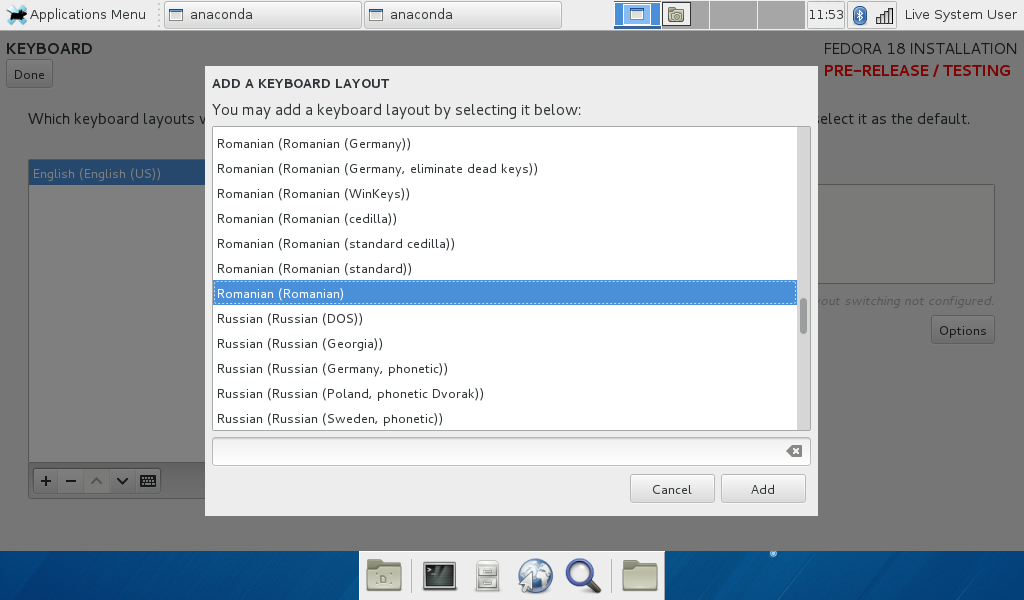
The less pleasant part part was when selecting the proper layout for the Romanian language (still, the problem isn't new). Can you tell which is the right one? It was not my first Fedora install, so I happened to know (hint: it would be a good idea to put the option needed by most users the first, not the last).

anaconda

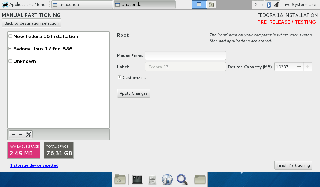
The destination selection screen follows the same convention but it is a small wizard in itself, with a "Continue" button in the "right" place. Why do I have to jump to opposite screen corners for buttons?

anaconda

The "wizard" mode is interrupted by a pop-up where you set some partitioning options. There is also a disabled "Modify software selection" button, hovering it the tooltip says "Please wait... software metadata still loading". No matter how long you wait, the button won't get enabled, you won't customize a thing.

anaconda

I didn't go in depth with partitioning, just re-used the old partitions from the previous Fedora 17 install.

anaconda

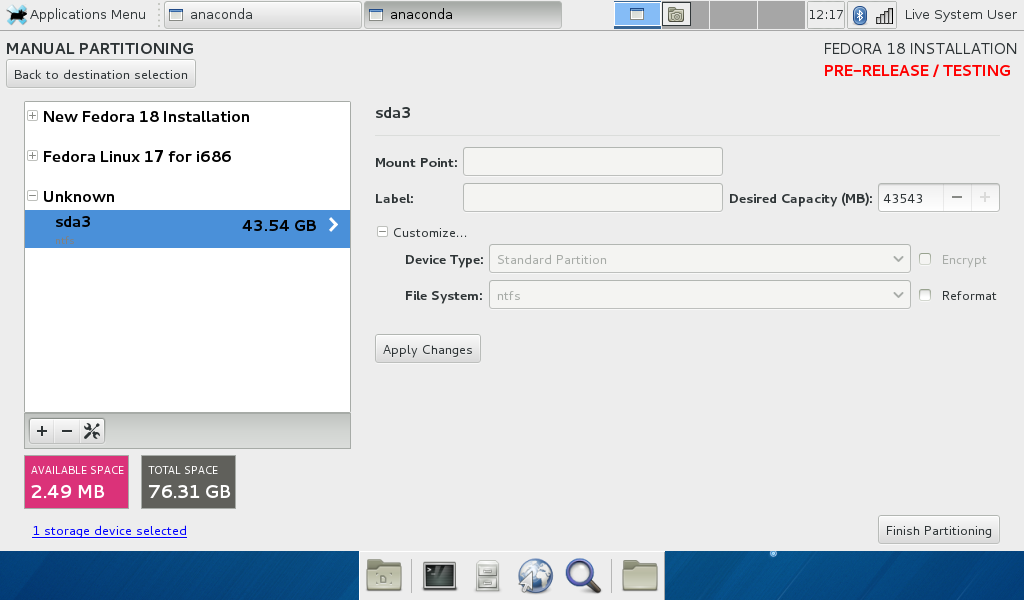
A very small regression is you having to type by hand the mount point for partitions (of course I want to mount /home in /home and of course if my hand is on the mouse I prefer to select from a drop-down, it used to be that way). The confusing part comes when I set the mount point for a partition and it appears in both F17 and F18 sections... I put it for F18, why still in F17, which I am erasing? If you stop and think, it makes some sense: you can have /home or swap shared by two Linux installs, but only if they have the same user IDs and SE attributes...

anaconda

Another minor part: that "Unknown" partition is not unknown, is a W I N D O W S partition (GRUB will recognize and use it), why not label it as such here? The old Anaconda did... and this brings me to the bigger complaint: the GRUB setup screen is gone and I need it: my computer at home is going to be shared by two persons, one (me) booting in Linux and the other in Windows. For her, it has to go in Windows by default. Regression. I will have to adjust it by hand post-install.

anaconda

With this done is the time to begin installation. From a button placed "correctly":

anaconda

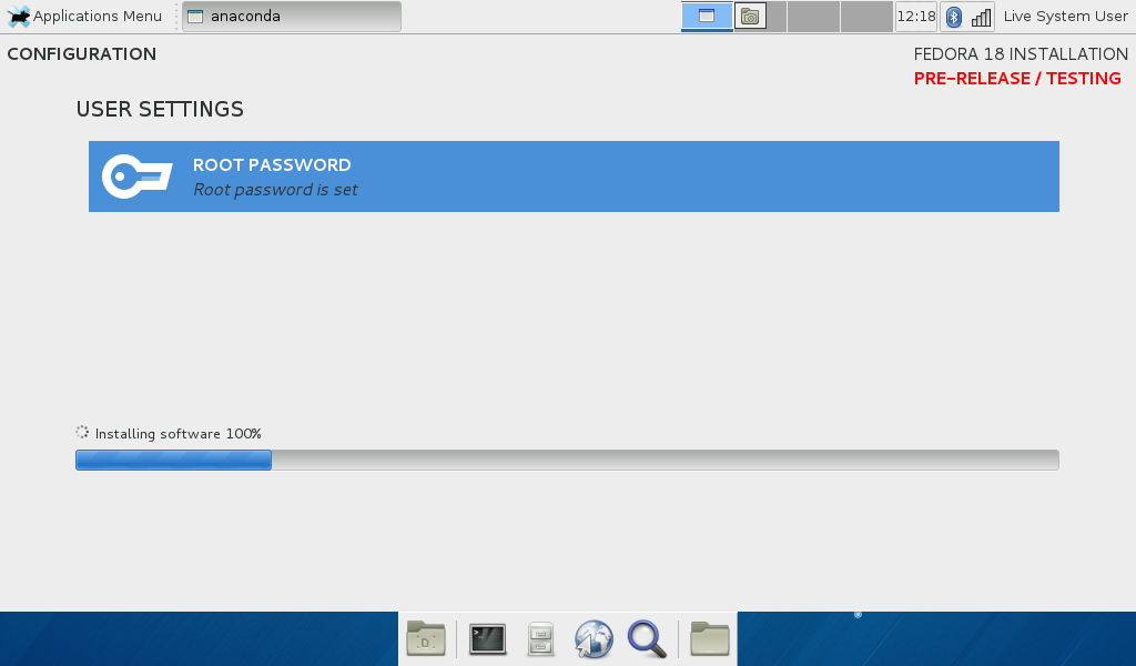
While files are copying, you are asked to set a root password.

anaconda

In the famous Anaconda way, the progression indicator has a rhythm of its own, unrelated with anything.

anaconda

When the bar s full the installation ended successfully, there is a button to reboot in the newly installed system.

anaconda

This was a visual guide of Anaconda, but the install is not ready, you will have one more step: the first run wizard, which is not covered with screenshots. It was 4 additional steps:

  • a "welcome" screen, where you just press a button
  • a license agreement screen, where you are presented with the text of GPL (at least I believe so, I didn't read it - TL;DR). Again, just press a button
  • user setup, a screen where you create the first user of the system. eventually making it an "administrator" (what an administrator is on a Linux system?). This is the only useful step from this wizard, it would make sense to move it elsewhere (Anaconda?) and get rid of the wizar
  • time setup, which I already did in the Anaconda interface. Is redundant.

Since the features are supposed to be ready by a Beta release, expect the experience in the Fedora 18 final release not to be far from this.

28 November 2012

GNOME alternatives in Fedora 18

There is a significant amount of people unhappy with the direction of GNOME 3 who do not enjoy KDE and find LXDE too weak in features or who just like the look and feel of the old GNOME 2 desktop. Here are their options in Fedora 18, as they can be seen in the recently released Beta.

Xfce

Xfce is by now an old desktop environment, with years of development and an existing community. When GNOME changed drastically, it was seen by many as the de facto replacement (before, it was seen by one as "GNOME Lite"), an important number of users adopted it, even Linus Torvalds used Xfce for a while.

Currently it is also the easiest to install on a Fedora system, there is a dedicated spin you can run as a live image on install on your computer. The spin is available also for the F18 Beta

The desktop is kind of basic, even now it looks better it still lack polishing and features and the included apps are limited in functionality. The development rate is not as fast as you may want, technically it feels a few years behind. Of course, being a GTK+ 2 desktop, you can run any GTK+ 2 (GNOME 2) applications seamlessly (note: major GTK+ apps like GIMP or Inkscape are still GTK+ 2 based).

The ideal target for Xfce are users with a limited need to fiddle with the desktop, who spend most of their time either in the terminal or a few apps and need a shell to launch those: either newbies or techies.

Cinnamon

Cinnamon is an alternative GNOME 3 shell developed by Linux Mint which was available for some time for Fedora in a 3-rd party repo and now is part of the main repo. It forks some components from GNOME, like the window manager (Mutter - > Muffin)

Still young, Cinnamon does not have yet a dedicated Fedora spin of its own, so you can install it with yum (yum groupinstall cinnamon-desktop) on an existing installation. I did it over the Xfce spin, but it may be a good idea to install from a Desktop (GNOME) spin, as it would re-use most of the GNOME stack and apps, or even from the net-install image, if you want to keep the footprint low (none of the desktop presented here are available on the install DVD but they can be yummed later).

The desktop feels like a mix of elements from GNOME 3, GNOME 2, Windows, KDE and others, is like GNOME 3 a "modern" desktop but with a different vision. There are a lot of inconsistencies in its look: some apps have dark windows, some have light windows, some icons are flat, some not, you can easily see the team is small. On the apps side, everything is there: since Cinnamon is an alternative GNOME 3 shell, it uses all the GNOME apps.

Honestly, I am not sure what is the intended audience for Cinnamon with its mixed feeling, I guess those who want a change, but not that much in the GNOME's intended way.

MATE

Another project from Mint, MATE is as simple as a direct GNOME 2 fork, with a few bug fixes and backports on top. It looks as gaining momentum and Fedora 18 Beta with MATE is receiving rave reviews.

Just as Cinnamon, MATE does not have a dedicated spin yet (look forward for one in Fedora 19), so you can get it with yum groupinstall mate-desktop from an existing install.

The desktop has an identical look and feel with a GNOME 2 desktop, since it is a direct fork of it: after install you will be in a 100% traditional GNOME environment. All the apps included are forks of the GNOME 2 apps, from Nautilus to gedit and eog. They have the name changed so they can live together on the same system. What will happen when the major GTK+ apps will move to GTK+3 remain to be seen, but that's distant future anyway.

If you want to pretend GNOME 3 never happened, then MATE is for you. That is its intended audience.

GNOME Classic

Even if at this point it is vaporware, GNOME developers announced a "Classic" mode, it's going to be a set of extensions on top of the shell, giving a more traditional feel. This is not Fedora material, is just a proposal. When/if released we'll see if it is too late and/or too little, for now it looks mostly like a move to limit defectors.

sed to the rescue

Don't know how, but I managed to delete all the emails in my Thunderbird's inbox this morning: it was like I hit Ctrl + A and then Shift + Del, without noticing it. I only noticed there are no messages. The first thing to check was the Inbox file ~/.thunderbird/[random_chars\/Mail/Local Folders/Inbox. It was there and big (1.75GB) with readable (vi or such) content. OK, it should be recoverable.

What happens here: when you delete an email in Thunderbird (or SeaMonkey), it is not deleted completely, only the value of one of its headers, X-Mozilla-Status is changed. The actual content is removed only when you compact the folder. I used to have the mail client to automatically compact its folders when some space can be saved, but it feels like it start compacting (and freezing the app) always when you have work to do. So I disabled that.

So the first step was to investigate the status of the messages in my Inbox:

grep "X-Mozilla-Status:" Inbox | sort -u

The result was something like:

X-Mozilla-Status: 0009
X-Mozilla-Status: 000b
X-Mozilla-Status: 0019
X-Mozilla-Status: 001b
X-Mozilla-Status: 1009
X-Mozilla-Status: 100b
X-Mozilla-Status: 1019
X-Mozilla-Status: 101b

You need a bit of knowledge about those statuses: 0009 means "read and deleted", 000b means "read, replied and deleted" and so on.

So I had to parse the Inbox file and replace messages. Wile a tool like mboxgrep may make some things easier, sed is good enough. I created a statuses.txt file with the following content:

s/X-Mozilla-Status: 0009/X-Mozilla-Status: 0001/g
s/X-Mozilla-Status: 000b/X-Mozilla-Status: 0001/g
s/X-Mozilla-Status: 0019/X-Mozilla-Status: 0001/g
s/X-Mozilla-Status: 001b/X-Mozilla-Status: 0001/g
s/X-Mozilla-Status: 1009/X-Mozilla-Status: 0001/g
s/X-Mozilla-Status: 100b/X-Mozilla-Status: 0001/g
s/X-Mozilla-Status: 1019/X-Mozilla-Status: 0001/g
s/X-Mozilla-Status: 101b/X-Mozilla-Status: 0001/g

Then feed it to seed:

sed -f statuses.txt Inbox > Inbox1

Wait for a while and you have a new Inbox1 with all the messages undeleted (0001 is "read", if you want "unread", use 0000 instead). Delete the old Inbox and rename Inbox1 to Inbox. Open Thunderbird and everything works.

27 November 2012

Unetbootin to the rescue

Quick tip: if you, like me, downloaded the Fedora 18 Beta, trying to install it with an USB stick and the Xfce spin and if you get the same error message:

No DEFAULT or UI configuration found!

Then the solution is not to use the liveusb-creator tool, but go instead for Unetbootin. For me, it did the job.

21 November 2012

Mint / MATE

Yesterday was released the new Linux Mint 14 codenamed "Nadia" in two flavours: Cinnamon and MATE. I downloaded the 32 bit MATE version, put it on a bootable USB for a quick try.

mint mate

At the first look is a plain and simple (remember, for a desktop, "plain and simple" is a good thing) traditional GNOME 2.x desktop with a lot of gray, a bit of green and a single-panel layout. It was not a big effort to bring it to something familiar. This is the natural GNOME 2 successor.

mint mate

It have an own applications menu, but only a couple away is the classic Applications-Places-System GNOME 2 menu. The themes available are limited and defaulting to green - easy to customize, I bet you can put GNOME 2 themes in place.

Compared with a Fedora desktop spin, the default application selection is richer: you will find GIMP, you will find Libre Office, you will find a working media player (I know about the "forbidden items", of course) and such. Obviously, there could be more of them :)

Look forward earlier next year for the Fedora 18 release which will have MATE available for repos for a yum install (probably Fedora 19 later next year will have a dedicated spin).

Social API, Facebook and Firefox

The most talked and hyped feature in Firefox 17 is the social API, intended to bring integration with various services in the browser. Knowing the first release will come (only) with Facebook integration (and knowing Facebook's history), I expected it to be a disaster, with potential to kill the idea... so as soon as Remi's repo provided the packages, I yummed them to see what is all about.

First thing to know, and this is a good thing, is not automatic, you have to go to a certain URL and enable it

firefox facebook

This will add a few toolbar buttons and a sidebar

firefox facebook

The sidebar will stay on while browsing other sites, but is already a problem: it has a certain (large) minimal width, and if your browser window is not big enough, the layout of many other websites will be messed-up (arguably, is their fault for not flowing correctly). Forget about it on a small display, like a netbook.

firefox facebook

I find the sidebar one of the (too many) Facebook's most annoying features, it make content move all the time in front of your eyes,fortunately you can remove it. Just imagine a browser window with such sidebars from all the social sites you use: Facebook, Google +, Twitter, Flickr and such. What space is left for the actual page content?

firefox facebook

Another annoyance: 4 buttons were added to the toolbar. While the notification an chat may be useful al the time (hint: install Pidgin, configure its Facebook chat with Jabber and you don't need the in-browser fb chat, how many a day are you going to use the friends or config buttons? Unfortunately, you can't customize which buttons are shown. As you can't customize either their position: open the Customize Toolbar dialog and you can drag them around, but they won't land anywhere, only stay in place.

firefox facebook

What you can do is head to the Tools menu and disable it (you can also remove it, but maybe I will need it later if a reader will flame me in the comments). Again, imagine the menu if/when you have 10 such services installed.

firefox facebook

Is too early to say, I upgraded Firefox only this morning and had enabled the fb integration for a short while, but I felt a browser performance degradation with it on (resource-consumption wise, Facebook IS a pig while browsing normally, not unlikely for the widget to be too).

20 November 2012

Jakob Nielsen and Windows 8

When the Jakob Nielsen makes an usability study on Windows 8, you know is going to be an interesting read, not only for Windows people, but also for those involved with other "modern" desktop systems, which share a lot of its features and concepts.

As everyone expect, the result is not favorable, while on a tablet Windows 8 is found only "weak", with problems which can be fixed in time for Windows 9, on a desktop it is found nothing short of "terrible", quote "much worse on regular PCs, particularly for knowledge workers doing productivity tasks in the office. This used to be Microsoft's core audience, and it has now thrown the old customer base under the bus" (emphasis his). Read on to understand why.

And remember, this is not some random change-hater, is one of the most prominent figures in usability and human-computer interaction. His conclusion: no not upgrade to Windows 8, wait and hope Microsoft will correct its mistakes in a future version, they are known to listen to customer feedback.

13 November 2012

Tutorial: Inkscape calendar layout

This year I made my own photo calendar, nicely printed on paper (is small sized, a calendar to put on your desk), the files are available as high-res PDFs, for download and use. Then the calendar sources were made available as SVGs, for anyone to use (both in Romanian and English), modify, play with and so on. Using Inkcape may look as a less optimal choice, a photographer would probably have used Photoshop for the task, a FOSS photographer GIMP, a designer Illustrator or Corel Draw, a FOSS designer Scribus, a newbie Microsoft Word, a FOSS newbie Libre Office... you got my point, there are a ton of tools to be used, some Free, some not. Still, my choice was Inkscape, since it is the tool I am comfortable the most for such task and here I will describe the process.
Of course, Inkscape is not the perfect tool for this, its lack of multipage support will make you use multiple files (12 files, one for each month and a cover, at least), self-made templates to keep the look consistent, will not automatically add crop and bleed marks (you can do it manually, but I didn't cover it here, maybe another time) and the resulting files will not be CMYK (if you need CMYK, which I didn't).

The calendar grid

Images or not, a calendar is defined by a grid of days, you can have a calendar with no pictures, but you can't have one with no days. So let's start with the most important part: creating a grid of days. I started with a square, you may start from a square too or use a rectangle, depending on the look you are aiming for, want the grid taller or wider. I made it colored to have the next step easier.

calendar layout

With the text tool write a digit (or a letter, whatever you want, a digit may be more useful since most of the text is goind to be numbers). This is the main text, so black is a sensible choice. Choose a font you like and a size that will look good (retrospectively, my choice it for a 36 pt font size was not the best, my final layout would have looked better with smaller letters, but bat taste is a right, correct?). Also, I made the text aligned to right, as that is the look I aimed for (depending on your intended look, it may fork aligned to left or center too). Place the text inside the rectangle whatever you want, only keep in mind its width will change, it should accustom both "1" and "30", so take care with spacing, size and alignment.

calendar layout

You can make now the rectangle white (or if you use a different background, make it that color). Or make it transparent, we don't need it visible any more but only as a spacer and placeholder.

calendar layout

Select the rectangle and the text and group them.

calendar layout

Select the group and make a bunch of tiled clones (Edit > Clone > Create Tiled Clones)

calendar layout

How many clones? Easy: a week has 7 days, sp we need 7 columns, a week is split in 4 weeks and some extra-days, so we need 5 rows for them plus another row for the day names, so 6 rows. Create the tiled clones. Make sure all the other parameters are zero, if needed reset them first.

calendar layout

read more

09 November 2012

F19 name vote

With the F19 name vote open, it was the time for me to cast my ballot, there are a couple of candidates I kind of liked and voted, Loch Ness Monster and Schrödinger's Cat, some others which didn't excite me at all and a couple more which looks like stolen from the Ubuntu naming schedule.

08 November 2012

No Fedora

After some point it becomes humorous:

no fedora wbcomic

Making your own calendar


I made my own calendar for 2013: a design created with Inkscape and a bunch of photos, one for each month. It is already printed on paper in a limited edition, which will be offered with signatures from the photographers. However, I decided to put it for free download (PDFs downloadable from the same blog post) in case someone else find it good looking or useful. When a fellow photographer liked the design but witnessed his lack of design experience, I also included empty PDFs (no photos, no name) one can re-use for his own purpose. The PDFs are created to the requirement of the print shop: 220 x 100 mm, with 2 mm bleeds on all the edges.

Then I decided I can be more open, I can do more: the design is made with Inkscape, a software rarely used by photographers (they will most likely do it in Photoshop), but I can share my Inkscape SVG sources: they have the months and days, they also have guides to help with alignment, they can be exported to high quality PDF and, if you want, they can be imported in a DTP application for further processing. The only downside is, I made them for a certain paper size, but having access to the sources, is easy to adjust them. The font used is Free, MgOpen Cosmetica.

Still not perfect: I made the calendar in Romanian, since this is what people around me speak, but most of those reading my blog won't, so it was obvious a translation is needed, I also have an English version of the calendar design, also ready to use in Inkscape/SVG format - you just need to add your photos and name.

I can already hear people telling me: you should have used Scribus instead and to some degree they are right, Scribus would have helped me with having a single PDF or source file (lack of multipage support was Inkscape's main downside for the task), would have provided better PDF output and automatic bleed/crop marks, but I feel more comfortable with Inkscape, so I used the app that makes me happier (you can import the SVGs in Scribus).

Update: here's a tutorial for making your own Inkscape calendar layout design